

Data Studio has twenty chart types, plus community visualisations — and most good reports use five of them. The hard part was never learning what a treemap does. It’s knowing which chart your data is actually shaped for, and that question has a shorter answer than most guides admit.
This is the reference version: a decision matrix keyed on the shape of your data, all twenty types with what each is genuinely for, verdicts on the head-to-heads people actually argue about, and the row-limit behaviour that silently changes your numbers.
First, the naming
Google renamed the tool Looker Studio, then renamed it back to Data Studio. Both names describe the same product and the same charts, so if you searched for either, you’re in the right place. We use Data Studio throughout because that’s the current name.
Worth knowing: Looker and Data Studio are different products. Looker is Google’s enterprise BI platform with its own modelling layer and its own, different set of visualisations. If a page you’re reading mentions LookML, it isn’t about this tool.
Start with the shape of your data, not the chart
The usual advice is “decide what you want to show.” That’s sound, but it asks you to already know the answer. There’s an easier question that comes first, and it’s one you can answer by looking at your fields:
- How many dimensions? Zero, one, or two.
- How many metrics? One, two, or many.
- Is one of the dimensions a date?
- How many distinct values does the dimension have? Four, or four hundred.
- Do the parts add up to a meaningful whole? Device categories do. Landing pages don’t.
Answer those five and the chart is usually decided for you. Data Studio itself thinks in exactly these terms — every chart declares how many dimensions and metrics it will accept — so working this way means you stop fighting the tool.

The decision matrix
Find the row that matches your fields. The first chart is the default answer; the runner-up is the one to try when the default is crowded or the audience is unusual.
| Your data | Example | Use | Runner-up | Avoid |
|---|---|---|---|---|
| No dimension, 1 metric | Total sessions | Scorecard | Scorecard with sparkline | Gauge |
| No dimension, 1 metric vs a target | Revenue against goal | Bullet | Scorecard + text | Gauge |
| Date dimension, 1–3 metrics | Sessions by day | Time series | Area | Bar |
| Date dimension, 2 metrics on different scales | Sessions and conversion rate | Combo, second metric on the right axis | Two stacked time series | One axis for both |
| Date dimension + a breakdown | Sessions by channel over time | Time series with a breakdown dimension | Stacked area | Pie per month |
| Text dimension, 1 metric, up to ~8 values | Sessions by channel | Bar, sorted by the metric | Table with bars | Pie |
| Text dimension, 1 metric, many values | Sessions by landing page | Table with bars | Bar with a row limit | Pie, treemap |
| Text dimension, parts of an exhaustive whole, 2–4 values | Device category split | Pie or donut | 100% stacked bar | Bar (it loses the whole) |
| Text dimension, several metrics | Campaign performance | Table | Pivot table | Any single chart |
| Two text dimensions, 1 metric | Channel by month | Pivot table with heatmap | Stacked bar | Grouped pie |
| Two metrics, one point per row | Spend against conversions | Scatter | Bubble, size as a third metric | Two separate bars |
| Geographic dimension, 1 metric | Sessions by country | Geo map | Sorted table | Bar, if geography is the point |
| Hierarchical dimension, 1 metric | Category then subcategory | Treemap | Pivot table | Pie |
| Ordered stages, 1 metric | Checkout funnel steps | Funnel | Bar in stage order | Pie |
| Source and destination pairs | Channel into landing page | Sankey | Pivot table | Bar |
| Sequential additions to a total | Revenue bridge month to month | Waterfall | Bar | Stacked bar |
| One metric, spread across many rows | Session duration spread | Boxplot | Bar on a bucketed field | Reporting the average alone |
Two of those rows deserve a note, because they’re where reports most often go wrong.
“Parts of an exhaustive whole” is doing real work. Device category is exhaustive — desktop, mobile and tablet account for every session. Landing pages are not: your top ten pages are a fraction of the site, so a pie of them implies a whole that doesn’t exist. That distinction, not the number of slices, is the actual test for a pie chart.
The last row is the one nobody builds. Almost every marketing report presents an average — average session duration, average order value, average position — with no indication of the spread behind it. An average is a summary of a distribution, and two wildly different distributions produce the same average. If a number drives a decision, it’s worth looking at its shape once before you commit to reporting only the mean.
The five you’ll actually use
If you build a report a week for a year, this is where most of your time goes.
Scorecard — one number that matters
A single metric, optionally with a comparison. The most under-used chart in Data Studio and the one stakeholders read first.
Use it for: headline KPIs at the top of a page.
Always: set a comparison date range to previous period or previous year. A number without context isn’t information — it’s a fact nobody can act on.
Worth knowing: a scorecard can carry a sparkline, which gets you the headline and the shape in the space of a headline.
Not for: anything where the trend matters more than the value.
Time series — change over time
The default whenever the x-axis is dates. A line chart plots one dimension with up to five metrics, or two dimensions with a single metric — so the moment you add a breakdown dimension, you’re down to one metric. That trade-off catches people mid-build.
Use it for: sessions, clicks, spend or conversions over weeks and months.
Watch: too many lines. Past four series it stops being readable — filter it, or split it into two charts.
Not for: comparing categories with no time dimension. That’s a bar chart.
Bar chart — comparing categories
The workhorse. It takes one dimension with up to twenty metrics, or two dimensions with a single metric.
Use it for: top channels, top pages, spend by campaign.
Always: sort by the metric, never alphabetically. Sorting is most of what makes a bar chart readable.
Watch: stacked bars past three segments. Only the bottom segment shares a baseline, so the others can’t be compared by eye.
Table — detail people need to read or export
Unglamorous and frequently the right answer. A table with bar or heatmap formatting on one column is often clearer than a chart, and it’s the only output a colleague can take away and work with.
Use it for: landing pages, queries, campaign detail — many rows, several metrics.
Always: keep to four or five columns. Fourteen columns gets scrolled past.
Worth knowing: tables can be exported, which matters more often than people expect.
Pivot table — two dimensions at once
When you need channel by month, or device by landing page. Add heatmap formatting and it becomes the densest useful chart in the tool.
Use it for: the nuanced view an analyst wants.
Not for: an executive summary page. Pivots reward digging, and executives don’t dig.
All twenty chart types
Google’s own list, with what each is actually for. The five above are covered; here’s everything else, including the ones most guides skip.
| Chart | Genuinely useful for | Careful of |
|---|---|---|
| Pie / donut | Composition, 2–4 slices, parts of a real whole | Nine slices. See below — this is the most common chart error in marketing dashboards. |
| Combo | Two related metrics on different scales — spend and ROAS, sessions and conversion rate | Dual axes mislead easily. Label both, and never imply the crossover point means anything. |
| Area | Cumulative totals over time, and volume you want felt rather than read precisely | Stacked areas hide the movement of individual series. |
| Scatter | Relationships between two metrics — spend vs conversions, position vs CTR | Needs at least two metrics and caps at 1,000 points. Powerful, but needs explaining to most audiences. |
| Bullet | Progress against a target — the honest version of a gauge | Being unfamiliar. Label the target band. |
| Gauge | Very little, honestly | Consuming a quarter of a row to show one number a scorecard shows in a sixth of the space. |
| Geo | Genuinely geographic patterns | Looking impressive while saying less than a sorted table of countries. |
| Google Maps | Store locations, service areas, anything at street rather than country level | Heavier to load; overkill for country-level data. |
| Tree map | Hierarchical composition with many categories | Precise comparison — area is hard to judge by eye. |
| Sankey | Flow between two points — channel into landing page, step into step | Becoming a hairball past a handful of nodes. |
| Waterfall | Explaining how a total got from A to B — budget variance, revenue bridges | Needing a positive/negative field set up properly to be readable. |
| Boxplot | Distribution — where the spread is, and where the outliers are | Audiences who’ve never read one. Worth a caption the first time. |
| Candlestick | Open/high/low/close ranges — financial data, rarely marketing | Being the wrong tool for almost every marketing question. |
| Timeline | Events and phases along a date axis — campaign flights, migrations, releases | Being confused with a time series. This plots spans, not values. |
| Funnel | Ordered stages with drop-off between them | Stages that aren’t genuinely sequential. A funnel implies each step follows the last. |
| Community visualisations | Anything the built-ins don’t cover — radar, heatmaps, custom marks | Third-party code with access to your data. Check what you’re installing, and expect no support if it breaks. |
One practical note on community visualisations: they’re built by third parties and run against your report’s data. For a personal project that’s fine. If you’re an agency putting one on a client report, treat it as a dependency you don’t control — the same judgement you’d apply to any plugin.
The variants that count as separate choices
Several of the biggest wins aren’t chart types at all — they’re settings that change what a chart is for. These are worth knowing because they close the gap between “the chart I can build” and “the chart I want.”
- Scorecard with a sparkline. Headline number plus trend, in scorecard space.
- Table with bars. A bar chart that also shows the values, and can be exported. Frequently the best answer for a long ranked list.
- Table with a heatmap. Turns a dense table into something scannable, without a chart.
- 100% stacked bar. Composition and comparison across categories at once — the chart to use when a pie can’t cope but the mix still matters.
- Smoothed time series. Useful for noisy daily data where the shape matters more than each point. Be honest that it’s smoothing.
- Bar with a breakdown dimension. Grouped or stacked, from the same chart type.
The head-to-heads
Line chart or bar chart?
Line for time, bar for categories. A line implies continuity between points — that the thing being measured existed between Tuesday and Wednesday and moved smoothly. That’s true of sessions over days and false of sessions by channel, where there’s no meaningful space between “Organic” and “Paid”.
The exception: if you have very few time periods — four quarters, say — a bar chart is often clearer, because with four points a line has nothing to describe.
Bar chart or column chart?
Same chart, rotated. In Data Studio they’re the same chart type with an orientation setting, so this is purely a readability call.
Horizontal bars when the labels are long — page paths, search queries, campaign names. The label sits on one line and stays readable. Vertical columns when the labels are short — months, device categories, single words — or when the x-axis is time.
Pie chart or bar chart?
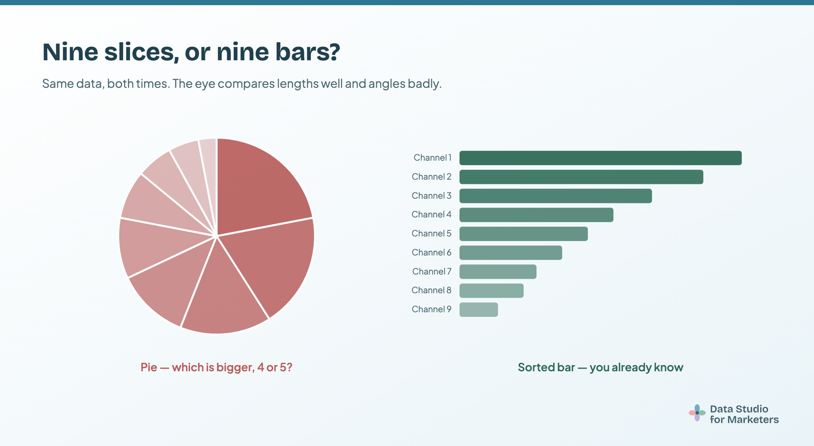
Bar, almost always. A pie earns its place only when the parts make up a genuine whole and there are no more than about four of them and the point you’re making is “this is roughly half” rather than “this is 47.3%”.
The charts that are usually a mistake
The many-sliced pie. Data Studio will show up to ten slices, which is roughly six more than anyone can rank by eye. If you have more than four categories, a sorted bar chart is easier to read and takes the same space.
The decorative gauge. A gauge uses a quarter of a row to display one number that a scorecard shows in a sixth of the space, with a comparison thrown in. If you need progress against a target, a bullet chart does it properly.
The dual-axis combo with unrelated metrics. Two axes make any two lines appear to converge or diverge meaningfully. If the metrics aren’t genuinely related, that apparent relationship is an artefact of your axis scaling, not a finding.
All three usually appear because someone was choosing charts for visual variety. Variety isn’t a design goal — clarity is.
Row limits and the “Others” row, which quietly change your numbers
This is the part nobody covers, and it’s the one most likely to make a chart wrong rather than just ugly.
Charts in Data Studio have a display limit — a pie chart, for example, shows between one and ten slices. When your dimension has more values than the limit, the setting Group the rest as “Others” decides what happens to the remainder. It is on by default, and it aggregates everything beyond the limit into a single row or slice labelled Others.
Three consequences worth internalising:
- An “Others” row is not a category. It’s the tail of your data wearing a label. Nobody should read it as a channel, a page or a campaign — and on a client report, somebody will.
- Turning the setting off doesn’t show you more data — it shows you less. With grouping disabled, the values beyond the limit simply aren’t represented, so your chart no longer adds up to your total. Google’s own documentation warns that the chart may not display all the data.
- It’s incompatible with comparison metrics. If you want a previous-period comparison on that chart, you have to disable Others grouping — which brings the point above into play. Decide which you’d rather have.
The practical habit: whenever a chart’s numbers don’t tie back to a scorecard on the same page, check the row limit before you suspect the data source. It’s the row limit far more often than it’s the connector — the same way most Search Console query totals don’t reconcile for reasons that have nothing to do with Data Studio.
Formatting that does more than the chart choice
- Use a limited, harmonious palette. Colour picked for decoration causes visual fatigue and slows comprehension. Set it once in the report theme rather than per chart.
- Check contrast and colour-vision accessibility. Red/green pairs are a genuine problem for a meaningful share of readers — roughly one in twelve men — and colour carries different associations across cultures, which matters for international teams. Never let colour be the only thing distinguishing two series.
- Sort every table and bar chart by the metric that matters.
- Use one colour with intent rather than a rainbow. If everything is highlighted, nothing is.
- Label anything unusual. If a chart needs explaining out loud, it needs a text box next to it.
Starter sets, by what you’re building
The right number of charts is fewer than you think. A reliable default is three or four scorecards, one time series, one or two breakdowns, and a text box explaining what changed. If something doesn’t help answer the question the report exists for, it belongs on another page or nowhere.
Beyond that, what you build depends on who’s reading it.
If you’re in-house, reporting upward
Bias hard toward scorecards with comparisons and a single time series. Your audience wants to know whether things are better or worse than last month and why — not to explore. One page, five charts, and a written summary at the top will outperform anything denser. Keep the pivot tables on a second page for whoever asks.
If you’re at an agency, reporting to clients
You’re building one report many times, so the cost of a bad chart choice multiplies. Two things pay for themselves: settle a house pattern for each report type and reuse it, and avoid community visualisations in client-facing work you’ll still be maintaining in two years. Build the template once, then copy it per client and swap the data source.
If you’re doing your own analysis
Different rules entirely — scatter charts, pivots and boxplots are all fair game, because you’re the audience and you’ll do the interpreting. Just don’t ship the analysis view to a stakeholder without rebuilding it.
Starter charts by channel
- SEO: clicks/impressions/CTR/position scorecards, clicks over time, top queries table, top landing pages table, branded vs non-branded split. Built from Search Console.
- PPC: cost/clicks/conversions/CPA scorecards, a combo of spend and conversions, a campaign table sorted by cost. Built from Google Ads.
- Web analytics: sessions/users/engagement scorecards, sessions over time with a channel breakdown, a landing page table. Built from GA4.
- Ecommerce: revenue/orders/AOV/conversion rate scorecards, revenue over time, a product table, and a funnel if your stages are genuinely sequential.
Cross-channel reports are the one case where chart choice runs into a platform limit rather than a design one: Meta, LinkedIn and TikTok have no native connector, so a genuine side-by-side needs a paid one. That’s a separate decision, and worth making after you know which charts you need rather than before.
How many charts should a page have?
Fewer than you think. Don’t try to cram every metric into one report — too much data overwhelms the audience and muddies the insight. If the story is simple, keep the visualisation simple: a colour-coded table can serve a C-suite audience better than anything fancier.
A good test before you publish: read the page as though you’re the person receiving it, and ask what decision it helps them make. Charts that don’t contribute to that answer are decoration, however well-chosen.
Frequently asked questions
How many chart types does Data Studio have?
Twenty, plus community visualisations built by third parties. Google’s list is: scorecard, table, pivot table, time series, bar and column, pie, combo, geo, Google Maps, area, scatter, bullet, gauge, tree map, sankey, waterfall, boxplot, candlestick, timeline and funnel. Most good reports use four or five.
How do I choose the right chart type for my data?
Answer five questions about your fields first: how many dimensions, how many metrics, is one of them a date, how many distinct values, and do the parts add up to a real whole. That narrows it to one or two options before you think about what you want to show.
What’s the most useful chart in Data Studio?
The scorecard with a previous-period comparison. It’s the one stakeholders read first and the easiest to get right.
Should I use a line chart or a bar chart?
Line for time, bar for categories. A line implies continuity between points, which is true of days and false of channels. With very few time periods — four quarters, say — bars are clearer.
What’s the difference between a bar chart and a column chart?
Orientation only; in Data Studio they’re one chart type with a setting. Use horizontal bars when labels are long, like page paths and queries, and vertical columns when labels are short or the axis is time.
When should I use a pie chart?
Only when the parts make up a genuine whole, there are no more than about four of them, and the point is roughly rather than precisely. Device split qualifies. Top landing pages don’t, because they aren’t the whole site.
What’s the difference between a table and a pivot table?
A table lists rows against one dimension. A pivot table crosses two — channel by month, for example. Use pivots for analysis, plain tables for reading and exporting.
How do I show two metrics with very different scales?
A combo chart with the second metric on the right axis. Label both axes, and don’t read meaning into where the two lines cross — that’s a function of your scaling.
Why does my chart show an “Others” row?
The dimension has more values than the chart’s display limit, and “Group the rest as Others” is on by default, so the remainder is aggregated into one row. Raise the limit or filter to the values you care about — but don’t just switch the setting off, because then those values disappear from the chart entirely.
Why can’t I add a comparison to this chart?
Comparison metrics aren’t compatible with “Group the rest as Others”. Disable that setting on the chart and the comparison becomes available — at the cost of the chart no longer representing all your data.
Are Looker Studio charts different from Data Studio charts?
No. It’s the same product under two names — Google renamed it Looker Studio, then back to Data Studio. Looker, without “Studio”, is a different enterprise product with its own visualisations.
Can I use a chart type Data Studio doesn’t have?
Yes, through community visualisations — third-party charts you add to a report. They cover radar charts, custom heatmaps and more. They also run third-party code against your data, so weigh that before putting one on a client report.