
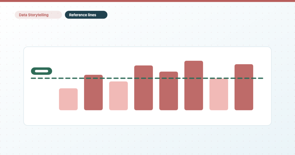
A number on its own is a fact. A number against a target is a verdict. Reference lines are the cheapest way to turn one into the other, they take about twenty seconds to add, and most client reports don’t use them at all.
This covers what you can put a line on, the four kinds of target, and the two limitations that catch everyone — one of which sends you somewhere else entirely.
Reference lines, reference bands and trend lines are three different things
Three different things, often confused:
- Reference line — a single horizontal line at a value you choose. Your target, your benchmark, your break-even point.
- Reference band — a shaded range between two values. For “acceptable” rather than “exactly this”.
- Trend line — a calculated line of best fit through the data. Available on time series and scatter charts only, and it describes what happened rather than what you were aiming at.
The first two are what this post is about. A trend line answers “which way is this going”; a reference line answers “is that good enough”.
Which Data Studio charts support reference lines
Not every chart supports them, and the list is shorter than people expect.
| Chart | Reference lines? |
|---|---|
| Time series | Yes |
| Column and bar | Yes |
| Line and combo | Yes |
| Area | Yes |
| Scatter | Yes |
| Stacked column, bar and area | Constant and parameter values only |
| 100% stacked | No |
| Scorecards, tables, pivots, pie | No |
That list is Google’s own documentation on reference lines and reference bands, which also sets the ceiling: a chart can carry up to ten. If you’re anywhere near that, the chart is doing too much — see choosing a chart from the shape of your data.
To add one: select the chart, open the Style tab, and find the reference line section. It’s in Style rather than Setup, which surprises people since it feels like data — the rule is that Setup decides what the chart shows and Style decides how it looks, and a reference line is technically the latter.
The four types of reference line in Data Studio
Constant value: a fixed target you type in
A fixed number you type in. Your monthly revenue target, a break-even CPA, an SLA. Simple, and the right answer most of the time.
The drawback is maintenance: when the target changes, someone has to edit the report. On fifteen client reports that’s fifteen edits.
Metric: a line driven by another metric in the chart
The line is driven by the chart’s own data — but read the second limitation below before relying on this one.
Calculation: mean, median, percentile, min, max or total
Average, median, percentile, min, max or total of the displayed data. “The average of the last twelve months” as a line under a monthly bar chart is one of the most useful charts in reporting, because it turns every bar into above or below normal at a glance.
Parameter: a target the reader can change themselves
You can drive a reference line from a parameter, which means the target becomes something the viewer can change without edit access.
Add a parameter for the target value, point the reference line at it, and put a control on the page. Now when a client revises their goal mid-quarter, they change it themselves — or you change it in one place rather than opening the report. For anyone maintaining reports at scale this is the difference between a five-minute job and an afternoon.
It’s also the honest way to handle a target nobody has actually agreed yet: put the control on the page and let the conversation happen against real data.
The limitation that catches everyone: a reference line can’t mark a date
Reference lines are numeric-axis only. They run horizontally, at a value on the y-axis.
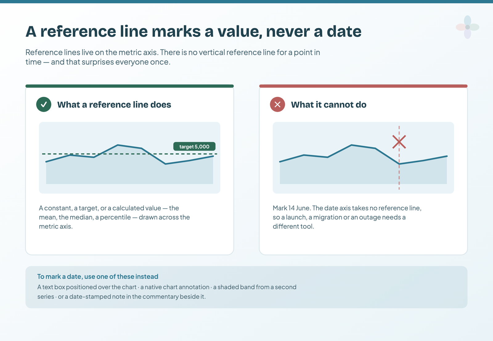
Which means you can’t drop a vertical line on a time series to mark the day a campaign launched, an algorithm update landed, or a site migration went live. That’s the single most common thing people want reference lines for, and Data Studio doesn’t do it.
Worth stating plainly because most guides don’t. They show you how to add a reference line, and leave you to discover on your own that the thing you wanted is impossible.
What to do instead is a genuinely different technique — a text box, a blended sheet of dated events, or a community component. That’s the four ways to get real annotations into a report, which exists largely because of this gap.
The second limitation: a metric reference line only sees displayed rows
Subtler, and it produces wrong numbers rather than missing features.
When a reference line is driven by a calculation — say “average” — it averages the rows the chart is displaying, not the underlying data. So:
- A row limit changes where the line sits. Showing the top ten of four hundred campaigns? Your “average” is the average of the top ten.
- “Others” grouping does the same. Remaining rows collapse into one row, which then counts as a single value in the calculation.
- A filter on the chart changes it too, which is usually what you want — but worth knowing when a control moves the line as well as the bars.
The practical consequence: if a chart’s average line looks higher than you expected, check the row limit before you check the data. This connects directly to how row limits and the “Others” row work, and the two together explain a surprising share of numbers that don’t tie up.
Five reference lines worth adding to a marketing report this week
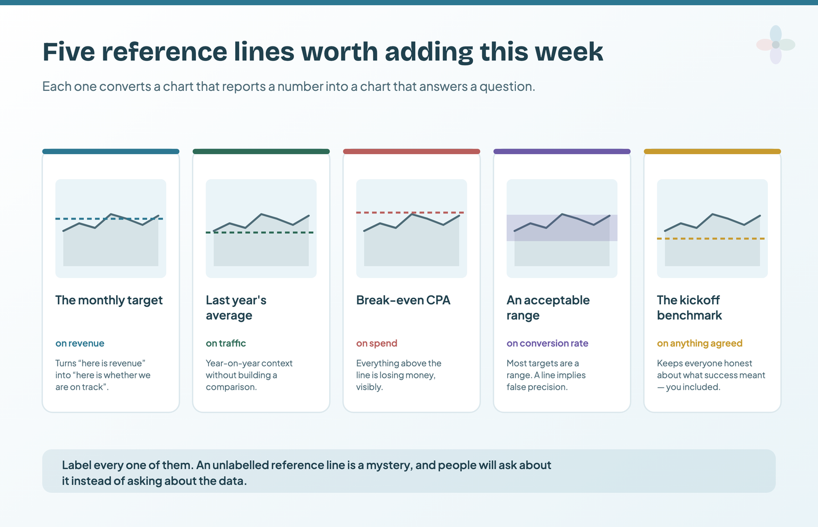
- The monthly target on the revenue time series. The single highest-value line in any client report — it converts “here’s revenue” into “here’s whether we’re on track”.
- Last year’s average on a traffic chart. Cheap year-on-year context without building a comparison.
- Break-even CPA on a spend chart. Turns a cost chart into a profitability chart. Everything above the line is losing money and everyone in the room can see it.
- A band, not a line, for “acceptable range”. Most targets aren’t a single number — conversion rate between 2 and 3% is fine, outside it isn’t. A band says that honestly, where a line implies false precision.
- The benchmark you agreed at kickoff. Put it on the chart and leave it there. It quietly keeps everyone honest about what success was supposed to look like, including you.
The gotcha nobody mentions: a fixed target against a moving date range
A constant reference line doesn’t know what period the chart is showing. It sits at the same value whether the reader has the date control on last month, last quarter or year to date — and a monthly target drawn across a quarterly view is simply wrong on the page.
Three ways out, depending on how much the report is going to be filtered.
Lock the chart’s date range. If the chart exists to answer “are we on track this month”, set its own date range rather than letting the report-level control drive it. The target then always matches the window. This is the right answer on a summary page, where the chart is making one argument.
Use a parameter instead of a constant. A parameter-driven line lets the reader set the target to match whatever period they have selected, which turns the problem into a feature on an exploratory page. It’s more setup, and it only helps readers who understand what they’re adjusting.
Put the period in the label. The cheapest fix and the one most reports should use: label the line “monthly target: 6,600” rather than “target: 6,600”. It doesn’t stop the mismatch, but it stops the mismatch being misread, which is most of the damage.
The same problem applies to calculation-driven lines in reverse: an average recalculates as the date range changes, so a line that looked stable in the build can move under a reader who is filtering. That’s usually correct behaviour, and it’s worth knowing before a client asks why the average moved when they changed the dates.
When a reference band beats a reference line
Most targets in marketing aren’t a single number, and drawing them as one implies a precision that the underlying business doesn’t have. Conversion rate between 2% and 3% is fine; 1.9% is worth a look; 3.4% usually means tracking is broken. That’s a band, not a line.
Reference bands are configured the same way as lines, in the Style tab, and take the same four value types. Three cases where a band is the honest choice:
An acceptable operating range. Anything with a floor and a ceiling — conversion rate, cost per acquisition, page load time. The band says “inside this is fine” without inviting a conversation about a one-point movement.
A seasonal envelope. Last year’s minimum and maximum for the same month, drawn as a band, gives a reader an immediate sense of whether this month is unusual. It’s far more informative than a single prior-year average, and it costs one extra field.
A forecast with uncertainty. If you’re showing a projection at all, showing it as a range is the difference between a forecast and a promise. A single projected line on a client report will be quoted back to you as a commitment.
Choosing a target value you can defend for a whole year
The line is the easy part. Deciding what number goes on it is where reference lines quietly cause damage, because a target on a chart looks like a fact and gets treated as one for the rest of the engagement.
Three ways to arrive at a number, in descending order of how well they survive being questioned.
Derived from a commercial requirement. The business needs 40 qualified leads a month to hit its revenue plan; at the current conversion rate that is 6,600 organic sessions to the relevant pages. This is the strongest kind of target because the arithmetic is checkable and the number changes when the business changes rather than when the mood does.
Derived from your own baseline. Last year’s same month, plus the growth the strategy is meant to produce. Weaker, but honest, and easy to keep current. State the growth assumption on the report rather than only in the proposal, or the target detaches from its reasoning within two quarters.
Derived from a benchmark. An industry average conversion rate, a competitor’s estimated traffic. This is the weakest, because the number describes somebody else’s business and nobody in the room can explain how it was calculated. If you use one, say where it came from on the chart itself.
Two habits protect you afterwards. Put the target’s basis in the label, not just its value — “target: 6,600 (40 leads at 0.6% CVR)” tells a new stakeholder in six months what the line is for. And when a target stops being right, change it in the open, in the month you change it, with the reason. Silently moving a line after a bad quarter is the reference-line equivalent of swapping a metric because it stopped flattering you, and it costs the same amount of credibility.
Styling a reference line so it reads as a target, not a series
- Label every one. An unlabelled reference line is a mystery, and people will ask about it instead of about the data.
- Dash it. A dashed line reads as annotation; a solid one reads as another data series.
- One accent colour, and not red on green. Red/green pairs are a real problem for a meaningful share of readers, and a red line over green bars is the worst common case.
- Keep it thin. A reference line is context, not the subject. If it’s heavier than the data it’s competing with it.
Frequently asked questions
How do I add a reference line in Data Studio?
Select the chart, open the Style tab of the Properties panel, and find the reference line section. It is in Style rather than Setup because Data Studio treats a reference line as presentation rather than data.
Can I add a vertical reference line to mark a date?
No. Reference lines are numeric-axis only, so they run horizontally at a value. To mark a launch, a migration or an algorithm update you need a positioned text box, a shaded band from a second series, or a blended annotations sheet.
Which Data Studio charts support reference lines?
Time series, column and bar, line and combo, area, and scatter. Stacked column, bar and area charts accept constant and parameter lines only, 100% stacked charts accept none, and scorecards, tables, pivot tables and pie charts do not support them at all.