
An executive summary page is defined by what you leave off it. Every other page in your report answers “what happened”. This one answers “what should we do about it” — and it only works if a reader can get that answer without scrolling, clicking or asking you a question.
This covers what earns a slot on the page, how to build it in Data Studio, and the part nearly everyone skips: writing the summary itself.
What an executive summary page in a Data Studio report is
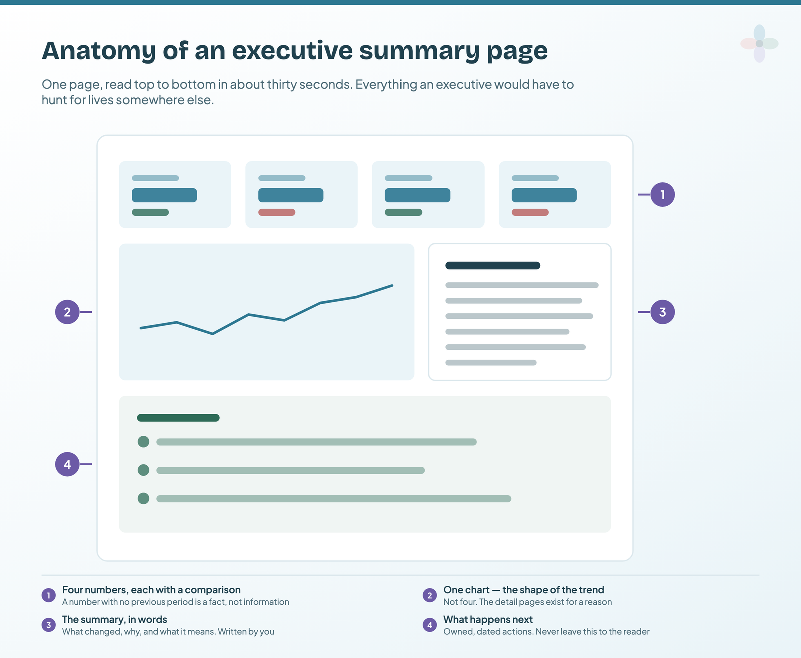
It’s a single report page, placed first, that states the headline performance, the one trend that explains it, what it means, and what happens next. Three or four numbers, one chart, a written summary, a short list of actions.
The distinction that makes it work is the one between exploratory and explanatory reporting. The rest of your report is exploratory — it lets someone dig. The summary page is explanatory: you’ve already done the digging, and you’re handing over the conclusion. Confusing the two is how a consultant loses authority, because a dashboard presented as an analysis implies you had nothing to add.
So the test isn’t “is this metric interesting”. It’s “would I say this out loud in the first minute of the meeting”.
Build the summary page on day one, not the month you need it
The usual approach is to build the detail pages first and add a summary later, when somebody senior asks for one. That’s backwards, and the reason is a scheduling problem rather than a design one.
If your day-to-day contact is reasonably senior, they will need a holistic view anyway. And the moment they introduce you to their boss — which happens with no notice, usually in a meeting you didn’t schedule — you need the page to already exist. Building it under time pressure, from a report designed for a specialist, produces exactly the cluttered page this article is about.
The architecture that works: one holistic, top-level page covering every channel, which links out to project-level pages underneath it. The summary is what the CEO or head of marketing sees. The detail is one click away for anyone who wants it.
The five-second rule for an executive summary page
Before the rule itself, the mechanism behind it. Type size sets reading order, always. The largest thing on the page gets read by everybody, including the person opening the report on a phone between meetings. The next size down gets read by most people, and many stop there. Body copy gets read by the specialist and by almost nobody else — the full version of that argument is in the dashboard design principles guide.
Which means a finding written in body copy hasn’t been communicated. If it matters to every reader, it belongs in the largest type on the page — and in practice that means rewriting a chart title rather than adding a paragraph.
Here is the test the rest of this article keeps returning to: if a reader can’t state the headline within about five seconds of the page loading, the page has failed.
Not “can they find the number” — can they say what it means. Those are different, and the gap between them is where most summary pages die. A page with eleven scorecards contains the answer somewhere. A page with four scorecards and a sentence is the answer.
Applied honestly, this rule removes about half of what people put on a summary page, and it settles arguments about whether something earns a slot faster than any principle about clarity or minimalism.
What earns a slot on an executive summary page
Three or four scorecards, each with a comparison
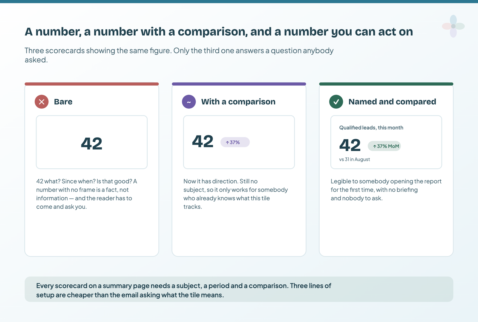
Every scorecard on this page needs three things: a subject, a period, and a comparison. A bare number is a fact rather than information — the reader silently supplies a baseline and it is usually the wrong one. A number with a change badge but no label works only for somebody who already knows what the tile tracks, which excludes the executive opening the report for the first time.
Each one needs a comparison. A metric without a previous period is a fact, not information — nobody can tell whether 31,900 sessions is good news without knowing what it was last month.
Pick numbers your reader is accountable for. This is where output metrics belong: revenue, orders, leads, conversions — the backward-looking measures of whether the thing worked. Input metrics (pages published, links earned, issues fixed) matter enormously, but they belong on the project pages, because an executive can’t act on them directly.
The rule of thumb that catches most over-stuffing: if you can’t say why a number is on the page in one sentence, it isn’t.
One chart, and it’s almost always a time series
One. Not four. The summary page shows the shape of the story; the detail pages show the breakdown.
A time series is usually right because the executive question is nearly always directional — is this getting better or worse, and since when. If your one chart is a bar chart, check whether the real question is actually “which channel” rather than “what’s happening”, because that’s often a sign the page is trying to do a detail page’s job. the guide to Data Studio chart types covers picking the right one from the shape of your data.
The written summary, which is the part everyone skips
This is the single biggest differentiator, and it’s covered properly further down, because it’s the hardest part and it deserves more than a bullet.
Short version: a page of charts with no words is a stats dump. Sending one out, however well-designed, isn’t storytelling — it’s delegation of the interpretation to somebody less equipped to do it than you.
The next-steps block, owned and dated
Owned, dated actions. Not “consider improving internal linking” — who is doing what, by when, and what you expect it to move.
It’s your job as the consultant to supply these. Leaving a client to work out their own next steps from a dashboard is the most common way a good analysis produces no change at all.
How to build an executive summary page in Data Studio, step by step
Step 1: make the summary a separate page and move it to position one
Add a new page (Page → New page) and move it to position one. Give it a name that says what it is — “Summary” or “This month at a glance” — because that name appears in the report’s navigation.
If your report has more than about three pages, set the navigation to a left-hand menu rather than tabs, in Theme and layout → Layout. Tabs run out of room and start truncating exactly when the report gets big enough to need them.
Step 2: add scorecards with a comparison date range
Add a scorecard per headline metric, then in Setup set the Comparison date range to previous period or previous year. This is the setting that turns a number into information, and it’s off by default.
Two things worth knowing:
- Previous period or previous year is a real choice. For anything seasonal — retail, travel, education — previous period will mislead. December against November isn’t a comparison anyone should act on.
- A sparkline earns its space here. A scorecard can carry one, which gets you the headline and the shape in the footprint of a headline.
Step 3: add one time series with the target drawn on it
Add the chart, set its date range explicitly rather than leaving it on Auto — Auto means the connector’s default, which differs between connectors and is a common cause of two charts on one page showing different periods.
If you’ve a target, put it on the chart as a reference line. A trend against a target answers “are we on track” in one glance; the same trend without one only answers “did it go up”.
Step 4: add the commentary text box
Insert a text box beside the chart, not underneath it. Underneath, it reads as a caption and gets skipped; beside it, it reads as the point.
There’s a real objection to putting commentary in a dashboard at all, and it deserves a straight answer. The dashboard updates automatically; your commentary doesn’t. On the first of the month you’re showing last month’s notes against this month’s data, which is worse than no commentary.
Two things fix it:
- Keep the commentary in a Google Sheet with a date column, and blend it into the report as a data source. Then updating the story is editing a spreadsheet row, not editing a report.
- Publish your update cadence on the page itself. A small text component saying “commentary updated on the first and third Monday of each month” converts a stale-looking dashboard into a documented one. It sets the expectation instead of leaving the reader to discover the gap.
The side effect is worth having: over a year you accumulate a detailed log of expert commentary against specific time points, which is its own asset at renewal time.
Step 5: add page navigation through to the detail pages
The summary page works because things are missing from it — which only holds if the missing things are one click away. Link out to the project pages explicitly, either through the report navigation or with buttons on the page.
If the same date control should apply everywhere, select it and use Arrange → Make report-level. The reader’s selection then carries across pages, so setting the summary to last quarter doesn’t leave the detail pages on last month.
How to write the summary text on an executive page
This is the highest-value four hundred words on the page, and the part that no competing guide shows an example of.
A four-part sentence pattern for report commentary
What changed → by how much → why → what we’re doing about it.
That’s it. It’s dull as a formula and it works, because it answers the four questions an executive is going to ask in that order anyway.
Three real report summaries, rewritten
Weak: “Organic traffic was down this month.”
Better: “Organic sessions fell 12% month on month, driven almost entirely by the blog. Two of our top ten landing pages lost position after the March core update. We’ve rewritten both and resubmitted them; we’d expect recovery within six to eight weeks.”
Weak: “Great month for conversions, up 24%!”
Better: “Conversions rose 24%, but 18 points of that came from the brand campaign that ran 8–22 March. Underlying non-brand conversion is up 6%, which is the number to plan against. The campaign ends in April.”
Weak: “Rankings continue to improve across target keywords.”
Better: “We now rank top three for 14 of the 40 target terms, up from nine. Those 14 account for 61% of the tracked search volume, so the revenue impact should be larger than the count suggests. Next is the nine terms sitting at positions four to seven.”
Notice what the good versions do: they name a cause, they separate signal from noise, and they end with something happening. None of them are longer than four sentences.
How to write numbers inside report commentary
- Round. “Up 12%” is more usable than “up 11.87%”, and nobody is making a different decision at the second decimal place.
- Give the comparison in the sentence. “31,900 sessions” means nothing; “31,900 sessions, up from 28,400” means something.
- Be honest about noise. If a 4% move is within normal variance for that metric, say so rather than narrating it as a trend. Doing this consistently is what makes people believe you when you say something is significant.
Writing the summary when the news is bad
Report it plainly, early, and with a route out.
Two habits cause most of the damage here, and both are about the consultant rather than the data. The first is simply being afraid of the conversation — softening a bad month, or hoping nobody asks. The second is subtler: anticipating how someone will react and shaping the narrative to suit that expectation, either going in combative or quietly downplaying. Both produce a subjective story, and objectivity is the whole basis of being believed next time.
The practical version: if performance is down because of something on the client’s side — a migration that shipped without you, three months of recommendations not implemented, a budget cut — that belongs in the summary. Framed as a fact with a consequence and a fix, not an accusation. Underperformance that sits within the reader’s own control to resolve is the most actionable thing you can put in front of them.
And don’t save it for the quarterly review. A conflict that surfaces once a quarter has had three months to compound.
How the summary page changes by who is reading it
The page changes depending on who opens it, and the difference is mostly about what counts as an outcome.
Reporting to a CMO or head of marketing
They care about channel mix, efficiency and whether the plan is working. Lead with the outcome metric they present upward — usually revenue, pipeline or cost per acquisition — and make the one chart show the trend against target. Keep channel breakdowns off this page; that’s what the click-through is for.
Reporting to a founder or CEO
Shorter still. They want to know whether this is working and what it costs. Two or three numbers, one trend, three sentences. Anything requiring a paragraph of setup belongs elsewhere. They won’t use a filter control, so don’t build the page around one.
Reporting to a client contact who reports upward
This is the most common case and the one most people get wrong. Your contact isn’t the final audience — they’re going to paste your numbers into their own deck.
Build for that: make the page exportable, write the summary in sentences they can lift verbatim, and give them the comparison figures they’ll be asked for rather than the ones you find interesting. The kindest thing you can do for a day-to-day contact is make them look well-prepared to their boss.
What to leave off an executive summary page
- Pivot tables. They reward digging, and this page is for people who won’t.
- Anything needing a paragraph to explain. If the metric requires a definition, it isn’t a summary metric — put it on a detail page with the definition next to it.
- Daily-granularity data. Day-level detail in a monthly report is noise wearing a chart. Match the granularity to the reporting cycle.
- Position tracking. Not because it’s a vanity metric — it’s genuinely useful — but because it’s mis-audienced here. It belongs on the specialist page. An executive doesn’t act on a rankings fluctuation, and putting it on the summary page invites a conversation about position 4 to 6 instead of about revenue.
- Everything you’re proud of building. The hardest cuts are the charts that took longest. They still belong on a detail page.
Taking the summary page into a slide deck
Most summary pages end up in a slide sooner or later. Two things make that painless:
- Build at a page size that exports cleanly. If the report is mainly read as a PDF or pasted into slides, set the canvas to A4 or a 16:9 size in Theme and layout before you build — changing it later doesn’t reposition anything for you.
- Remember the export captures what’s rendered. A table showing ten of four hundred rows exports as ten rows. On a summary page that’s rarely a problem, which is another argument for keeping tables off it. how exporting and scheduling a report works.
Executive summary mistakes that make the page get skipped
Showing everything. The most common failure, and it usually comes from a good instinct — wanting to demonstrate the work. Demonstrate the work on the detail pages.
Starting from the chart. Deciding you want a nice-looking dashboard and then finding metrics to fill it. Start from the decision the reader has to make.
No context on any number. Comparisons, targets and denominators are what convert a metric into a judgement. A number on its own is something the reader has to interpret, which is the job you were hired for.
No takeaway. A page that ends on a chart ends on a question. Put the answer on it.
A narrative the data doesn’t support. The one genuine risk of getting good at this. A compelling story built on a correlation is more dangerous than a boring one built on a fact, precisely because it’s more persuasive. If you’re inferring rather than measuring, say which one you’re doing.
Frequently asked questions
What is an executive summary page in a Data Studio report?
A single page, placed first, that answers what happened, why, and what happens next — without the reader needing to open anything else. Three or four scorecards with comparisons, one chart, a written summary and a set of owned, dated actions.
How do I add a comparison to a scorecard in Data Studio?
Select the scorecard, open the Setup tab and set the Comparison date range — previous period, or previous year for anything seasonal. It is off by default, which is why so many reports ship without it.
What should the written summary on a report actually say?
Follow a four-part pattern: what changed, by how much, why, and what you are doing about it. Three or four sentences per point. Longer than that and it is not a summary any more.
Where to go next on summary pages and reporting
- Data storytelling for marketers: the full guide
- The “so what?” test for a dashboard
- Metrics that tell a story, and the ones that do not
- Annotations and expert commentary in Data Studio
- Reference lines, bands and targets in Data Studio
- Presenting a Data Studio report to a client
- Data Studio chart types, and how to choose one
- Dashboard design principles for readable reports
- Designing scorecards that communicate at a glance