
Community visualisations are chart types built outside Data Studio’s standard chart list (chord diagrams, Venn diagrams, Gantt charts, sunbursts) that you add from a gallery inside the editor. The ones built by third parties only work when the data source uses Owner’s credentials, and only after an editor consents to them.
This guide covers the gallery as it stood on 14 October 2026: the three visualisations Google built, nine partner charts with clear marketing uses, and the radar chart many reports lost in 2025. For each one I give what it shows, the data it needs, marketing use cases, an illustration next to the built-in chart that answers the same question, and its known limits. Then the errors people hit most, and how to build and submit your own.
What a community visualisation is, and where the gallery is
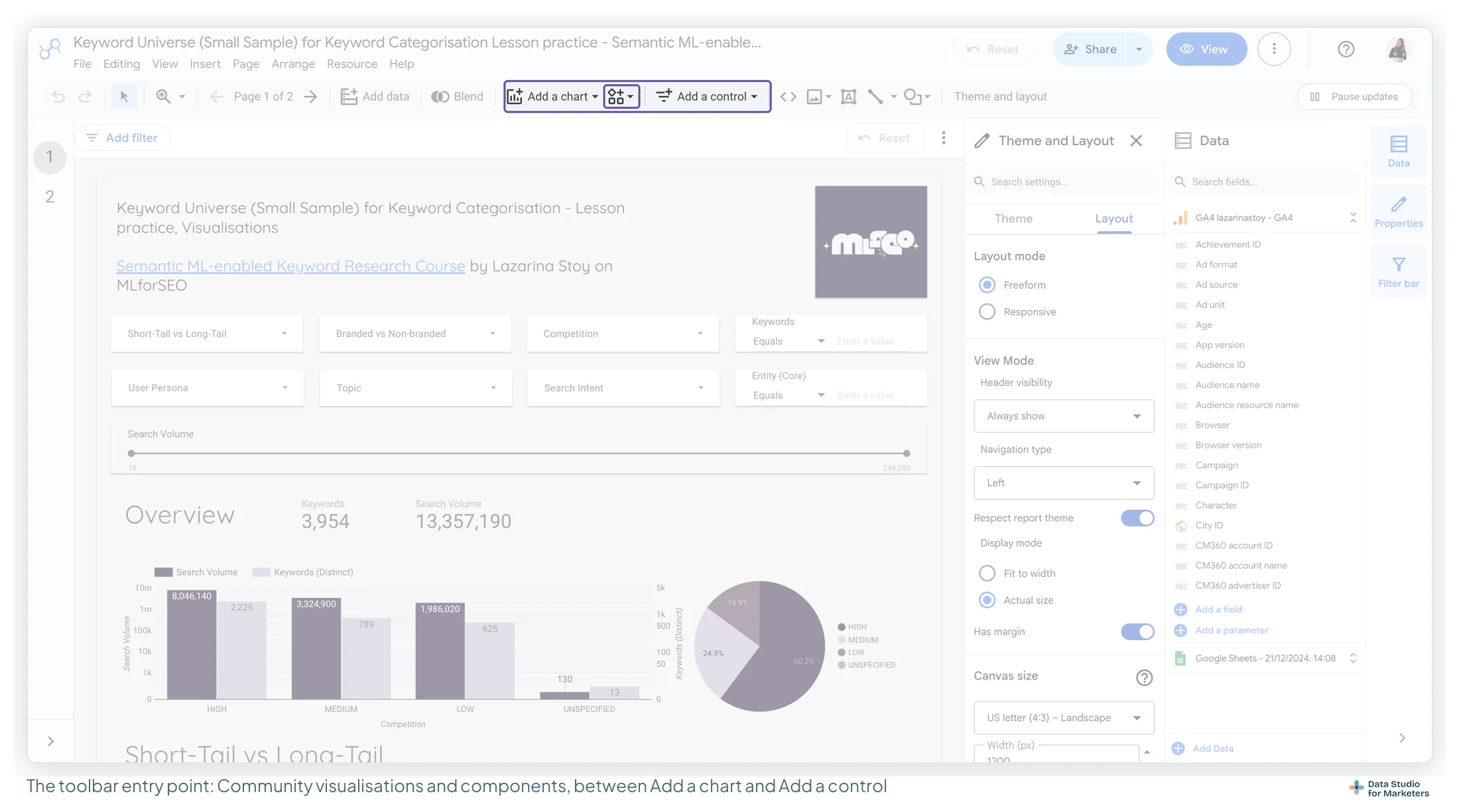
A community visualisation is a piece of JavaScript, hosted by its developer, that Data Studio loads into a report as a chart. You configure it like a built-in chart: a data source, dimensions, metrics, style options. It lives behind its own toolbar button, between Add a chart and Add a control:
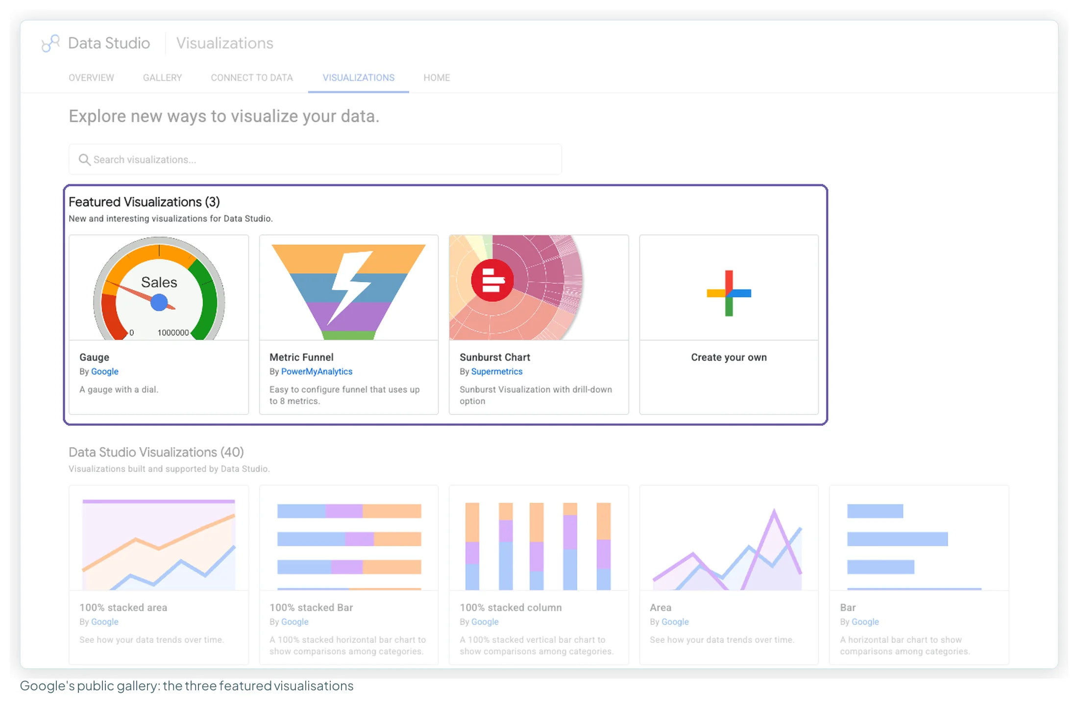
Click it for featured visualisations, the ones already in your report, and + Explore more, which opens the gallery. Google also publishes the gallery as a public page you can browse without signing in. On 14 October 2026 it listed three featured visualisations, 40 “built and supported by Data Studio” (mostly the standard chart types, including the three charts Google built through the community route) and 32 partner visualisations.
Google labels the feature two ways on one page: the title says “Developer Preview” and the body says “This feature is in Beta”. It has worked for years in that state. Use it, and don’t promise a client it will look the same forever. Sankey, funnel, gauge, tree map, timeline, waterfall and candlestick are all in Google’s own chart list now, which changes the advice for most of the entries below.
The 13 at a glance
Data shapes come from Google’s chart reference or the developer’s own demo report. “Consent” means an editor has to approve the visualisation before it shows data.
| Visualisation | Best for | Data shape | Built by | Consent | Built-in alternative |
|---|---|---|---|---|---|
| Gauge (dial) | One KPI against a target | 1 metric | No | Bullet chart, Gauge | |
| Waterfall | Explaining a change between two totals | 1 dimension + 1 metric | No | Waterfall, bar chart of changes | |
| Candlestick | Ranges per period | 1 dimension + 4 metrics | No | Candlestick, line chart | |
| Metric Funnel | Steps stored as separate metrics | Up to 8 metrics | Power My Analytics | Yes | Funnel chart |
| Lighthouse Gauge | A 0–100 score | 1 metric | James Buckley | Yes | Gauge with ranges |
| Sankey | Flow from one set to another | 2 dimensions + 1 metric | Yulan Lin | Yes | Sankey, pivot table |
| Heatmap | Patterns across two categories | 2 dimensions + 1 metric | Yulan Lin | Yes | Pivot table with heatmap |
| Sunburst Chart | Hierarchies | Up to 8 dimensions + 1 metric | Supermetrics | Yes | Tree map |
| Gantt Chart | Campaign calendars | Rows with start and end dates | Supermetrics | Yes | Timeline chart |
| Histogram | Distributions | 1 metric split by 1 dimension | Supermetrics | Yes | Boxplot, bar chart of bins |
| Chord Diagram | Two-way relationships | 2 dimensions + 1 metric | Email Meter | Yes | Pivot table with heatmap |
| Venn Diagram | Overlap between groups | 1 dimension + 1 metric, pre-aggregated | First | Yes | Bar chart on a CASE field |
| Radar | Several KPIs per item | 1 dimension + up to 5 metrics | Duncan Ross (open source, not in the gallery) | Yes | Grouped bar chart |
The catch: owner’s credentials, or nothing
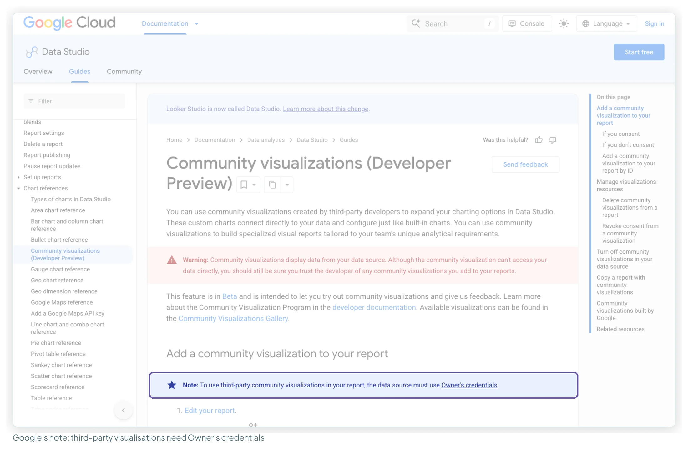
Google states it in one line that’s easy to scroll past:
“To use third-party community visualizations in your report, the data source must use Owner’s credentials.”
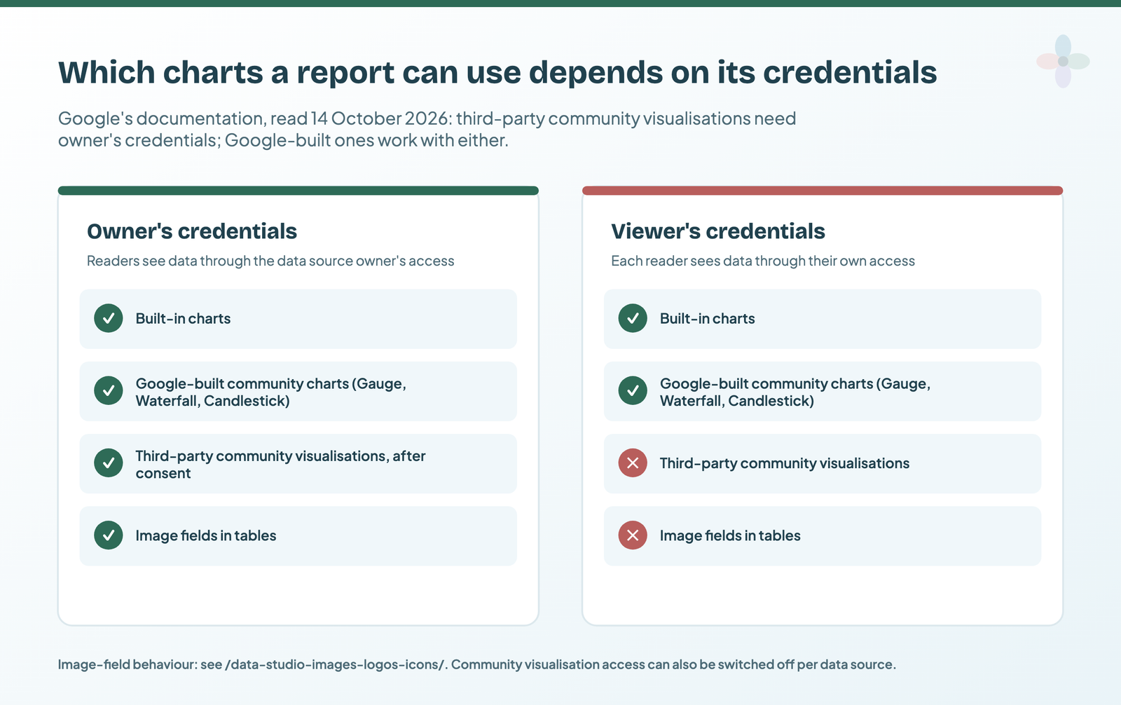
Owner’s credentials means the report reads data through the data source owner’s access, so readers need no access of their own. Viewer’s credentials means each reader sees data through their own access. Plenty of client reports use viewer’s credentials on purpose: it’s the right choice when each person should only see what they’re allowed to. On those reports, third-party community visualisations aren’t available.
One change since I first wrote this: Google’s page now says the visualisations it built itself “may use either Viewer’s credentials or Owner’s credentials to access the data”. So the Gauge, Waterfall and Candlestick work in both modes.
The data source guide covers which mode to pick and why.
Consent, and the switch on the data source
Adding a third-party visualisation prompts you to consent to it showing data. Both outcomes are documented:
| If you… | Then every component using that visualisation… |
|---|---|
| Consent | Shows data. You can revoke consent later. |
| Don’t consent | “Show[s] only the consent request. They won’t show any data.” |
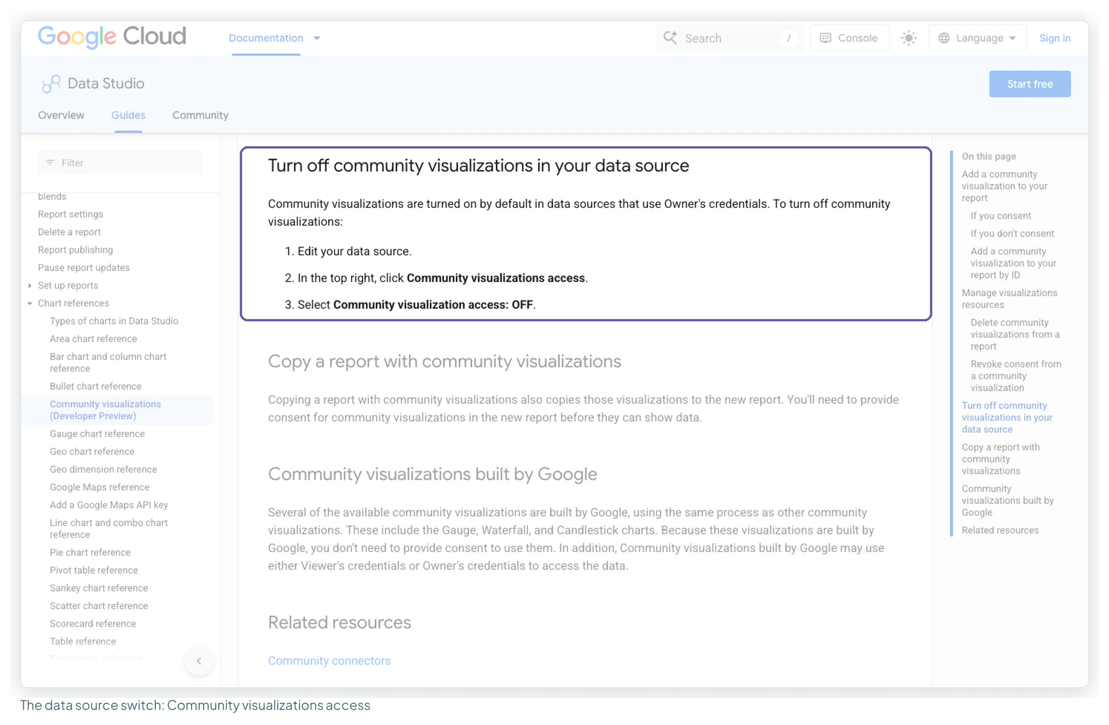
There’s a second gate, on the data source. Google’s documentation says community visualisations “are turned on by default in data sources that use Owner’s credentials”, and anyone who can edit the data source can turn them off: Edit the data source, click Community visualizations access in the top right, and choose Community visualization access: OFF. With it off, no community visualisation can render that source’s data.
Three you can use with no consent at all
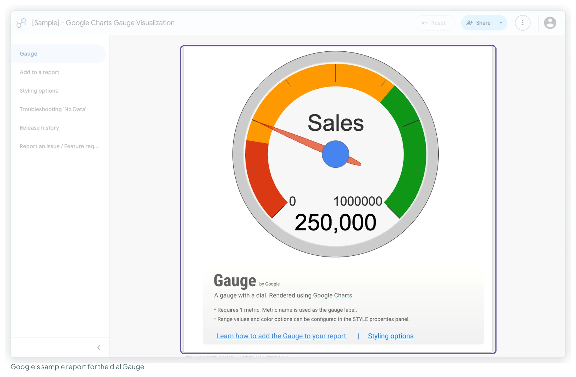
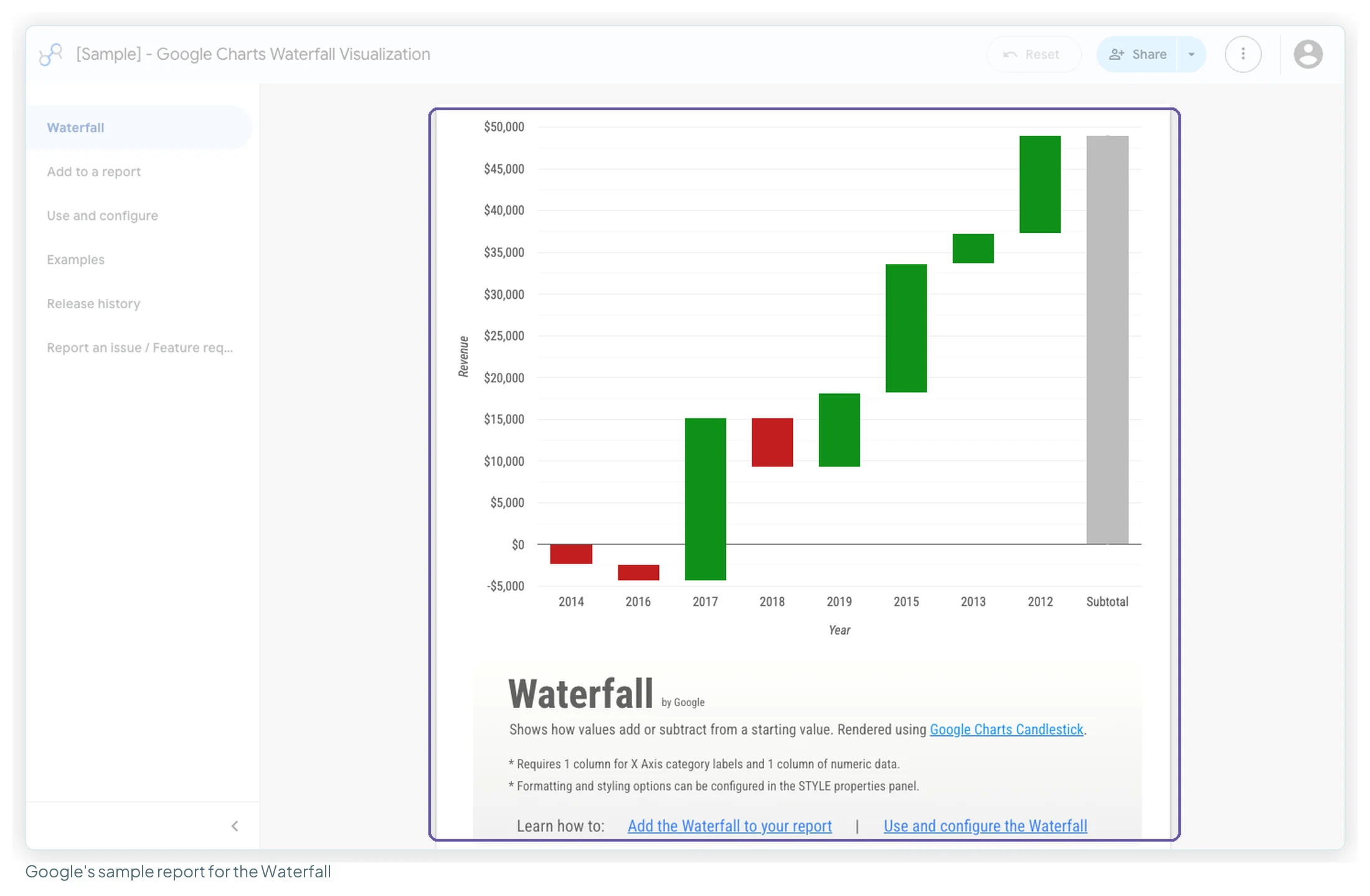
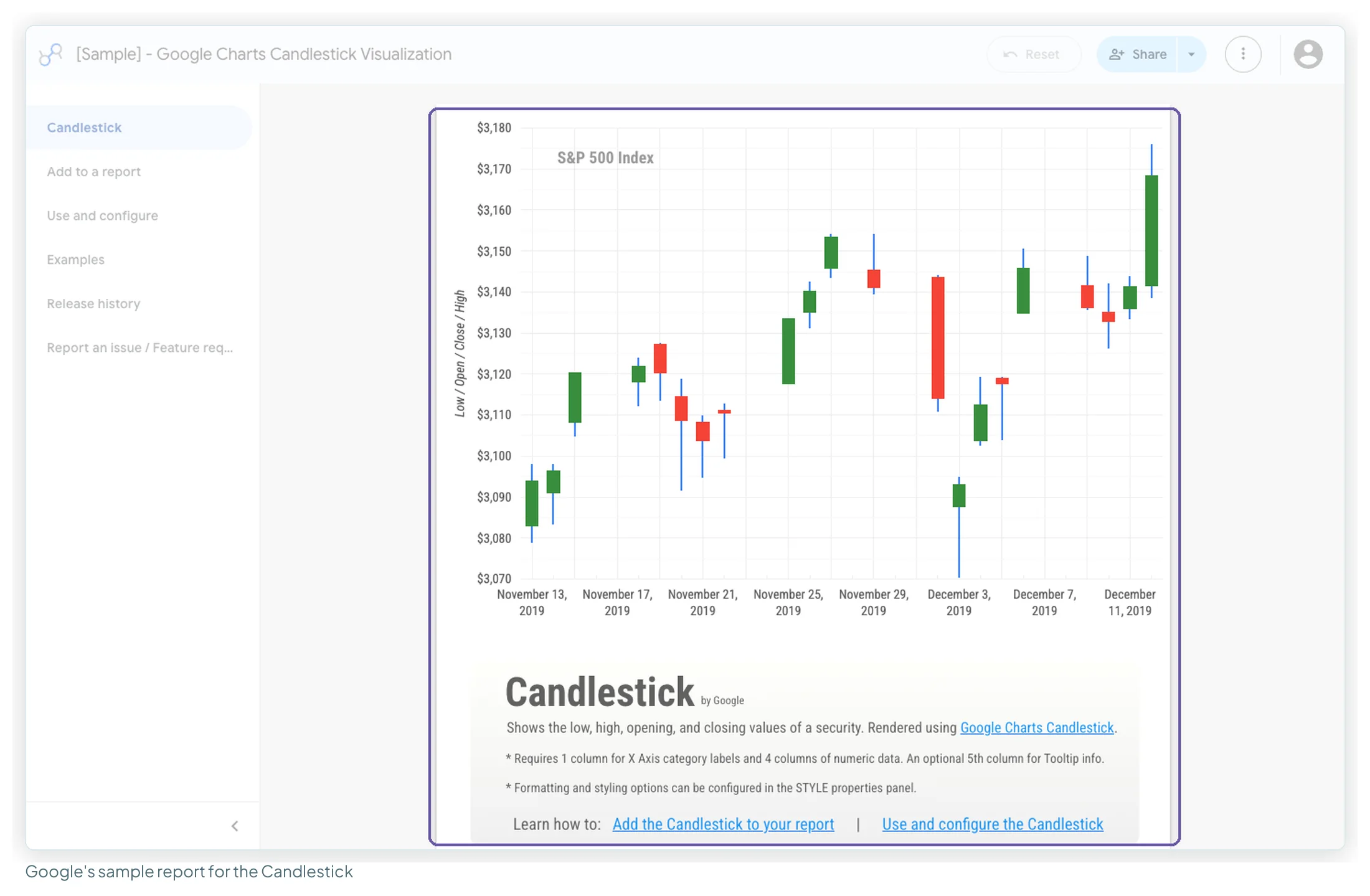
Gauge, Waterfall and Candlestick are built by Google through the same mechanism as every other community visualisation, so they need no consent. Each has a Google sample report, rendered with Google Charts. Data Studio’s chart list now also has its own Gauge, Waterfall and Candlestick, documented in Google’s chart reference, so you have a built-in version of each.
Gauge (dial), by Google
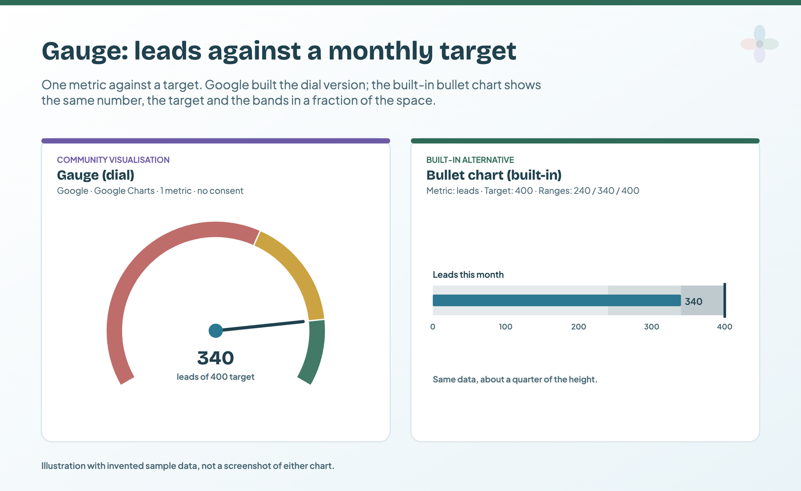
What it shows: one number on a dial with coloured bands. Data: one metric; Google’s sample report says the metric name becomes the gauge label.
- Leads this month against the monthly target.
- Ad spend against the budget cap.
- A site-speed or audit score on a 0–100 scale.
Built-in alternative: the bullet chart. Add a chart → Bullet, pick the metric, set the target and up to three ranges. It carries the same information in a strip a quarter of the height, and it reads more precisely. If you want a dial anyway, the built-in Gauge takes a target and up to five ranges.
Waterfall, by Google
What it shows: how a starting total becomes an end total through a series of increases and decreases. Data: one dimension for the steps and one metric. This is the one marketers should know.
- Sessions from September to October, broken down by the channels that moved.
- A budget reconciliation: planned spend, overspend by channel, actual spend.
- A revenue bridge: last quarter, new customers, refunds, churn, this quarter.
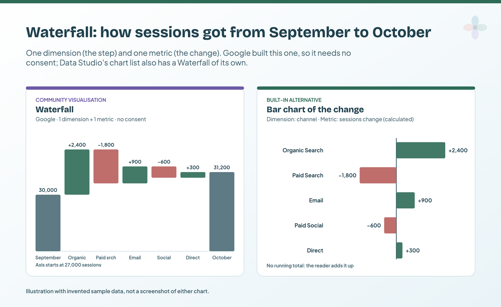
Built-in alternative: Data Studio’s own Waterfall chart (one dimension, one metric). Without a waterfall at all, a bar chart of the change per channel shows what moved, but the reader has to add up the running total.
Candlestick, by Google
What it shows: for each period, an opening value, a closing value, and the high and low in between. Data: one dimension and four metrics (Google’s sample allows an optional fifth column for tooltips). Built for share prices, it rarely suits marketing data, but there are uses:
- Weekly cost-per-click range: Monday’s CPC, Friday’s, and the week’s extremes.
- Average ranking position per week for a keyword group.
- Price monitoring for a product feed.
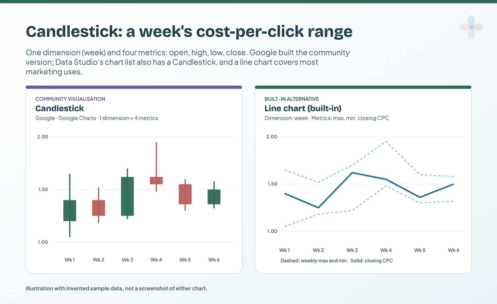
Built-in alternative: the built-in Candlestick takes four metrics in a fixed order (high, opening, closing, minimum). For most marketing readers, a line chart of the closing value with the weekly maximum and minimum as two lighter lines is easier to read.
Nine partner visualisations, one by one
These are the partner charts in Google’s gallery with the clearest marketing uses; the rest of the partner list follows the radar section. Each needs owner’s credentials and consent. The status line comes from opening each developer’s linked demo report, signed out, on 14 October 2026.
Metric Funnel, by Power My Analytics
What it shows: a funnel of steps with the percentage that survives each one. Data: metrics, not a dimension: the gallery says “up to 8 metrics”, and the guide says to “select metrics in the order of funnel steps”.
- GA4 ecommerce: item views, add-to-carts, checkouts, purchases.
- Paid media: impressions, clicks, leads, sales-qualified leads.
- Email: sent, delivered, opened, clicked.
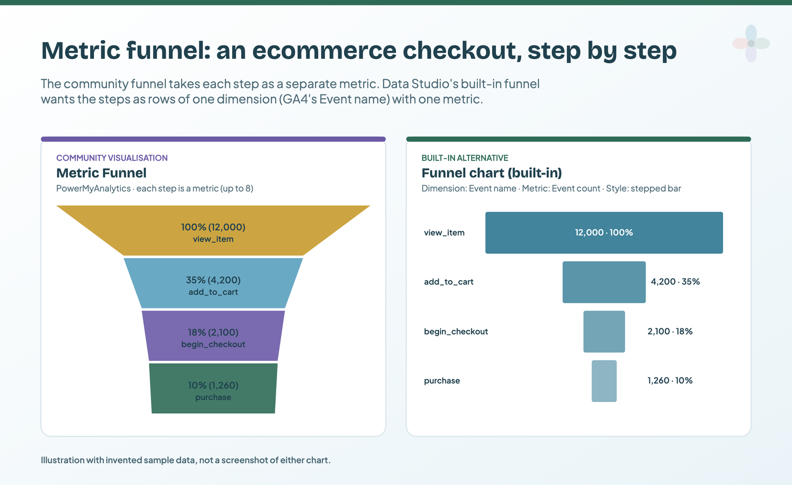
Built-in alternative: Data Studio’s Funnel chart needs a dimension for the steps, a metric and a sort field. With GA4, use Event name filtered to your four events, Event count, sorted descending, and pick the smoothed, stepped or inverted-triangle style. You lose the metric-per-step layout, so steps that live in different fields (sessions, then a conversion) need the community version or a calculated field. You gain no consent and either credential mode.
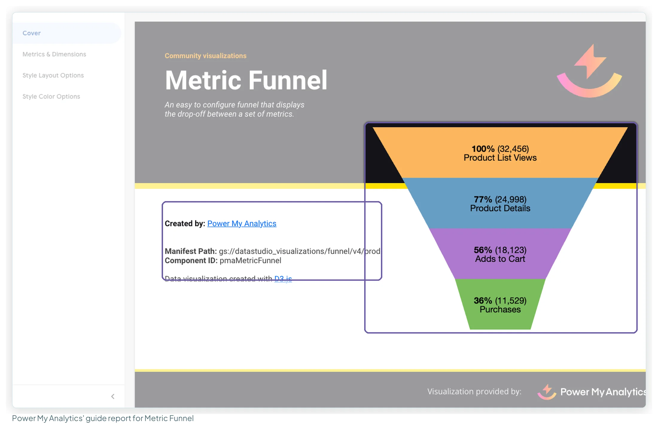
Other funnels come and go: users of Ayima’s funnel chart reported in March 2026 that its manifest “could not be found”, and Mehdi Oudjida published a replacement in April 2026.
Lighthouse Gauge, by James Buckley
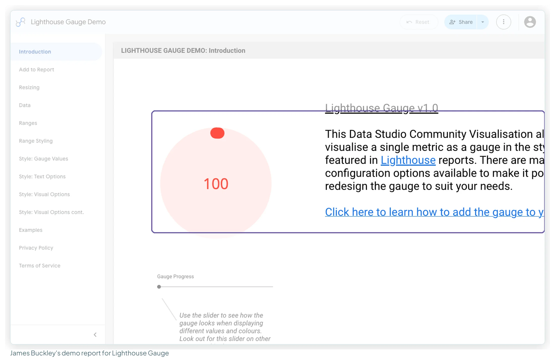
What it shows: one score as a ring, in the style of Google’s Lighthouse audit reports. Data: “Only one metric is required”; ranges and colours are set in the Style tab.
- Core Web Vitals or PageSpeed scores per template.
- An SEO health score from a crawler export in Google Sheets.
- Percentage of a quarterly target reached.
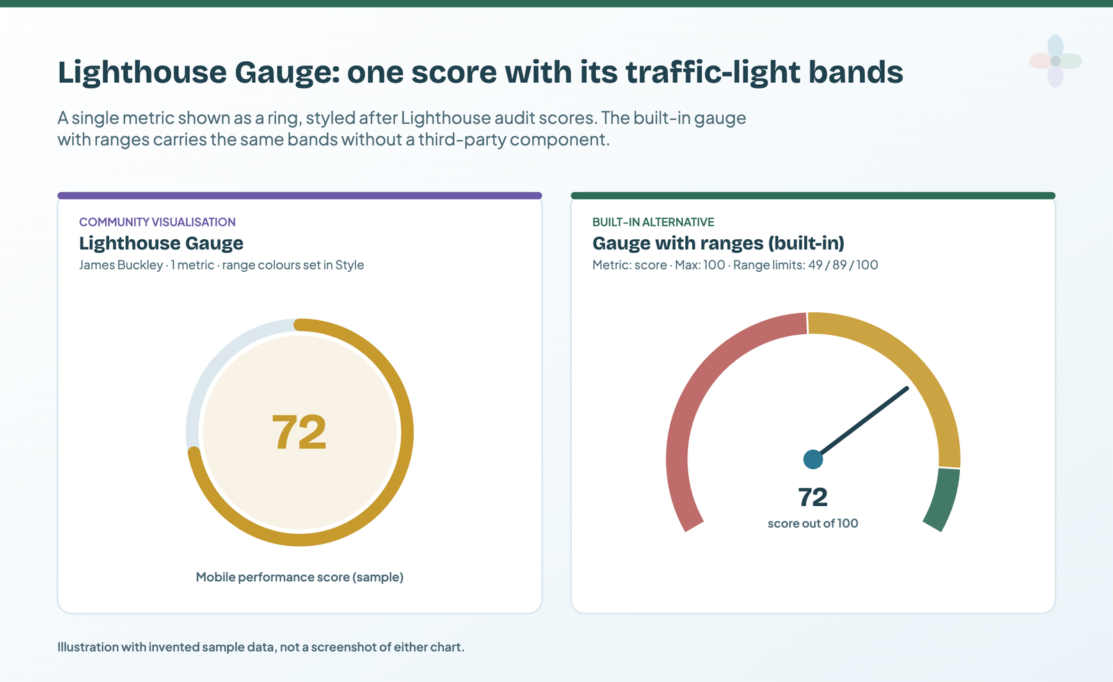
Built-in alternative: the built-in Gauge with a maximum of 100 and range limits at 49, 89 and 100 gives the same red-amber-green reading. A scorecard is enough when nobody needs the bands.
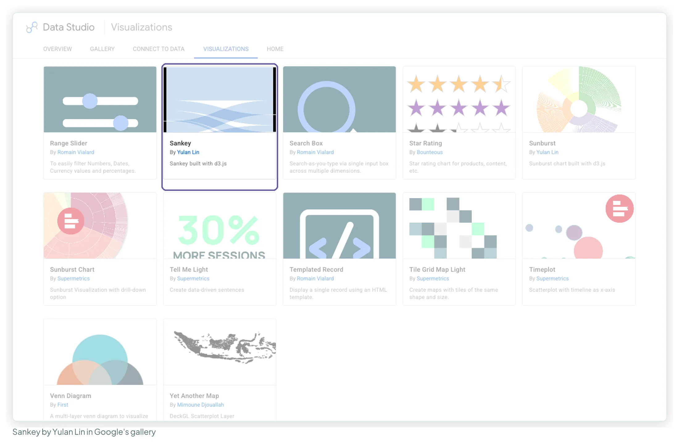
Sankey, by Yulan Lin
What it shows: flow from one set of values to another, with band width proportional to the metric. Data: two dimensions and one metric, and “the two dimensions cannot share a value”. It’s one of Google’s showcase visualisations, which its report says “are not supported, actively developed, or intended to work with all datasets”.
- Default channel group → landing page, by sessions.
- Device category → country, by conversions.
- First-user source → session source, to see what brings people back.
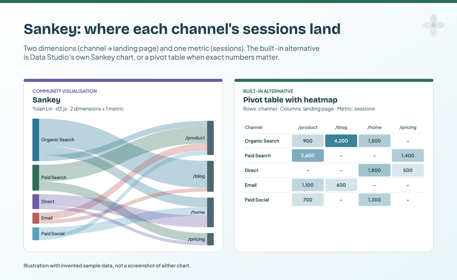
Built-in alternative: Data Studio’s own Sankey chart: a source dimension, a target dimension and a weight metric, with the same rule that source and target values must be unique. When the reader needs exact numbers, a pivot table with heatmap (channel in rows, landing page in columns) is clearer.
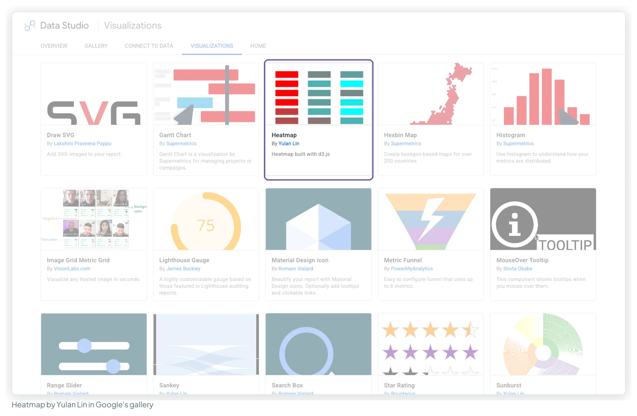
Heatmap, by Yulan Lin
What it shows: a grid of tiles coloured by value. Data: “2 dimensions (x & y tiles) & 1 metric (color)”. Clicking a tile filters the rest of the page.
- Sessions by day of week and hour, to time emails and ad schedules.
- Conversion rate by channel and device.
- Clicks by landing page and week, to spot decay.
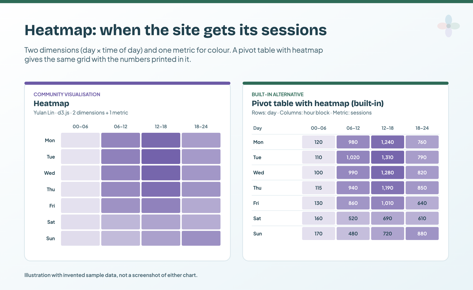
Built-in alternative: a pivot table with heatmap: day in rows, hour block in columns, sessions as the metric. Same grid, with the numbers printed in the cells and exportable. This is the swap I make most often.
Sunburst Chart, by Supermetrics
What it shows: a hierarchy as rings, one per dimension. Data: “up to 8 dimensions” and one metric; clicking a segment drills down and can filter the page. Yulan Lin’s separate Sunburst in the gallery takes one to four dimensions.
- Revenue by channel, then source, then campaign.
- Sessions by country, then city.
- Product revenue by category, then item.
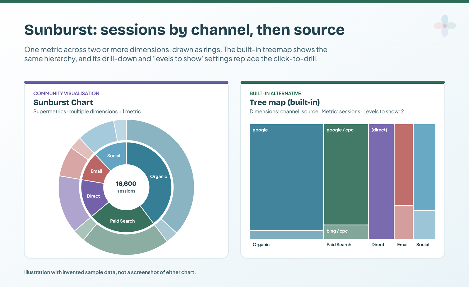
Built-in alternative: the tree map: add channel and source as dimensions, set Levels to show to 2, and turn on drill-down. Rectangles compare areas more accurately than ring segments.
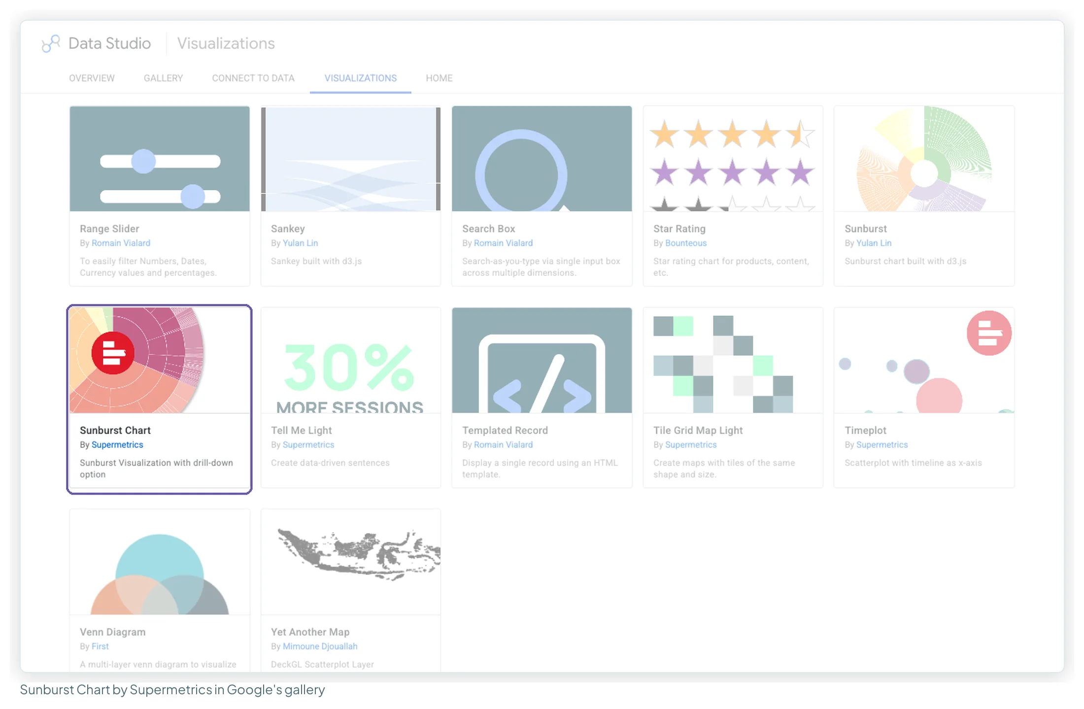
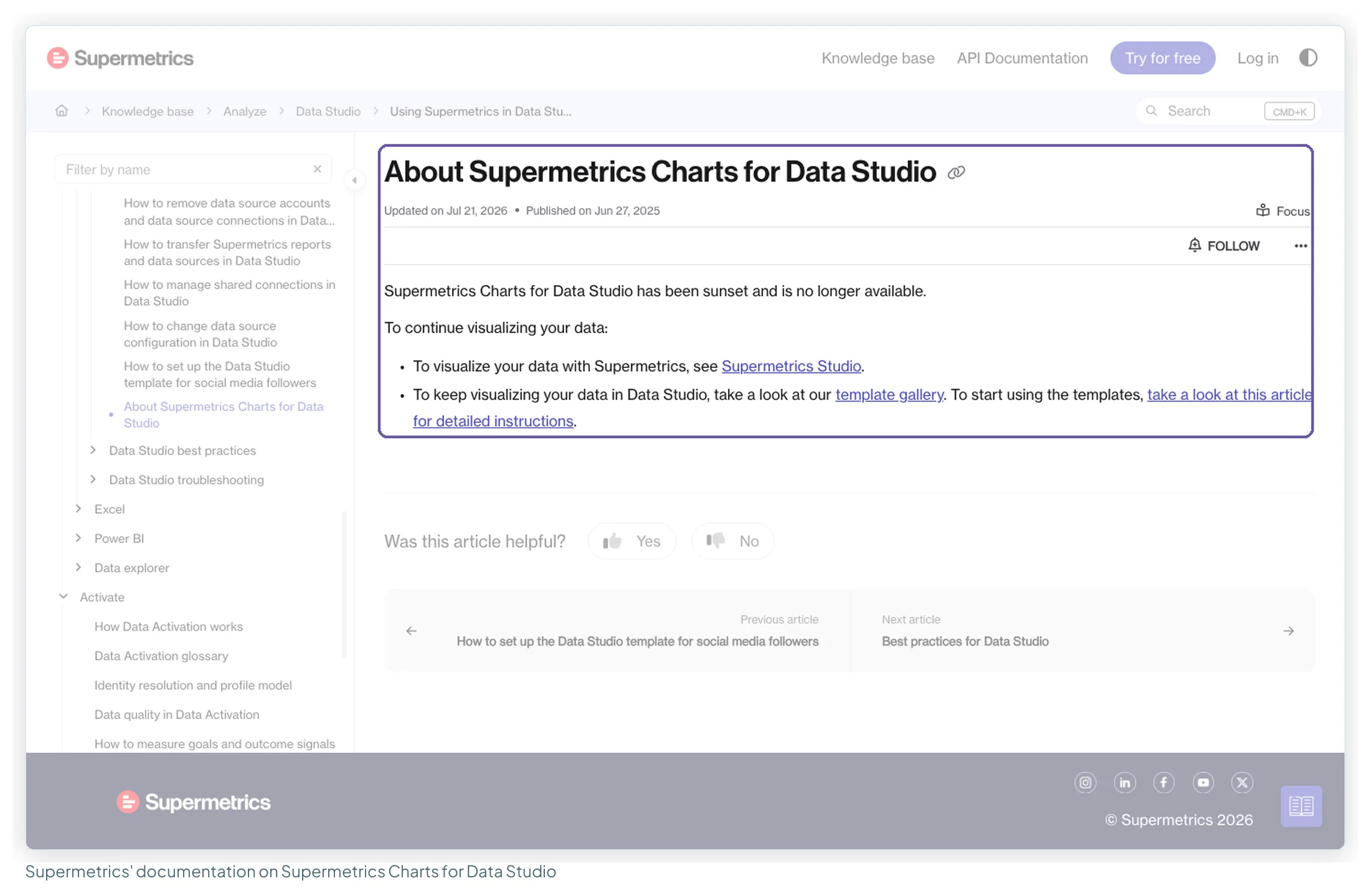
Status to check first: this Sunburst’s demo report is titled “Supermetrics Charts for Data Studio – Demo Report”, and Supermetrics’ documentation says “Supermetrics Charts for Data Studio has been sunset and is no longer available” (updated 21 July 2026). Google’s gallery still listed it on 14 October 2026, and its demo report showed a consent prompt rather than an error, so test it before building a client report on it. The Gantt Chart and Histogram below come from Supermetrics’ earlier visualisation package (the Histogram dates from April 2020), which the sunset page doesn’t mention; the same test is worth doing.
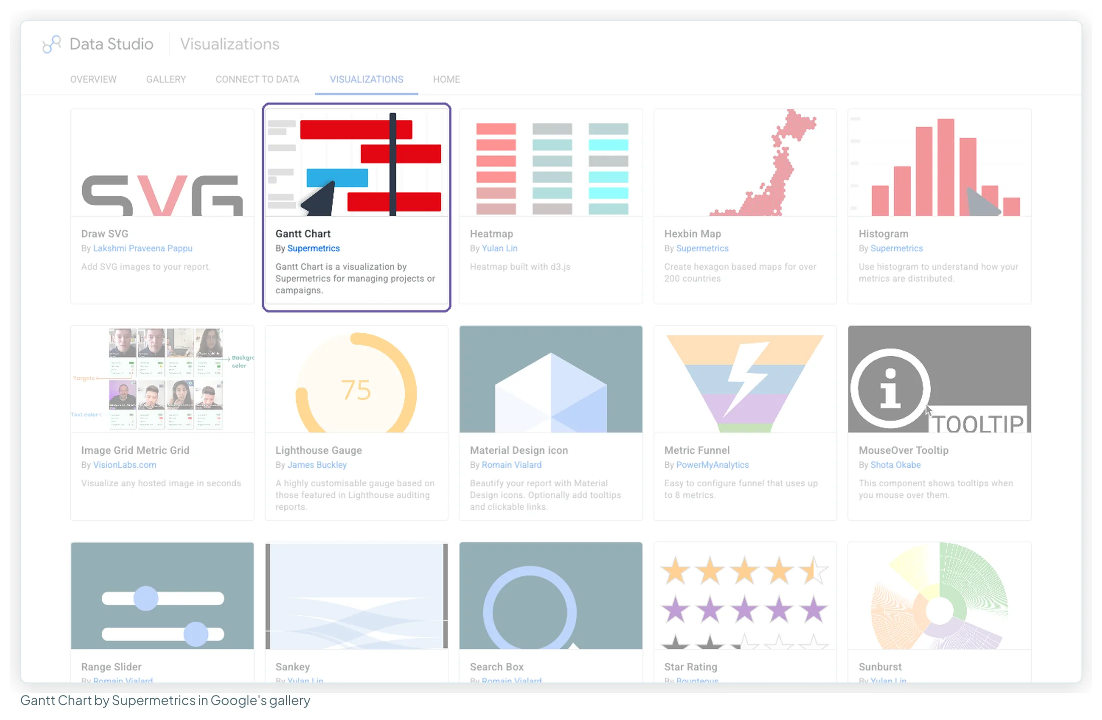
Gantt Chart, by Supermetrics
What it shows: each row (a campaign, a task) as a bar from its start date to its end date. The gallery describes it as “for managing projects or campaigns”.
- The campaign calendar: launches, sales, nurture sequences on one axis.
- Content production: brief, draft, review, publish.
- Experiment schedules, so overlapping tests are visible.
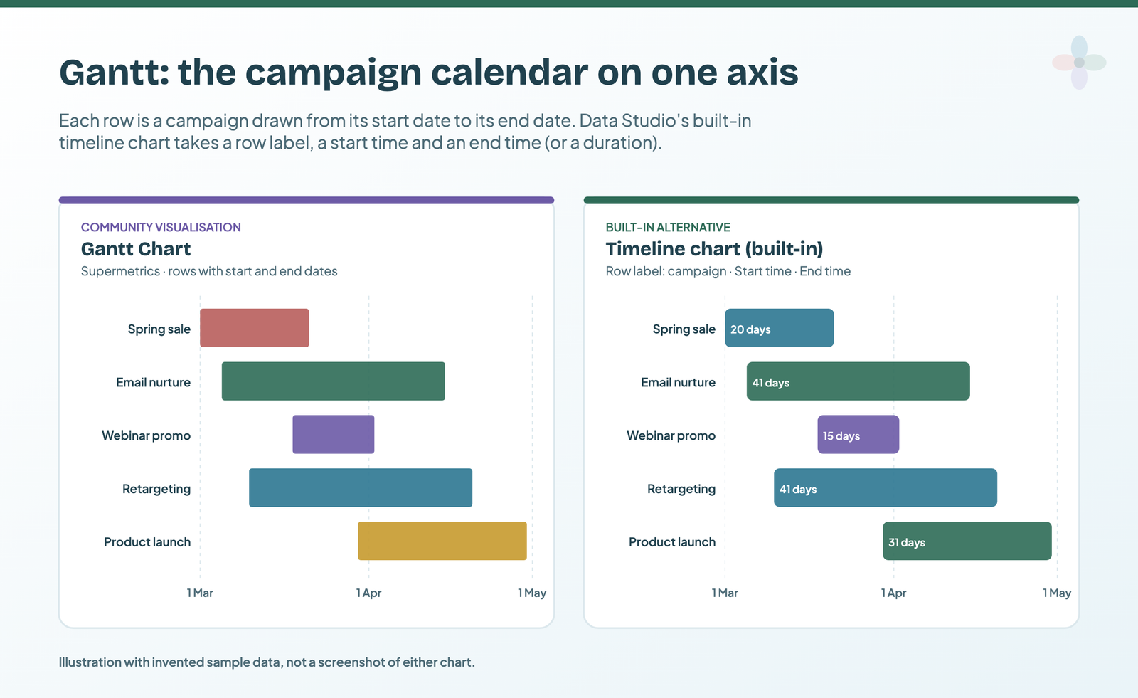
Built-in alternative: the timeline chart needs a Row label (text), a Start time (date) and either an End time or a Duration. A Google Sheet with campaign, start and end columns is enough. This is now the default I’d reach for.
Histogram, by Supermetrics
What it shows: how many items fall into each value range. The gallery’s own example: “pick a metric, like conversion rate, and split it by a dimension, like date”. The histogram counts the days in each conversion-rate range.
- Daily conversion rate over 90 days: is last week normal or an outlier?
- CPC across keywords: how many cost more than you can afford?
- Order values: where the bulk of baskets sits.
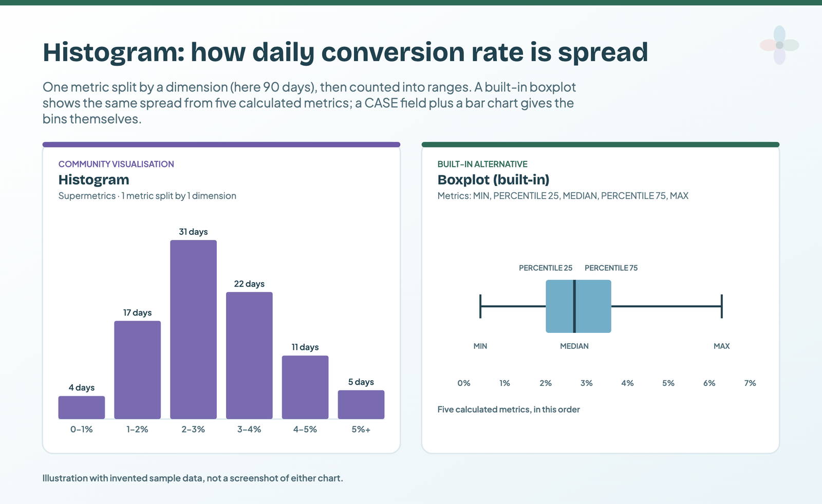
Built-in alternative: two routes. The boxplot takes five metrics in order (minimum, 25th percentile, median, 75th percentile, maximum), built as calculated fields with MIN, PERCENTILE, MEDIAN and MAX. Or create the bins yourself with a CASE field (“0–1%”, “1–2%”…) and count rows in a bar chart. That second route works where each row is already one day or one keyword.
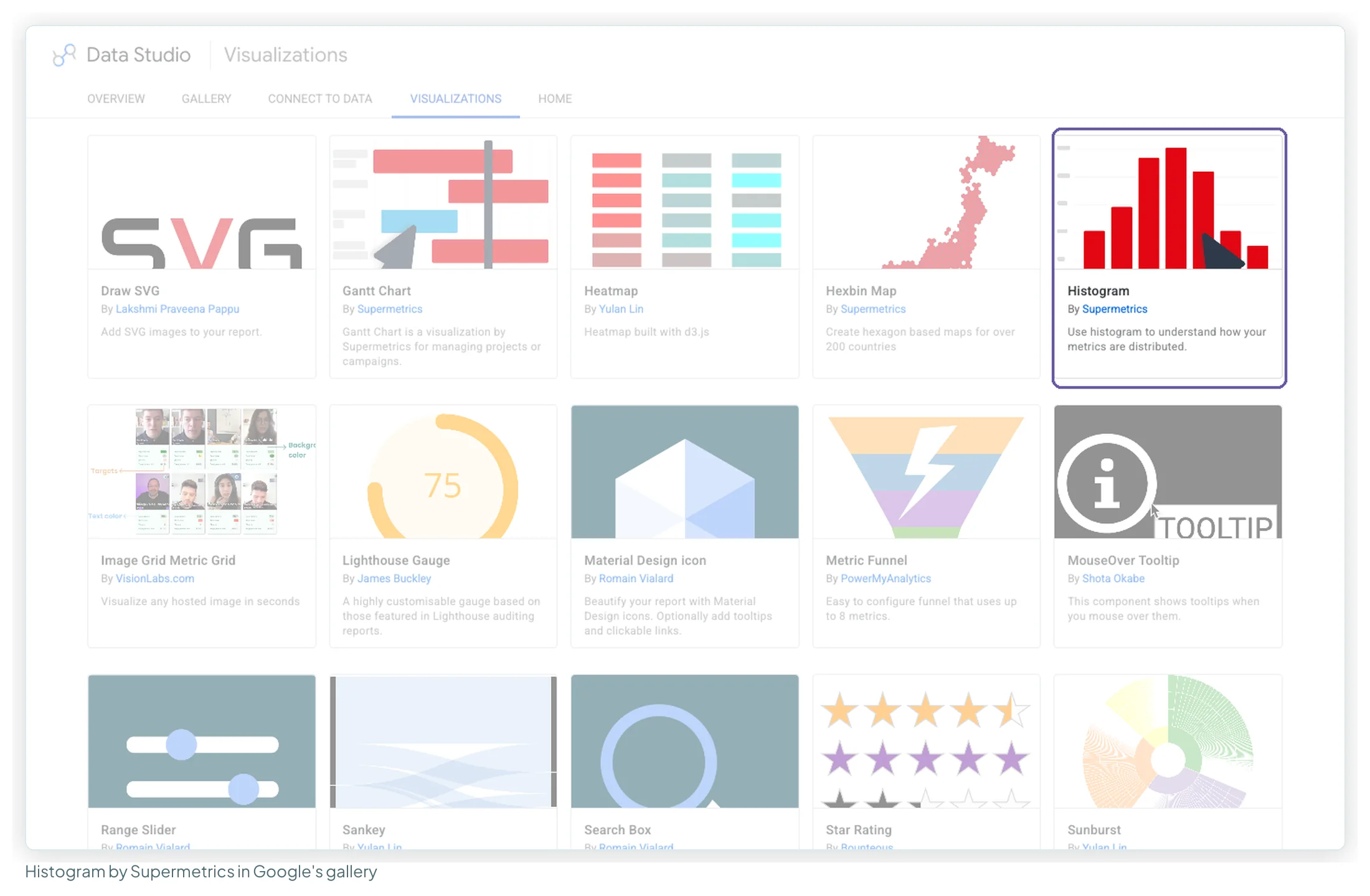
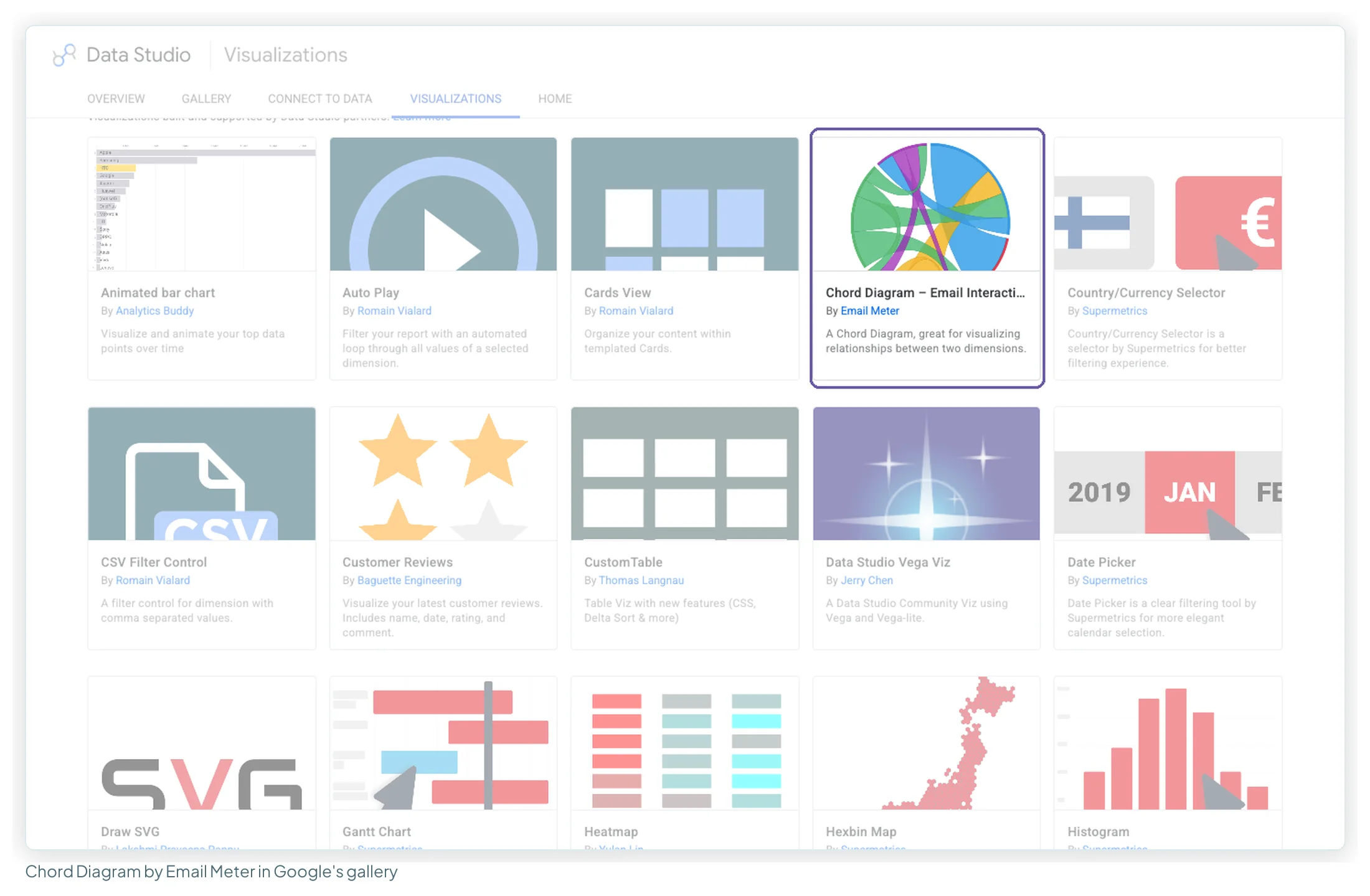
Chord Diagram – Email Interactions, by Email Meter
What it shows: relationships between members of two dimensions, as ribbons across a circle. The developer describes it as “useful for visualizing relationships between two dimensions”; it was built for email data (who emails whom).
- Team member ↔ client, by emails exchanged.
- First-touch channel ↔ last-touch channel, by converting customers.
- Source page ↔ destination page, by internal link clicks.
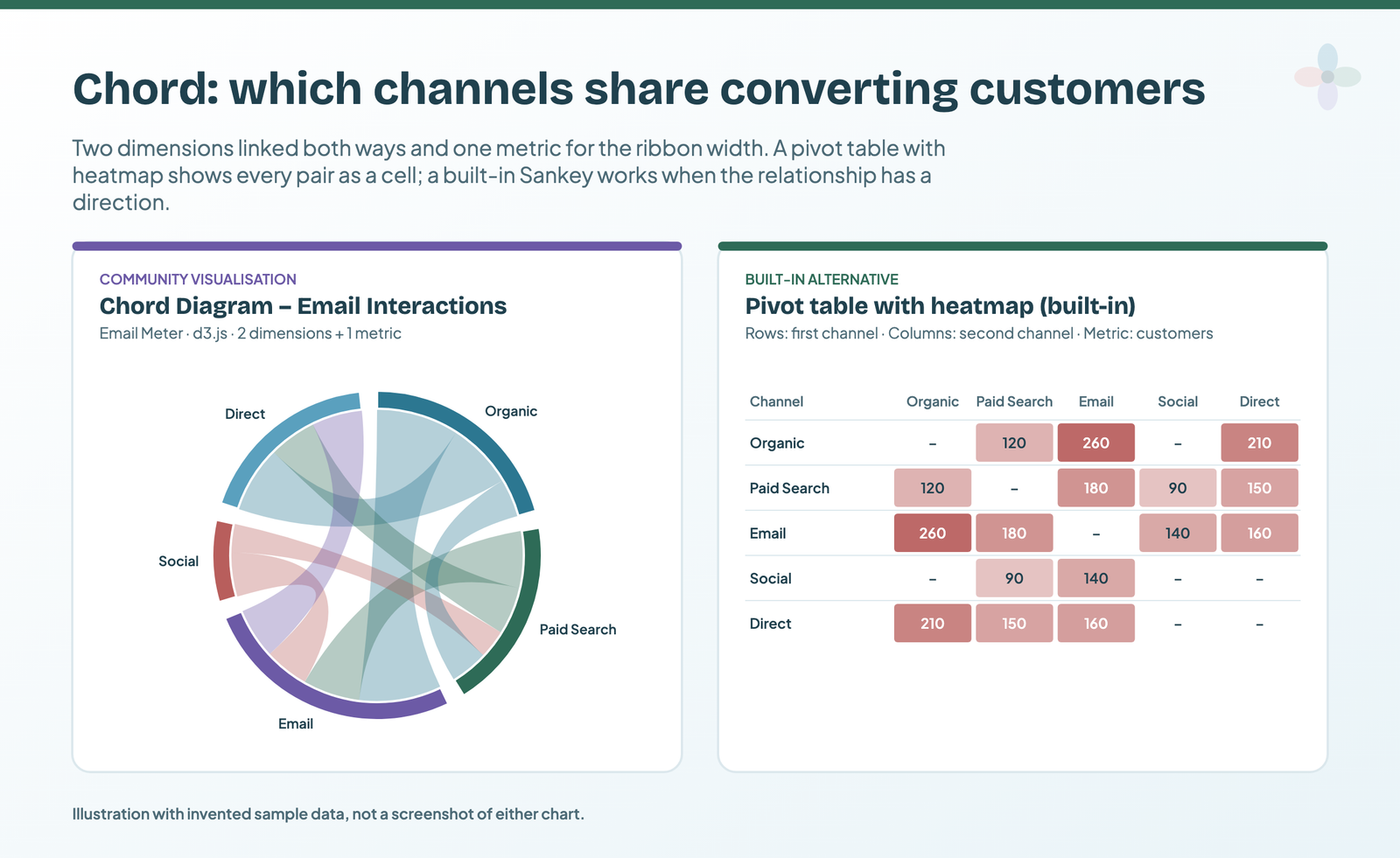
Built-in alternative: a pivot table with heatmap, one dimension in rows and the other in columns, shows every pair as a readable cell. When the relationship has a direction (from → to), use the built-in Sankey.
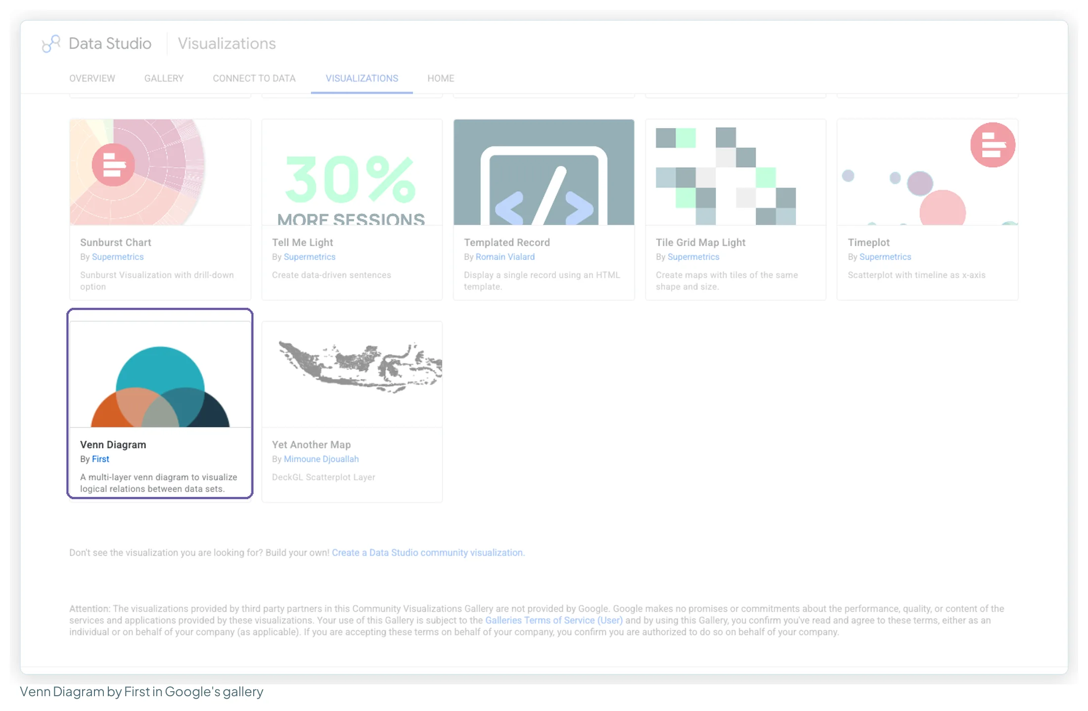
Venn Diagram, by First
What it shows: overlapping circles sized by group. Data: pre-aggregated. The developer’s guide asks for “a table which contains two columns: ‘dimension’ and ‘metric'”, one row per set, with overlaps named by joining the set names with a comma (“Football, Rugby”).
- Customers who bought from category A, category B, or both.
- Queries you rank for organically, bid on, or both.
- Email subscribers who are also customers.
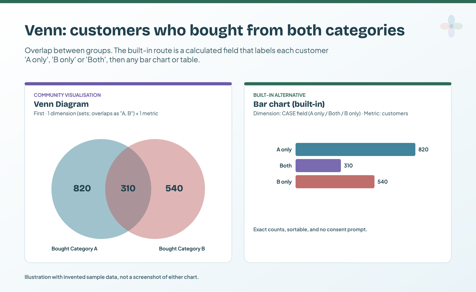
Built-in alternative: a calculated field with CASE that labels each customer “A only”, “B only” or “Both”, then a bar chart or table counting them. You get exact counts and sorting, and no consent prompt.
The radar chart, and what happened to it
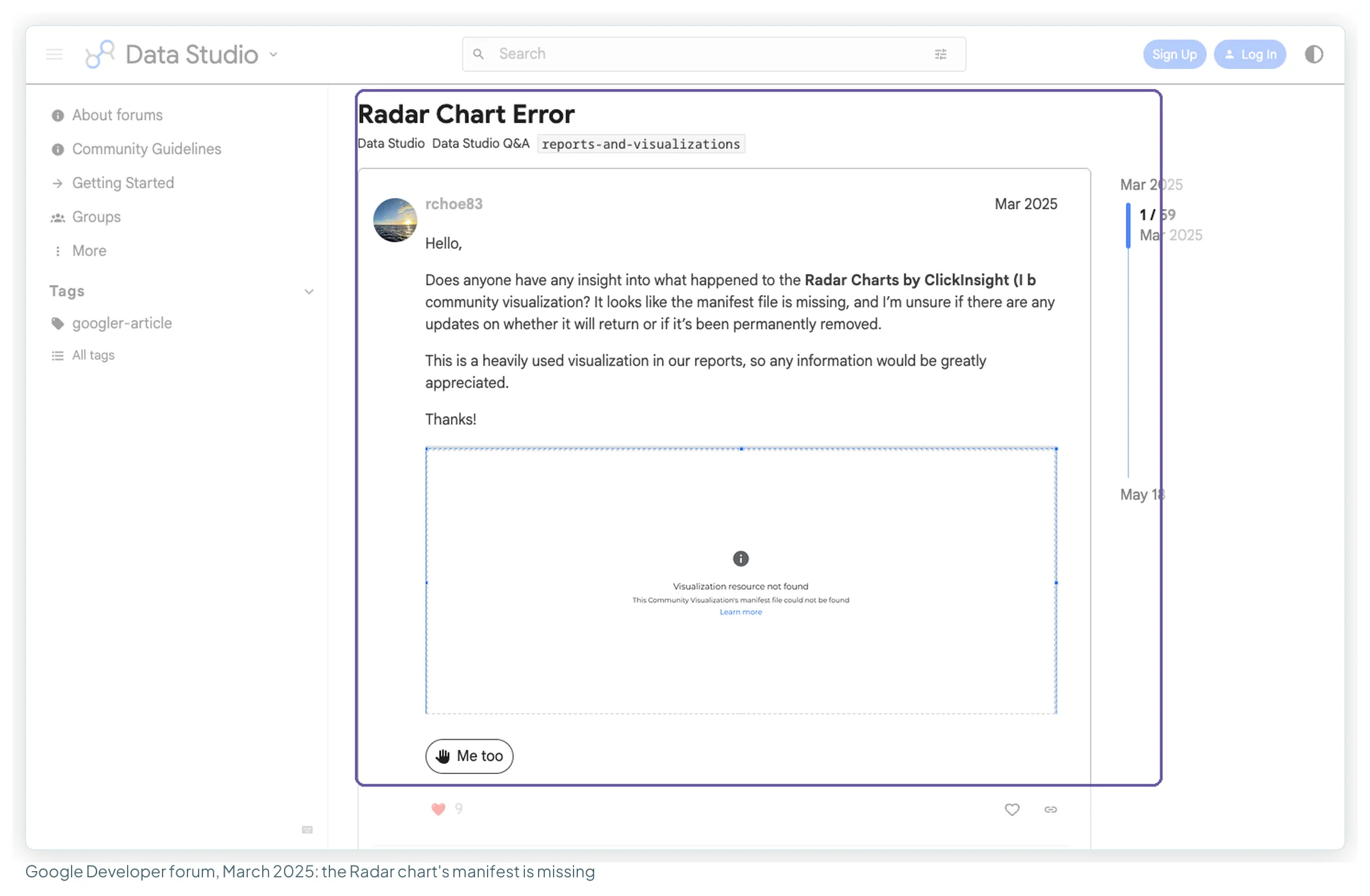
The radar chart many reports used was ClickInsight’s. On 3 March 2025 users started a forum thread (59 posts by October 2026) saying its manifest file was missing. A Google reply in a companion thread said the visualisation was “currently not available” and that Google was in touch with its owners. It isn’t in the public gallery today.
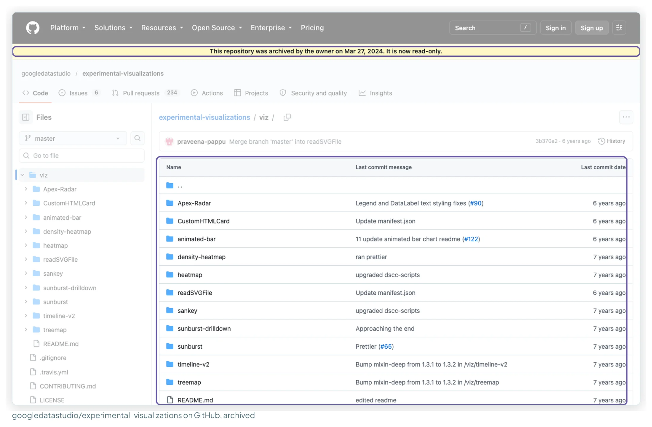
An open-source radar still exists: the ApexCharts radar by Duncan Ross in Google’s experimental-visualizations repository, which “takes 1 dimension and up to 5 metrics”. The repository has been archived since March 2024, so you’d host it yourself (see building your own).
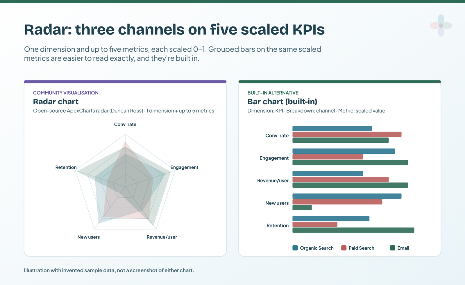
Use cases: channels compared on five KPIs scaled 0–1; competitors on an audit scorecard; content types on engagement measures. Built-in alternative: a bar chart with the KPI as the dimension, the channel as the breakdown dimension and the scaled value as the metric. Bars are read along a common baseline, which is why they’re more exact.
The other 23 partner entries
The rest of the partner list is mostly controls, layout and content components, plus a few more charts and maps. Counted from the public gallery on 14 October 2026:
| Developer | Entries |
|---|---|
| Romain Vialard | Auto Play, Cards View, CSV Filter Control, Material Design icon, Range Slider, Search Box, Templated Record |
| Supermetrics | Country/Currency Selector, Date Picker, Hexbin Map, Tell Me Light, Tile Grid Map Light, Timeplot |
| One each | Animated bar chart (Analytics Buddy), Customer Reviews (Baguette Engineering), CustomTable (Thomas Langnau), Data Studio Vega Viz (Jerry Chen), Draw SVG (Lakshmi Praveena Pappu), Image Grid Metric Grid (VisionLabs.com), MouseOver Tooltip (Shota Okabe), Star Rating (Bounteous), Sunburst (Yulan Lin), Yet Another Map (Mimoune Djouallah) |
Two had broken routes that day: the Animated bar chart’s linked page returned a 404, and Star Rating’s demo asked for a sign-in.
The security question, stated plainly
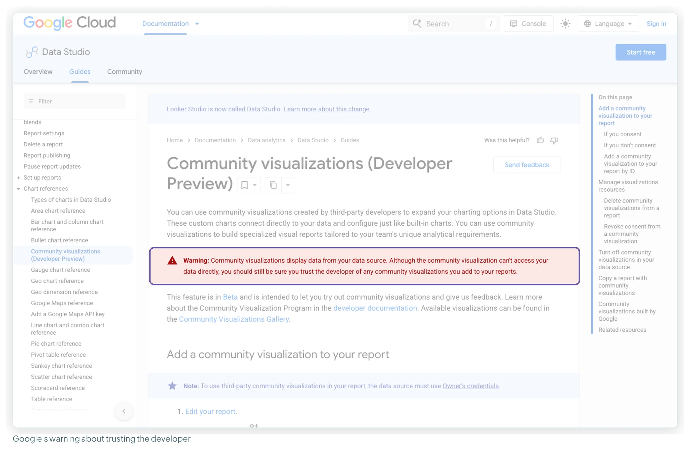
Google’s own warning, at the top of its documentation:
“Community visualizations display data from your data source. Although the community visualization can’t access your data directly, you should still be sure you trust the developer of any community visualizations you add to your reports.”
Three facts from Google’s developer pages put that in proportion. A content security policy blocks a visualisation’s requests to outside servers, “to mitigate the risk of a community visualization sending data to an external server”. The code itself is public: anyone who views a report can read it. And the gallery page says partner visualisations “are not provided by Google”.
My rule for client reports: fine on aggregate marketing metrics, not on personal data, detailed revenue or anything under an NDA. For an enterprise client, ask before adding one. (The same questions come up with AI assistants: what agencies check before client data goes into ChatGPT, Claude or Gemini.) And if a client wants assurance, the data source switch above is the control Google provides for it.
Common errors, and how to fix each one
I opened each visualisation’s public demo report, linked from Google’s gallery, in a browser with no Google sign-in. Most of the partner reports didn’t show their chart:
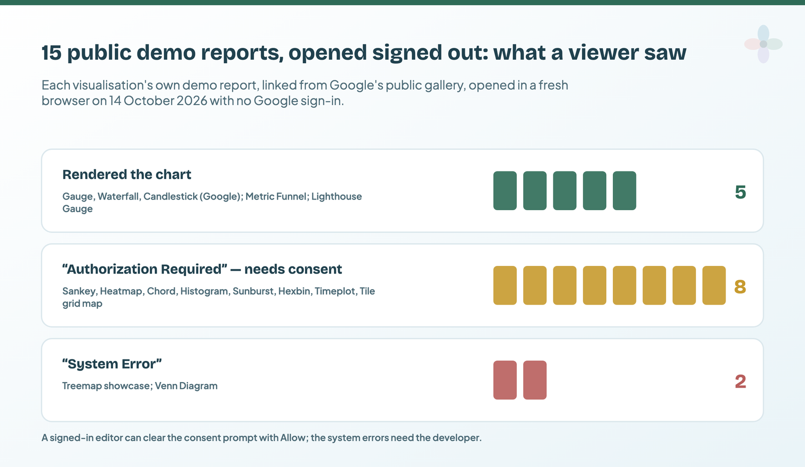
| What you see | Why | Fix |
|---|---|---|
| “Authorization Required … Consent to render this community visualization has not been provided” | Nobody has consented in this report | An editor clicks Allow on the component |
| “The community visualization has been modified and requires updated consent” | The developer changed the code since consent was given | An editor clicks Allow again |
| Can’t add a third-party visualisation; data won’t show | The data source uses viewer’s credentials | Switch to owner’s credentials, or use a Google-built or built-in chart |
| Community visualizations access is off or greyed out | The switch is off, or you can’t edit the data source | Ask the data source owner to set it to ON |
| Blank after copying a report | Copies need fresh consent | Consent in the new report |
| “Community visualizations cannot display data selected from the data control” | Data controls don’t work with community visualisations | Use a fixed data source for that chart |
| “Manifest file … not found” or “System Error” | The developer removed or broke the hosted files | Nothing on your side: replace it with a built-in chart |
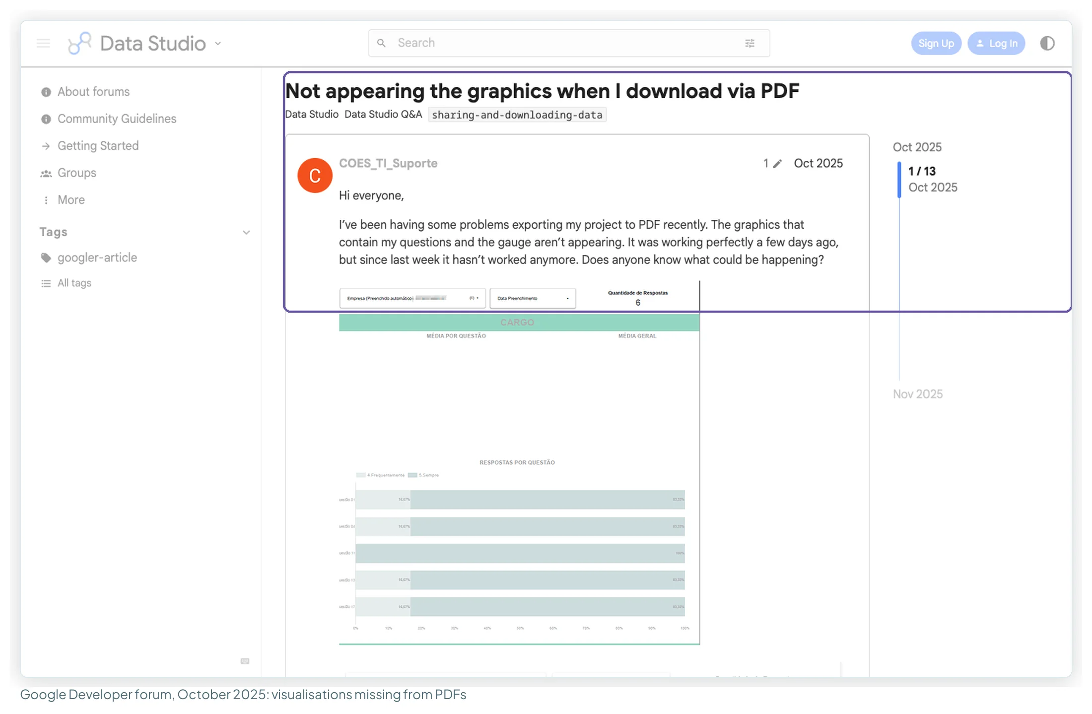
| Grey box in PDFs and scheduled emails | Reported since October 2025 | Use built-in charts on any page that gets emailed |
| Rows missing | A visualisation requests 2,500 rows by default unless its developer sets another maximum | Aggregate first, or check the developer’s limit |
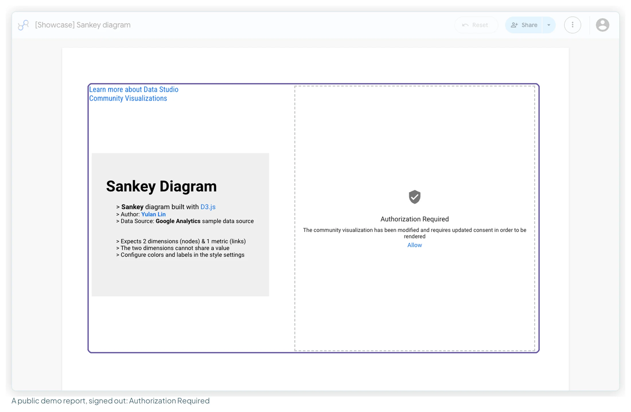
The consent prompt is the most common of these, and it isn’t a broken chart: it’s a permissions prompt sitting where the chart should be.
The two that need the developer look different:
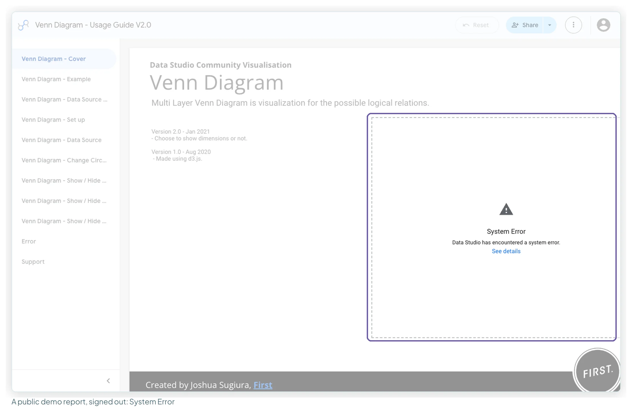
When a visualisation disappears, you can lose more than the picture: in the March 2026 funnel thread one user couldn’t see which metrics the broken charts had used. Note the fields of any client-critical community chart somewhere outside the report.
The PDF problem has the longest trail. A forum thread from October 2025 reports community visualisations exporting as empty rectangles after 16 October 2025; later threads name Gauge, Lighthouse Gauge and Cards View in scheduled emails, and the most recent post I found, on 6 April 2026, still had no fix. The scheduled-report guide covers the checks before a send.
Why deleting a chart doesn’t remove it
Adding a community visualisation adds a resource to the report; the charts on the canvas are instances of it. Deleting a chart, per Google, “doesn’t remove the resource or revoke consent to use that resource”. To remove it properly: Resource → Manage community visualizations, find it, click Revoke, close, then delete any components that still use it. Do this before a report goes to a client, and on any report you inherit.
Errors when you build your own
- Changes don’t show: Data Studio caches components and refreshes the cache every 12 hours. Set
devModetotruewhile building. - “An error occurred while requesting the visualisation’s config resource”: check that every file is publicly readable in Cloud Storage (Google requires it) and that each
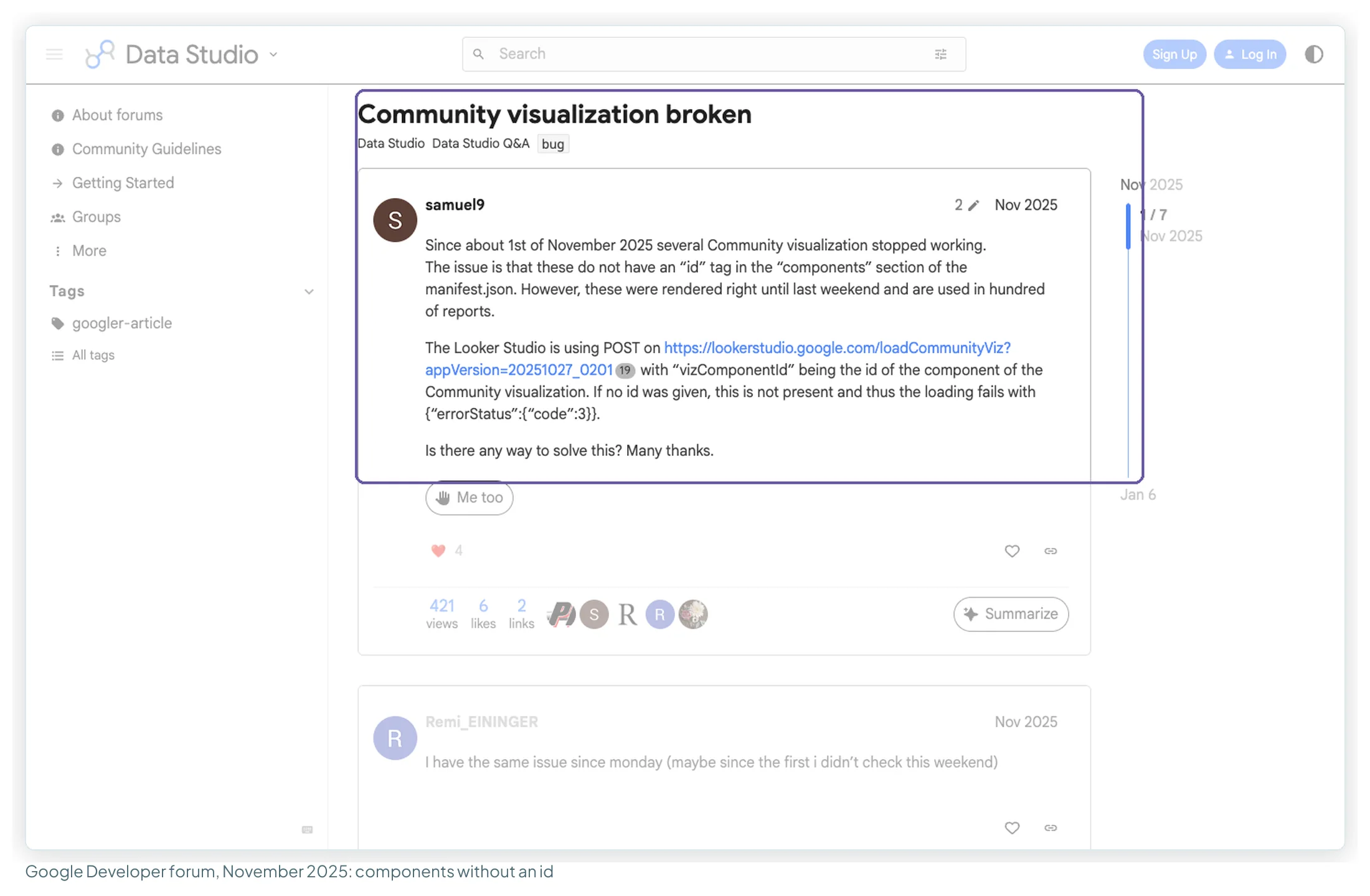
gs://path in the manifest is right. A September 2026 forum thread reports the same error with public, verified files and, so far, no answer. - Worked for months, then stopped: from about 1 November 2025, users traced broken visualisations to manifest components with no
id. Google’s manifest reference requires one. - External images or API calls fail: the content security policy blocks them. Generate graphics in JavaScript instead.
id. View full sizeHow to build your own and submit it to the gallery
You need JavaScript and a Google Cloud project. Google’s codelab takes “about 30 minutes”, and it’s the best start. The route, from Google’s developer documentation:
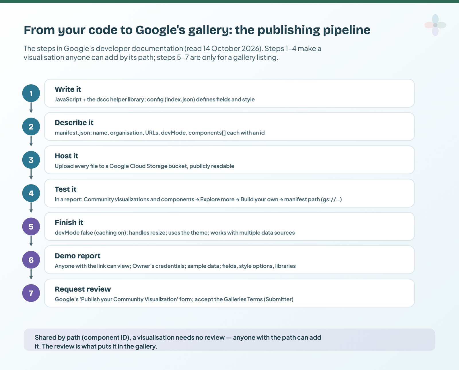
- Write it. Any JavaScript library works. Google’s helper library, dscc (
npm install --save @google/dscc), passes data and style to your code. A config file declares the dimensions, metrics (with minimums and maximums) and style options; aFILTERinteraction lets your chart filter the page.npx @google/dscc-gen vizscaffolds a project with a local preview. - Describe it in
manifest.json: name, organisation, support and policy URLs,devMode, and acomponentslist where each component has anidandgs://paths to its JavaScript, config and CSS. - Host it in a Google Cloud Storage bucket. Every file must be publicly readable:
gsutil cp -a public-read * gs://YOUR_BUCKET. - Test it in a report: Community visualizations and components → Explore more → Build your own visualization, enter the manifest path, Submit. Keep
devModeon while you iterate. - Finish it for others:
devModeoff so caching speeds it up; handle resizing; use the report theme; work with any data source. - Build a demo report shared as “Anyone with the link can view”, on owner’s credentials and sample data, explaining the fields, style options and libraries used.
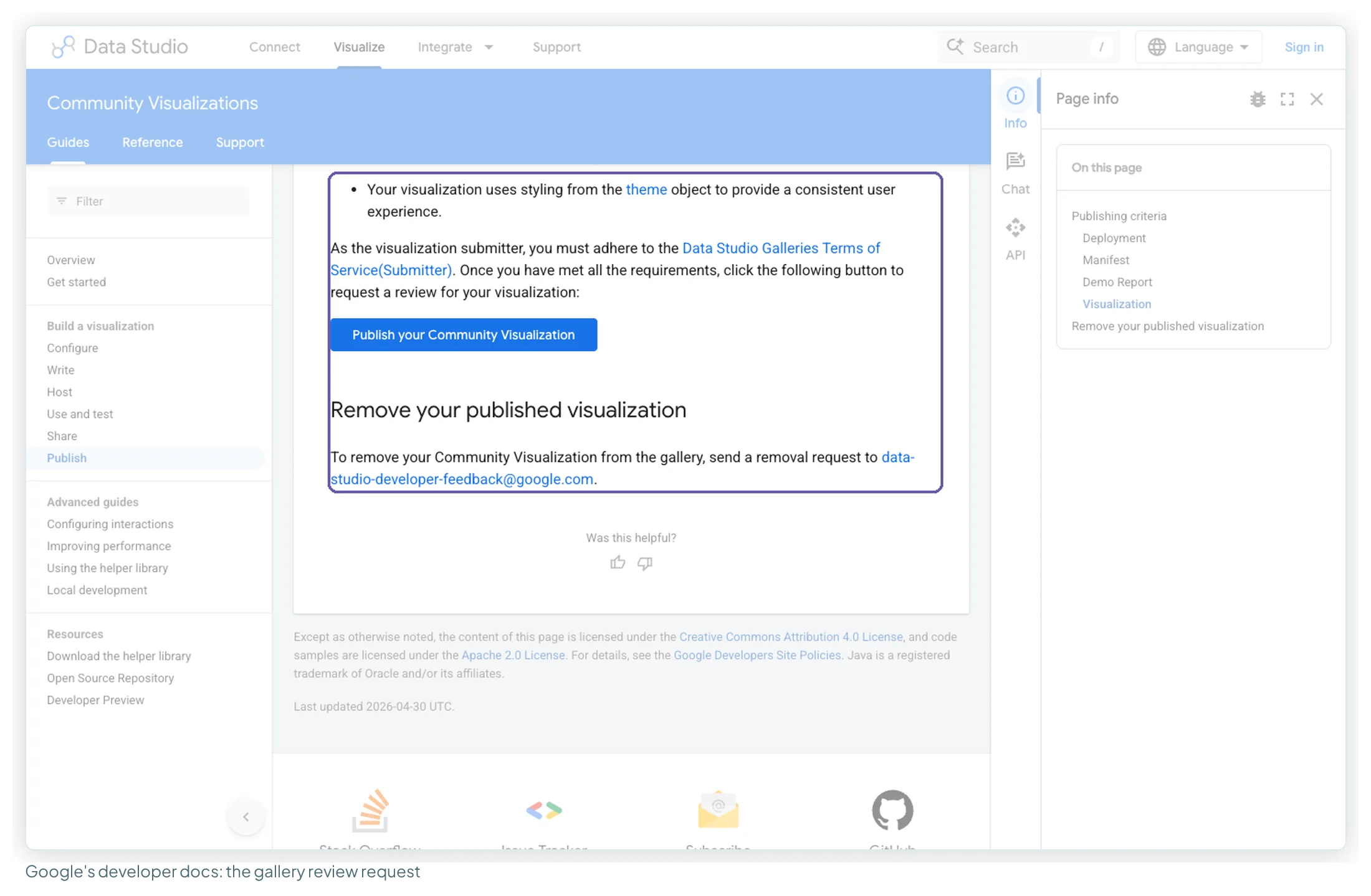
- Request a review with Google’s Publish your Community Visualization form, after accepting the Galleries Terms of Service for submitters. Removal is by email to Google.
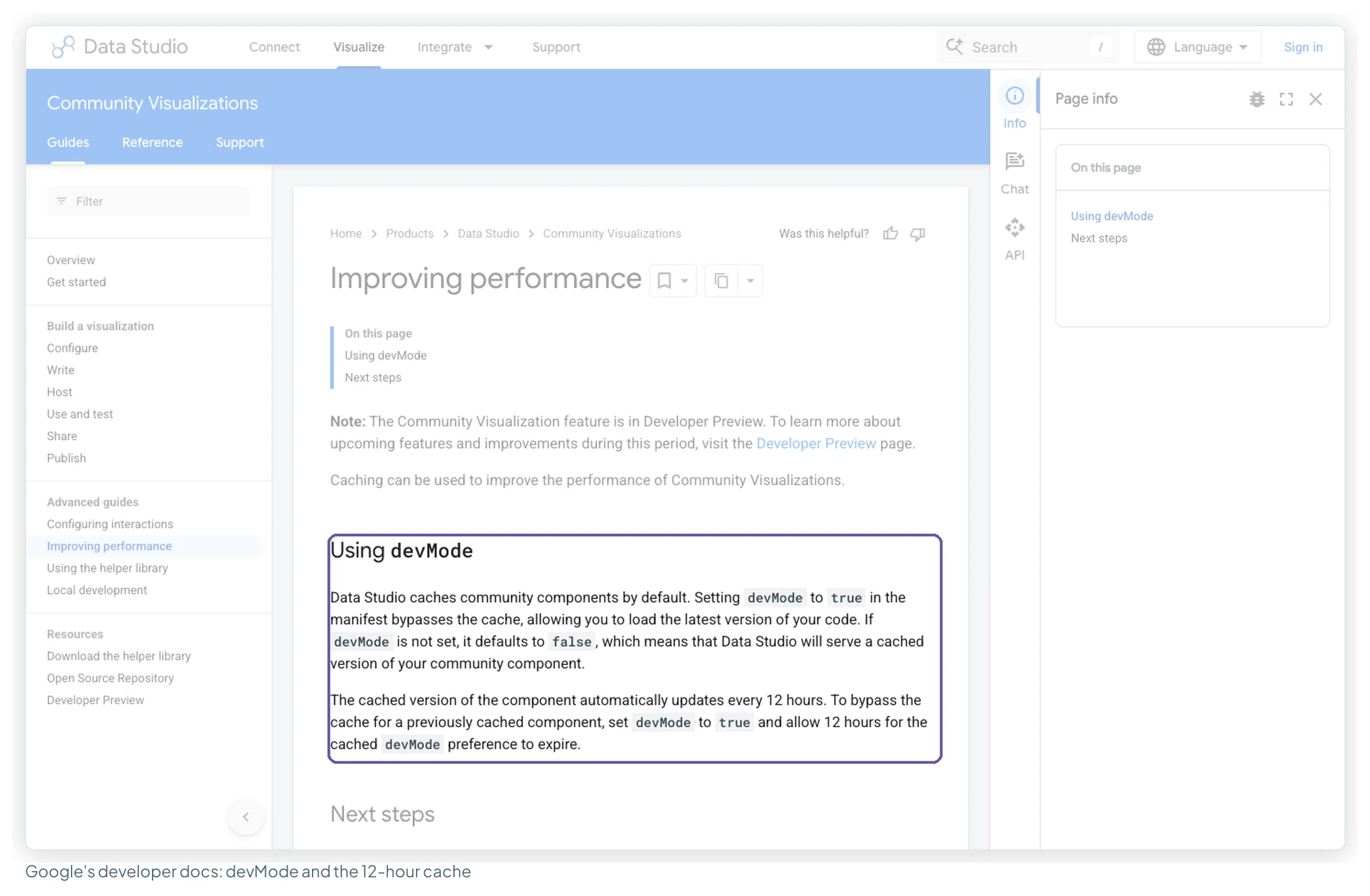
Steps 1–4 are all you need for your own reports. Anyone with the manifest path can add your visualisation without any review, so treat the path as public. Steps 5–7 are for a gallery listing; Google’s publishing criteria also ask for a 4:3 logo, a 4:3 icon of at least 800×600, and a visualisation that isn’t “unfinished or in beta”.
For worked examples, Google’s two open-source repositories hold sample visualisations written to its best practices and community contributions (Sankey, heatmap, sunburst, treemap, radar). Both are archived, so read them as examples rather than maintained code.
When to reach for one
| Reach for one when… | Use a built-in chart when… |
|---|---|
| The shape has no built-in equivalent: a chord, a Venn, steps stored as separate metrics | A built-in Sankey, funnel, gauge, timeline or tree map does the job |
| The report uses owner’s credentials | It uses viewer’s credentials |
| The chart’s data is aggregate | It’s personal, detailed revenue, or confidential |
| People read the report on screen | It’s sent as a PDF or scheduled email, or copied widely |
A dashboard is an argument about what matters, not a showcase of what’s available, and most reports that want a radar chart want a well-labelled bar chart. Chapter 15 of my ebook, Data Storytelling in Data Studio, covers when a community visualisation earns its place, and the charts you can build yourself from the built-ins when the menu runs out.
How this was researched
No test account was available this round, so nothing here comes from adding a visualisation to a report. On 14 October 2026 I read Google’s community visualisation page (updated 13 October 2026), its chart reference for each built-in alternative, and its developer documentation; counted Google’s public gallery (3 featured, 40 Google, 32 partner); opened 15 demo reports signed out; and read 17 threads on Google’s developer forum dated September 2023 to September 2026, plus the two googledatastudio GitHub repositories. I also read the eight articles ranking for this topic. Every illustration uses invented sample data.
Templates to start from
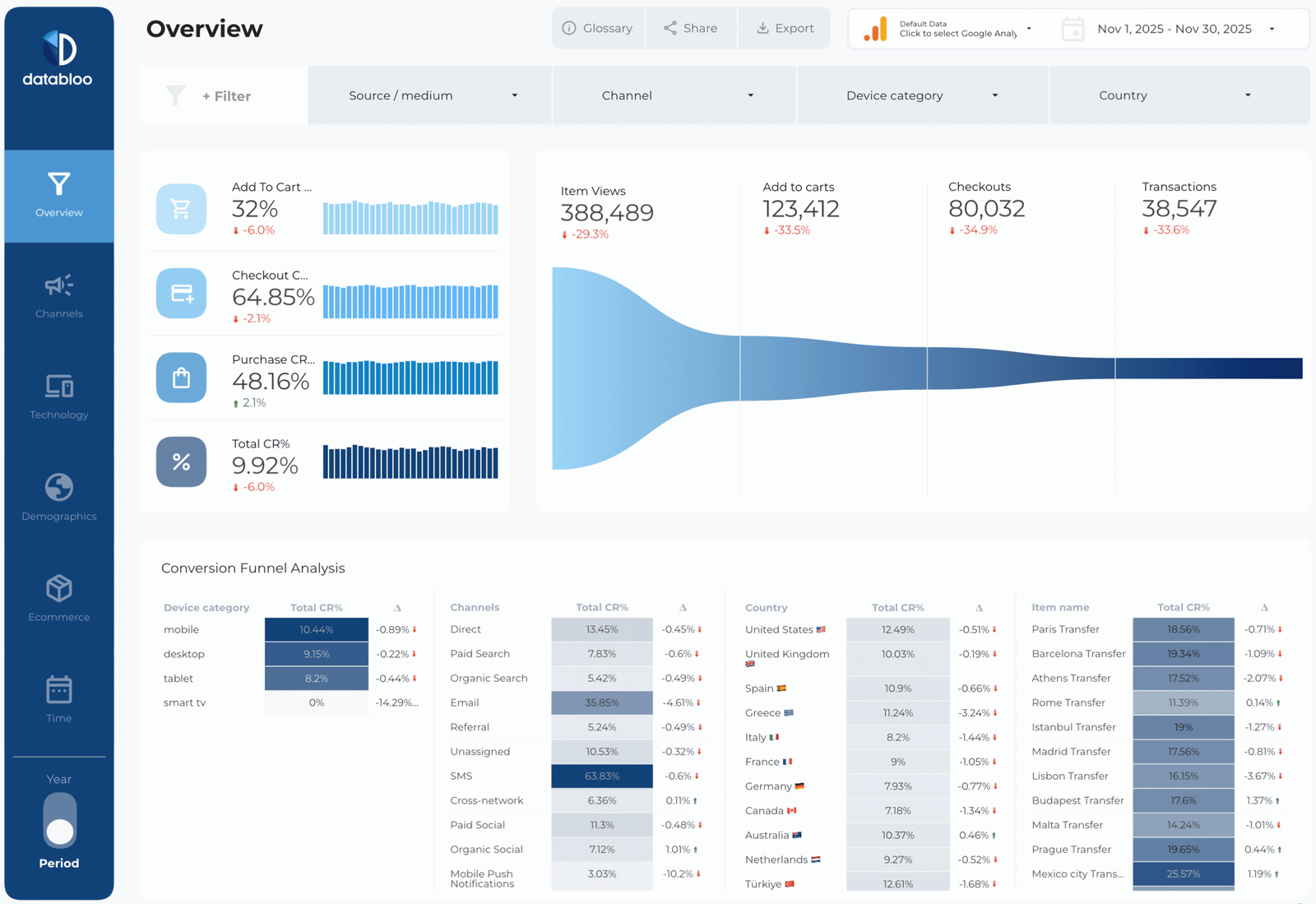
A GA4 ecommerce funnel from the library, built around the same four steps as the Metric Funnel example above:
Where to go next on charts and report design
- Data Studio chart types, and how to choose one
- Data sources versus datasets, and which credentials to use
- Using images, logos and icons in Data Studio
- When a scheduled report doesn’t send, or sends incomplete
- Dashboard design principles for readable reports
- Data Studio dashboard examples worth copying
Frequently asked questions
Why can’t I add a community visualisation to my Data Studio report?
Most likely the data source uses viewer’s credentials. Google’s documentation says third-party community visualisations need the data source to use owner’s credentials. The three Google built (Gauge, Waterfall, Candlestick) work with either.
What does “Authorization Required” mean on a community visualisation?
Nobody has consented to that visualisation in this report, or its developer changed the code since consent was given. An editor clicks Allow on the component. Viewers see the prompt instead of the chart until then.
Why is “Community visualizations access” greyed out or off?
The switch sits on the data source, so only someone who can edit the data source can change it. Google turns it on by default for owner’s-credentials data sources; if it’s off, ask the data source owner.
Are Data Studio community visualisations safe to use?
Google says a visualisation “can’t access your data directly” but does display it, so trust the developer before adding one. A content security policy blocks requests to outside servers. Use them on aggregate marketing metrics, not on personal or confidential data.
Do community visualisations show up in PDFs and scheduled emails?
Forum threads since October 2025 report them exporting as empty grey boxes, and the latest post I found, in April 2026, had no fix. Use built-in charts on pages that get emailed.
How do I remove a community visualisation completely?
Deleting the chart isn’t enough; Google says it “doesn’t remove the resource or revoke consent”. Go to Resource → Manage community visualizations, find it, click Revoke, then delete any charts still using it.
Some links in this post are affiliate links: if you sign up through one, I may earn a commission at no extra cost to you. How I work with partners.