
There are only four places to look in Data Studio — the menus, the toolbar, the canvas, and the panel on the right. Once you know which of them owns which decision, the tool stops feeling large. Almost all the time people lose in here is spent hunting in the wrong region.
This is a map rather than a tutorial: what each region is for, the one rule that tells you which tab to open, and the handful of things in the interface that most people never find.
The four regions, and what each one owns
| Region | Where | What it owns |
|---|---|---|
| Menu bar | Top: File, Editing, View, Insert, Page, Arrange, Resource, Help | Things that affect the whole report — data sources, blends, filters, page settings, sharing |
| Toolbar | Below the menus | Adding things to the canvas: pages, data, charts, controls, text, shapes, images |
| Canvas | The middle | Where the report is. Position, size, layering and alignment |
| Right-hand panel | The right edge | Configuring whatever is currently selected |
The rule underneath that table: the menus change the report, the toolbar adds to it, and the right-hand panel configures one thing at a time. When you can’t find a setting, ask which of those three it is, and you’ll be in the right region on the first try.
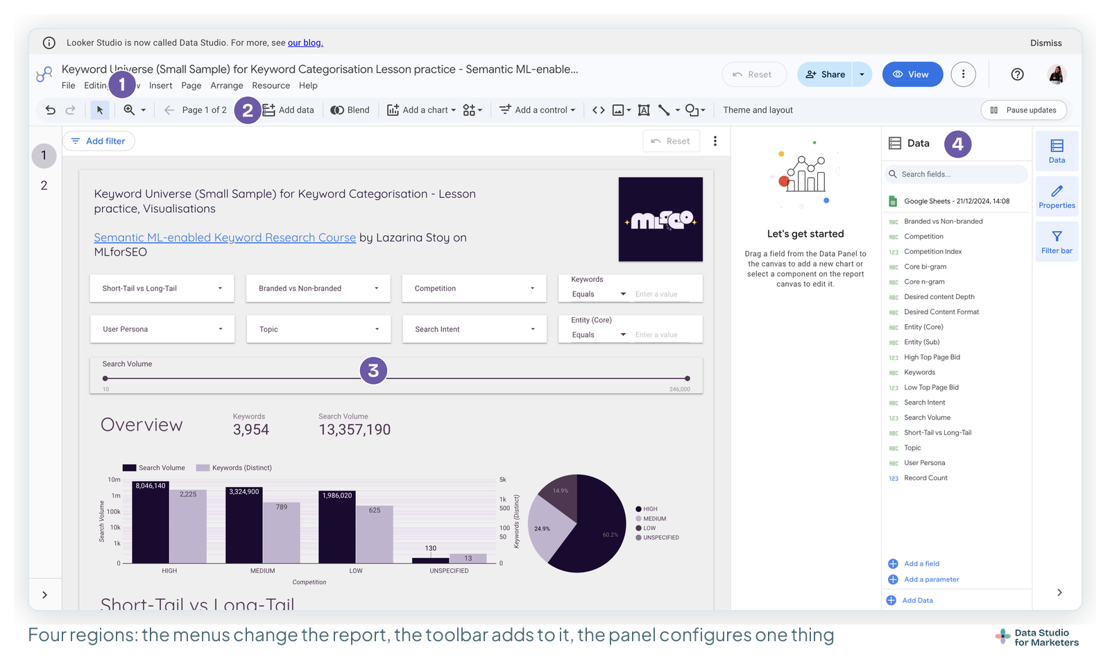
Two small naming details, because they trip people following older guides: the menu is Editing, not Edit, and it’s Resource, singular.
Edit mode and view mode
Data Studio has two modes, and the switch between them sits at the top right.
- Edit mode is the builder. You get the menus, the toolbar and the right-hand panel, and clicking a chart selects it rather than filtering by it.
- View mode is what your audience gets. Clicking a chart cross-filters the page, controls behave normally, and none of the building furniture is there.
The habit worth forming: spend more time in view mode than you do. Interactions behave differently between the two, so a report that feels fine while you’re building it can be confusing to use. Every dashboard that ships with a broken control shipped because nobody looked at it the way the reader would.
If you only have view access to someone else’s report, you can still open Make a copy and get an editable version of your own — which is how template reuse works.
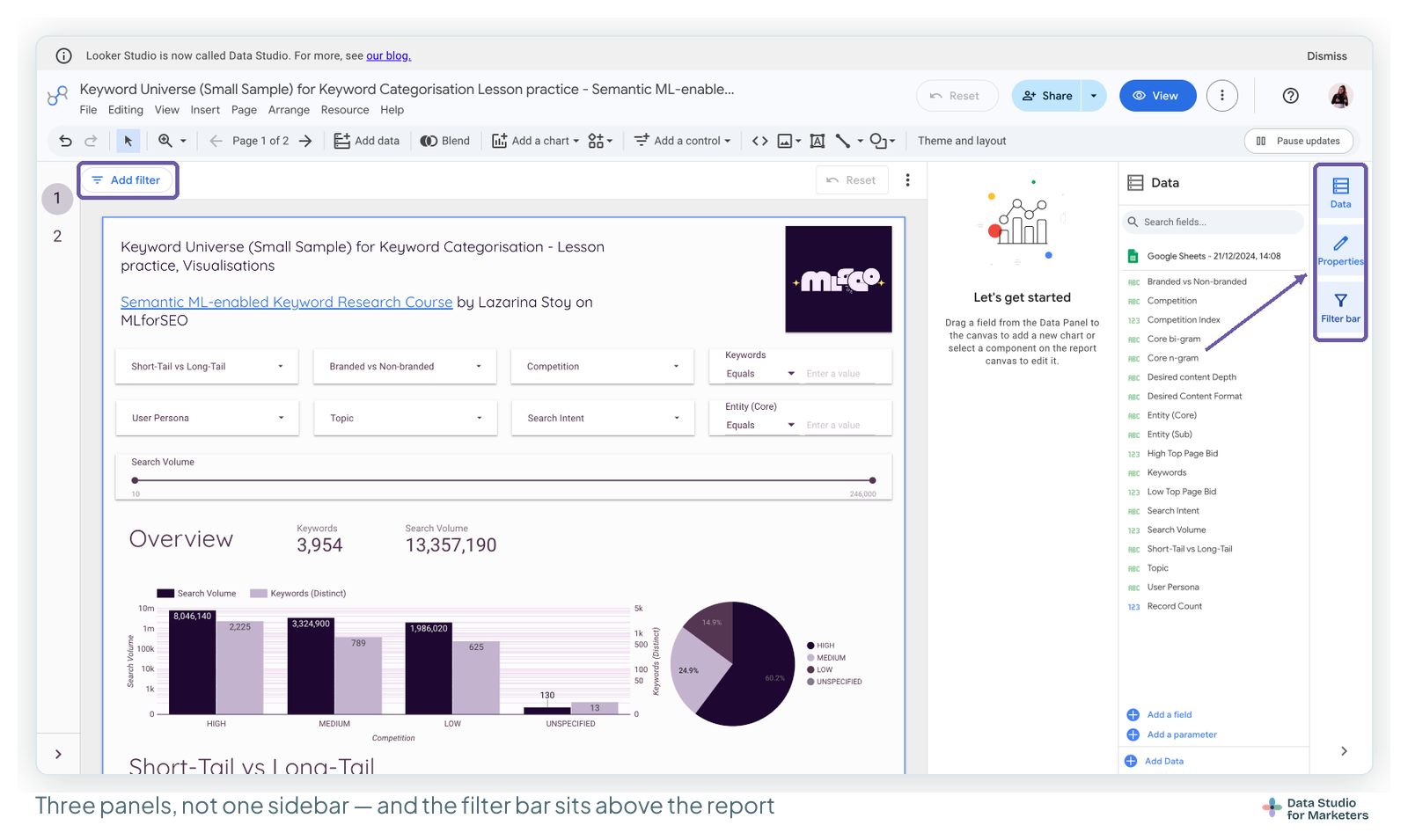
The right-hand panel is actually three panels
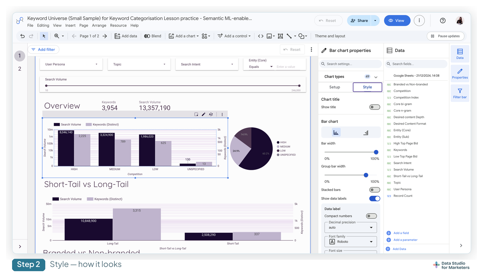
This is the single biggest source of “where has that gone”. Most guides call it “the sidebar” as though it were one thing. It’s three, and they’re switched by a strip of tabs on the far right edge:
- Data — the fields available from your data sources. Search, drag onto the canvas to make a chart, and at the bottom: Add a field, Add a parameter, Add Data.
- Properties — the settings for whatever is currently selected. Empty until you select something.
- Filter bar — the editor-side filter bar, for filtering while you build without adding controls to the report itself.
If the panel looks blank, you almost certainly have nothing selected, or you’re on the Properties tab with an empty canvas click behind you. Click a chart and it fills in.
Setup and Style — the rule that saves the most time
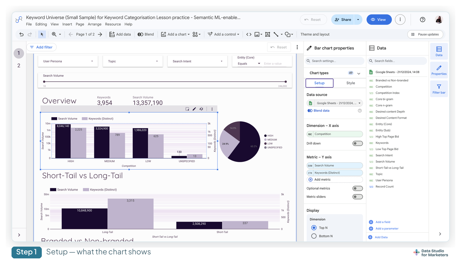
Select any chart and the Properties panel splits into two tabs. The distinction is consistent enough to memorise:
- Setup — what the component shows. Data source, dimensions, metrics, date range, sorting, row limits, filters, interactions.
- Style — how it looks. Colours, fonts, axes, gridlines, borders, backgrounds, headers, conditional formatting.
The useful part is that this holds everywhere, not just for charts. Controls have Setup and Style. So does the page itself, under Page → Current page settings. So when you’re hunting for a setting, decide first whether it changes the numbers or the appearance, then open that tab. Nearly every “I can’t find where to change X” is someone in the wrong one of these two.
One that catches everyone: the number format lives in Style, not Setup, even though it feels like data. And sorting lives in Setup, even though it feels like presentation.
The canvas, and the boundary that matters
The white rectangle is the report. Anything you drag outside it is invisible to viewers — which sounds obvious and still surprises people, usually when a chart has been nudged half off the edge and gets cropped in the shared version rather than deleted.
Canvas size lives in Theme and layout. There are presets, including screen sizes and A4 for reports meant to be printed or sent as PDF, and you can set a custom size. Two practical notes:
- Decide the canvas size before you build, not after. Changing it later doesn’t reflow anything — your charts stay where they were and you reposition all of them by hand.
- If the report will mostly be read as a PDF, start from the A4 preset. It’s much easier than building at screen size and fighting the export later. Same applies if it’s going out by scheduled email.
Grid and snapping are under the View menu, and they’re separate toggles: Smart guides (the alignment lines that appear as you drag) and Grid (the dotted background you can snap to). Turning on snapping is the cheapest way to make a report look deliberate rather than assembled.
Alignment and layering live under Arrange: align, distribute, group, and order. Grouping a scorecard with its label so they move together is a small habit that saves a lot of re-nudging.
Theme and layout
These are two tabs of the same panel and they do genuinely different jobs.
Theme is appearance: a gallery of presets, a Customize tab for setting your own colours, fonts, borders and chart palette, and — the one worth knowing about — Extract theme from image, which builds a palette from an uploaded image. Drop in a client’s logo and you get a serviceable branded theme in about ten seconds. It won’t be perfect, but it beats picking hex codes by hand.
Theme settings apply globally, to new charts and new pages. Individual charts can override them in their own Style tab, which is what you want — set the theme once, override the exceptions.
Layout is structure: header visibility, navigation type (tabs, a left menu, or hidden), canvas size, and display mode. The navigation setting is the one that changes how a multi-page report feels most: left navigation suits a report with many pages, tabs suit three or four.
A detail that makes reports look tidier: chart headers have three states — always shown, shown on hover, or hidden. Set them to appear on hover and the report loses a lot of visual clutter without losing the export and sort controls your readers occasionally want.
Report level, page level, component level
Almost every setting in Data Studio exists at more than one level, and knowing the hierarchy prevents a lot of confusion:
| Level | Where | Typical use |
|---|---|---|
| Report | File → Report settings | The default data source and default date range for everything |
| Page | Page → Current page settings | A page that needs its own date range, filter or data source |
| Component | The Properties panel | One chart that should ignore what everything else is doing |
The more specific level wins. A chart with its own date range ignores the page’s; a page with its own ignores the report’s. That’s the mechanism behind most “why isn’t my date range control affecting this chart?” questions, and it’s covered properly in the date range post.
Report-level components are the related trick. Put a component in the report header or footer area and mark it report-level, and it appears on every page — one date range control and one logo, maintained once, instead of copies drifting out of sync across eight pages. For any report with more than about three pages, this is the difference between maintainable and not.
Freeform and responsive layout
Data Studio has two layout modes, and most people have never noticed the second one.
Freeform is the default and behaves like a slide: you place things at exact coordinates and they stay there. Predictable, and what nearly every tutorial assumes.
Responsive reflows components to fit the viewport, which is what you want if the report will be read on phones. The trade-off is real, though, and it’s why it isn’t the default: responsive mode restricts what you can do with layout. Components can’t overlap, some fit options aren’t available, and the freedom to place things precisely goes away.
One caveat worth carrying with that choice: responsive reports do not support report-level components, so the logo-and-date-control trick above is unavailable there. The three mobile options covers what else responsive mode gives up.
Choose based on the audience honestly. A client report opened on a laptop should stay freeform. An internal dashboard people check on their phones between meetings is worth the constraints.
Four things in the interface most people never find
The applied filters panel. In view mode, View applied filters shows everything currently filtering the page. When a number looks wrong, this is the first thing to check — far more often than not, a control is set to something you forgot about.
Pause updates. Top right in edit mode. It stops the report re-querying while you make a run of changes. On a heavy report against a slow source, this turns a frustrating build into a fast one.
Report descriptions. You can attach a description to a report, which shows in listings. On its own, minor. Across an agency with forty reports in a shared folder, it’s the difference between finding the right one and opening four.
Component visibility rules. You can control whether a component shows based on conditions — useful for a note that only appears when a metric crosses a threshold, or for hiding a section that isn’t relevant to a particular client. Genuinely powerful, and almost undocumented in the third-party guides.
What to learn first, depending on where you sit
You don’t need all of this at once. What’s worth learning first depends on what you’re building.
If you’re in-house and building for yourself and a manager, learn Setup vs Style, the report-level date range, and view mode. That’s genuinely enough for a good weekly report, and everything else can wait until you hit a specific wall.
If you’re at an agency building the same report for many clients, invest early in theme, report-level components and canvas size. The cost of getting these wrong scales with the number of clients — a report-level date range control set up once beats fixing the same thing on eight pages across fifteen reports. Get the structure right before you make the first copy.
If you’ve come from a BI tool — Tableau, Power BI, Looker proper — the thing to unlearn is that Data Studio’s canvas is a slide, not a layout engine. It’s closer to Google Slides with live data than to a dashboarding framework, and freeform mode makes much more sense once you accept that.
Frequently asked questions
What’s the difference between edit mode and view mode in Data Studio?
Edit mode is the builder — menus, toolbar and the properties panel, where clicking a chart selects it. View mode is what your audience sees, where clicking a chart cross-filters the page. Interactions genuinely behave differently, so check your report in view mode before sharing it.
Why is my properties panel empty?
Nothing is selected. The panel configures one component at a time, so click a chart, control or the page background and it fills in.
What’s the difference between the Setup and Style tabs?
Setup is what the component shows — data source, dimensions, metrics, date range, sorting, filters. Style is how it looks — colours, fonts, axes, borders, number formatting. If you’re hunting for a setting, decide whether it changes the numbers or the appearance first.
Where do I change the number format?
In the Style tab, not Setup, even though it feels like a data setting. Select the chart, open Style, and find the field’s formatting options.
How do I change the canvas size in Data Studio?
In Theme and layout, under the Layout tab. There are presets including screen sizes and A4, plus a custom option. Set it before you build — changing it later doesn’t reposition anything for you.
How do I make something appear on every page?
Place it in the header or footer area and set it as a report-level component. One date range control and one logo maintained in one place, rather than copies on every page.
What is responsive layout mode?
A layout mode that reflows components to fit the viewer’s screen, instead of holding them at fixed positions. Useful for reports read on phones, but it restricts layout — components can’t overlap and some sizing options go away.
Why does my chart ignore the date range control?
Something more specific is overriding it. A chart with its own date range ignores the page’s, and a page with its own ignores the report’s. Check the chart’s Setup tab first.
Can I stop the report reloading while I work on it?
Yes — Pause updates, top right in edit mode. It stops re-querying while you make a batch of changes, which makes a big difference on slow data sources.
Is Looker Studio’s interface different from Data Studio’s?
No. Same product, same interface — Google renamed it Looker Studio and then back to Data Studio. Guides written under either name describe the same screens, though older ones predate the current panel layout.