

Adding a date range control takes ten seconds. The confusing part is that three different places can set a date range, and the most specific one always wins. That single rule explains almost every “why is my chart ignoring the control” question, and almost nobody states it.
This covers what the control does, the hierarchy, how to set defaults that don’t need touching every month, and a diagnostic list for when a chart won’t respond.
What the date range control actually does
It’s a calendar widget your readers can change without edit access. Insert it from the toolbar, drop it on the canvas, and by default it governs every chart on the page that has a date dimension.
Two conditions have to hold for it to do anything at all:
- The report has at least one data source with a genuine Date field
- The charts you want it to affect have a date range dimension set
That’s it. The rest of the difficulty is about scope.
The three levels, and which one wins
This is the core of it. A date range can be set in three places, and they resolve in this order:
| Level | Set at | Beats |
|---|---|---|
| Component | The chart’s Setup tab, “Default date range” | Everything. This chart does what it likes. |
| Page | Page → Current page settings | The report level, for charts on this page |
| Report | File → Report settings | Nothing. It’s the fallback. |
The most specific level wins, and each level inherits from the one above when it’s left unset. A chart set to Auto takes the page’s range; a page set to Auto takes the report’s.
Most guides describe this as a two-level system — chart and report. It’s three, and the missing middle is why people can’t work out where a range is coming from. If a chart is showing something you didn’t set on the chart or the report, check Page → Current page settings.
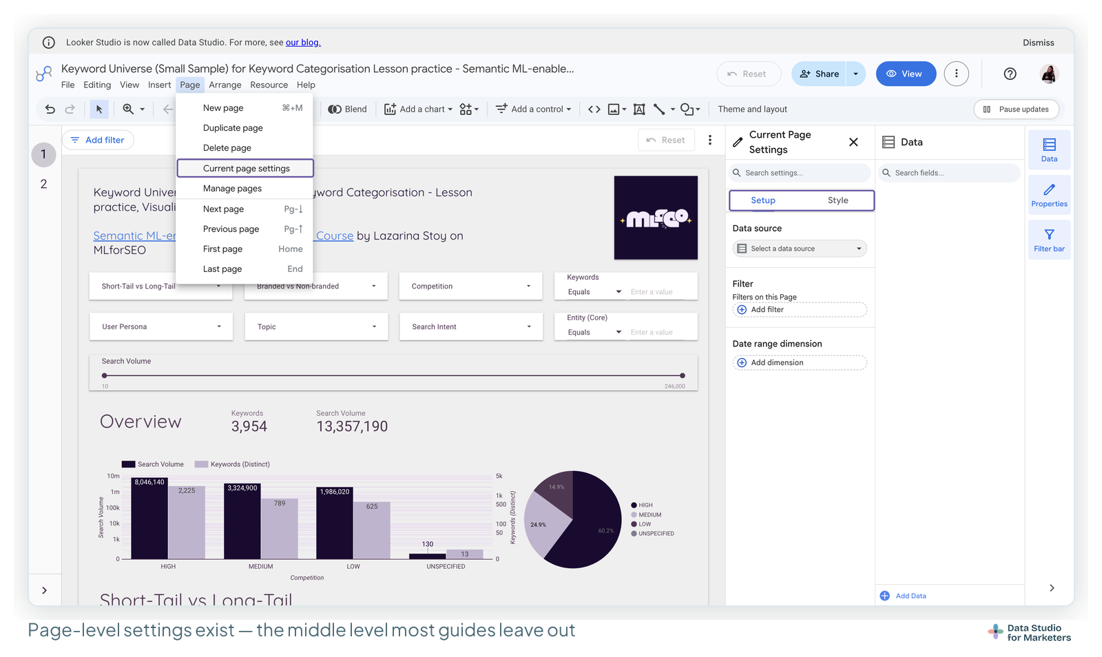
The practical use for the page level: a report where most pages show last 28 days but one year-on-year page needs last 13 months. Set it once on that page instead of on each of its charts.
Setting the default date range
The default is what people see before they touch anything, which makes it more important than it sounds.
Auto — and why two charts can disagree
Auto means “whatever the connector’s default is”, and connectors disagree. Analytics connectors typically default to the last 28 days. BigQuery and Sheets show the entire range in the dataset.
So a report combining GA4 and a Google Sheet, both left on Auto, opens with two charts showing genuinely different periods — and nothing on screen tells you that. This is a surprisingly common cause of “the numbers don’t tie up”, and the fix is simply to set an explicit default rather than leaving Auto.
Fixed ranges
A hard start and end date. Right for a report about a specific campaign or a closed period; wrong for anything recurring, because someone has to update it.
Rolling ranges
Last 7 days, last 28 days, last quarter, this year to date, and so on. This is what you want for almost every recurring report.
Watch the “Include today” option. Today is always a partial day, so including it drags averages down and makes the most recent point on every time series dip. Unless there’s a reason to want today’s incomplete numbers, leave it off — it’s the single most common reason a chart looks like performance fell off a cliff.
Advanced ranges
The one most people never find. Instead of picking from the list, you can build a range from a start and an end, each defined as Today, Yesterday, or a fixed date, plus or minus a number of days, weeks, months or years.
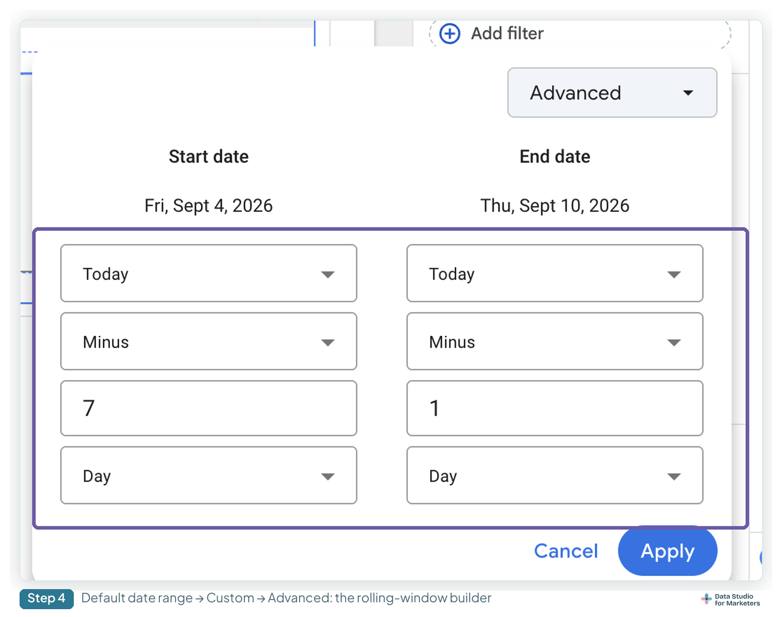
That gets you things the preset list can’t: last 90 days ending yesterday (so today’s partial data never appears), or last 52 weeks ending last week (so a weekly report never shows a half-finished week). For any report someone reads on a Monday morning, ending the range at “yesterday” or “last week” is usually the right call.
Making one control cover the whole report
Add a date range control, select it, then Arrange → Make report-level.
The control now appears on every page in the same position, and — the part that matters — the selection carries across pages. A reader sets it to last quarter on page one and page four is already showing last quarter. Without this, every page has its own control and its own state, which is confusing to use and tedious to maintain.
One gotcha Google notes and nobody else mentions: report-level components can end up underneath page-level ones. If your control has vanished on one page, it’s probably behind a chart. Select the offending chart and send it backwards.
For anything longer than about three pages, make the date control and any global filters report-level as a matter of course. It’s the same principle as report-level headers in the interface.
Comparison date ranges
A comparison range adds “vs previous period” or “vs previous year” to a chart, which is what turns a number into information.
Set it on the chart, in Setup, under Comparison date range. The options mirror the main range: previous period, previous year, a fixed range, or an advanced one.
Two limits worth knowing before you promise a client something:
- Only editors can set comparison ranges. A viewer with a date range control can change the timeframe, but they can’t toggle a comparison on or change what it compares to. If people need to switch between year-on-year and month-on-month themselves, you need two charts or two pages, not a control.
- It isn’t available on every chart type. Time series, tables, area charts and scorecards support it; several others don’t.
And a cross-reference worth having: on bar and pie charts, comparison metrics are incompatible with the “Group the rest as Others” setting, which is covered with the row limits.
Why a chart ignores your date range control
In roughly the order that resolves it fastest:
- The chart has its own default date range. By precedence it beats the control. Open its Setup tab and set the date range back to Auto. This is the answer maybe half the time.
- The chart has no date range dimension. Without one, there’s nothing for the control to filter.
- The date field isn’t actually a Date. A text column that reads
2026-04-01is still text. Fix the type in the data source — and note it needs a complete date: year, month and day. A field holding only year and month won’t work. - The control is grouped with other components. Grouping scopes a control to its group, so anything outside the group is unaffected. This one is invisible until you know to look for it.
- The control is on a different page and isn’t report-level. Make it report-level.
- The chart uses a blend, and the date isn’t carried through the join. If the date dimension didn’t survive the blend, there’s nothing to filter on.
- The connector locks the date dimension. Some, including Google Ads and Analytics, set it automatically, so what you’re seeing is intended behaviour.
- It’s a chart type that handles ranges differently — scorecards in particular behave unlike time series when comparisons are involved.
If you’re several items down this list and still stuck, open View applied filters in view mode. More often than people expect, the chart is responding correctly to a filter somebody forgot about.
When your date field isn’t really a date
Worth its own note because it accounts for so much lost time, especially with Google Sheets.
Data Studio needs a Date-typed field with a complete date in it. Spreadsheet columns arrive as text far more often than people realise, particularly when several people maintain the sheet and the formats have drifted. The tells: the field has a text icon in the data panel, date-based charts don’t sort chronologically, and the control has no effect.
The fix is in the data source, not the report: set the field’s type to Date with the right format. Do it there and every chart in every report using that source is fixed at once — which is exactly the behaviour described in data sources vs datasets.
What to set up, depending on the report
A recurring client report: one report-level date control, an explicit rolling default ending yesterday, and a previous-period comparison on the headline scorecards. Set once, never touched again.
An internal dashboard people poke at: report-level control, Auto off, and accept that people will change it and not change it back. Anything you need to be stable regardless should have its own component-level range — that’s the legitimate use of overriding the hierarchy.
A one-off analysis: fixed ranges are fine. It isn’t going to be read next quarter.
Frequently asked questions
Why doesn’t my chart respond to the date range control?
Most often the chart has its own default date range set, which beats the control by precedence — set it back to Auto in the chart’s Setup tab. Other causes: no date range dimension, a date field that’s actually text, the control being grouped with other components, or the control being on another page without being report-level.
Where do I set the default date range — report, page or chart?
All three exist and the most specific wins. Chart level (Setup tab) beats page level (Page → Current page settings), which beats report level (File → Report settings). Set it at the highest level that’s right, and override only the exceptions.
How do I make one date range control apply to every page?
Select the control and use Arrange → Make report-level. It then appears on every page in the same position, and the reader’s selection carries across pages.
My report-level control has disappeared on one page. Where is it?
Probably behind a chart — report-level components can end up beneath page-level ones. Select the chart covering it and send it backwards.
Can viewers change the comparison period?
No. Only editors can set or change a comparison date range. Viewers can change the timeframe with a date range control, but not what it’s compared against.
How do I build a rolling range like “last 90 days ending yesterday”?
Use the advanced date range option. Set the start to Today minus 90 days and the end to Today minus 1 day. Ending at yesterday keeps today’s partial data out, which is usually what you want.
Why do two charts show different periods when the report first loads?
Both are probably set to Auto, and Auto means the connector’s default — which differs between connectors. Analytics sources typically default to the last 28 days while BigQuery and Sheets show the whole dataset. Set an explicit default instead.
Should I include today in the date range?
Usually not. Today is always a partial day, so it drags averages down and makes the latest point on every time series dip — which reads as a performance drop that isn’t real.
My date column isn’t working as a date. What’s wrong?
It’s coming through as text, or it isn’t a complete date. Data Studio needs a Date-typed field with year, month and day. Fix the field type in the data source and every report using that source is fixed too.
Can I have two date range controls on the same page?
Yes, but they’ll both apply to the same charts unless you scope them by grouping each control with the charts it should affect. Two unscoped controls on one page will fight each other.