
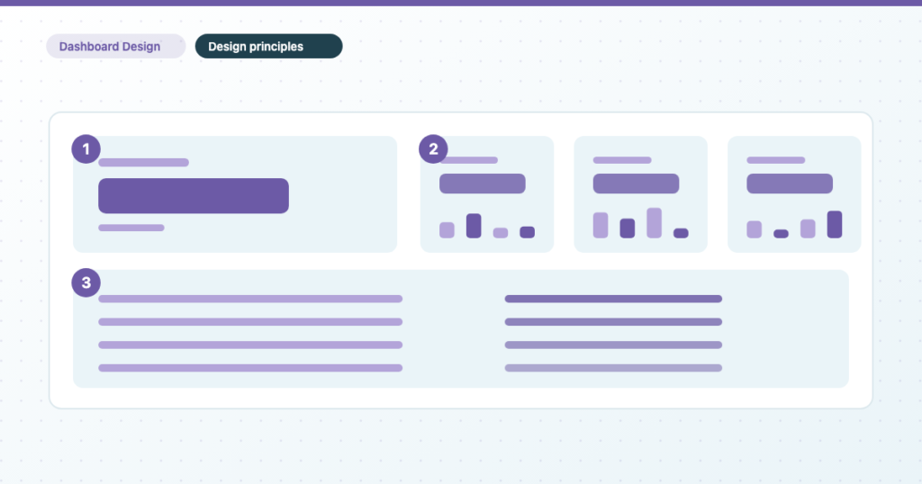
Most dashboards aren’t badly designed. They are undesigned — assembled by accumulation, one chart at a time, each added because somebody asked for it once. The result is technically correct and unreadable, and no amount of choosing better chart types fixes it, because the problem is happening at the level of the page rather than the chart.
This covers the page-level decisions: what to remove, how to group, how colour should be used, and why type size decides what gets read. Choosing a chart from the shape of your data handles the chart-level decisions, and the two together are most of what “make it look better” actually means.
Remove to improve: the clutter isn’t neutral
The first pass on any dashboard is subtraction, and the reason is that clutter isn’t merely ugly. Every non-data element on a chart is something the reader has to identify and dismiss before they reach the number. Individually each costs almost nothing; a page of them costs comprehension.
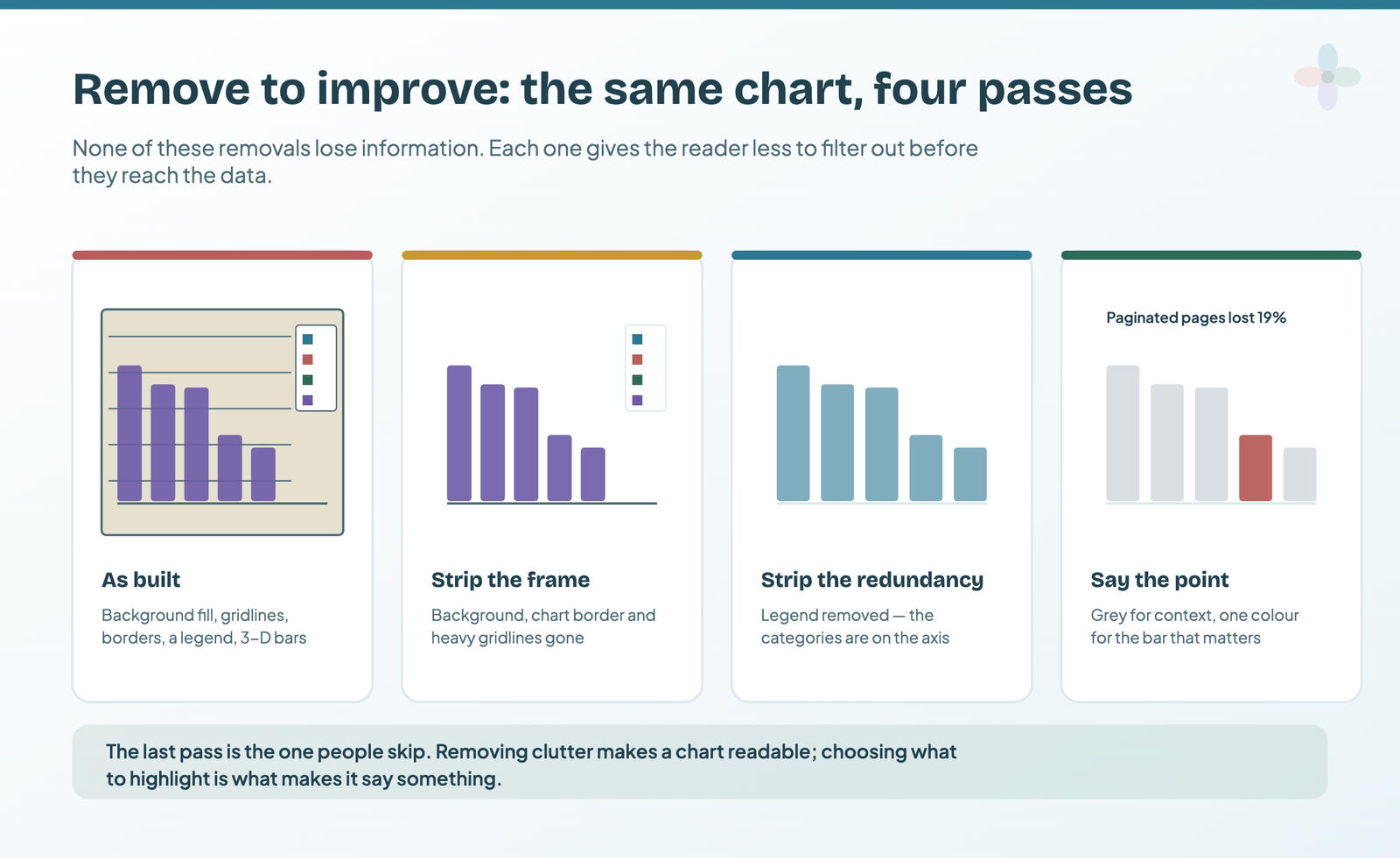
Strip the frame first. Background fills, chart borders, heavy gridlines, and any 3-D effect. None of these carry information and all of them compete with the data. In Data Studio these live in the Style tab: set the chart background to none or white, turn the border off, and set gridlines to a light grey or remove them entirely.
Then strip the redundancy. A legend duplicating the axis labels. An axis title repeating the chart title. Data labels on every bar of a chart that also has a value axis. Pick one of each pair and delete the other.
Then collapse the numbers. £19,901 becomes £19.9k; £431.72 becomes £431. Two decimal places on a revenue figure is precision nobody is using and four extra characters everybody is reading. Data Studio handles both per field: compact numbers turns 19,901 into 19.9K, and decimal precision set to zero removes the trailing pence on anything above a few hundred. Set it on the field itself rather than per chart and it holds everywhere that field appears.
Then say the point. This is the pass that gets skipped, and it’s the one that turns a tidy chart into a useful one: grey everything that’s context and give one colour to the thing you’re talking about, then write the finding as the chart title. Removing clutter makes a chart readable. Choosing what to highlight is what makes it say something.
Visual hierarchy: what gets read, and in what order
Type size and weight decide reading order. Always, and whether or not you chose them deliberately. The only real question about a dashboard is whether the thing you most want read is the thing that got the biggest type.
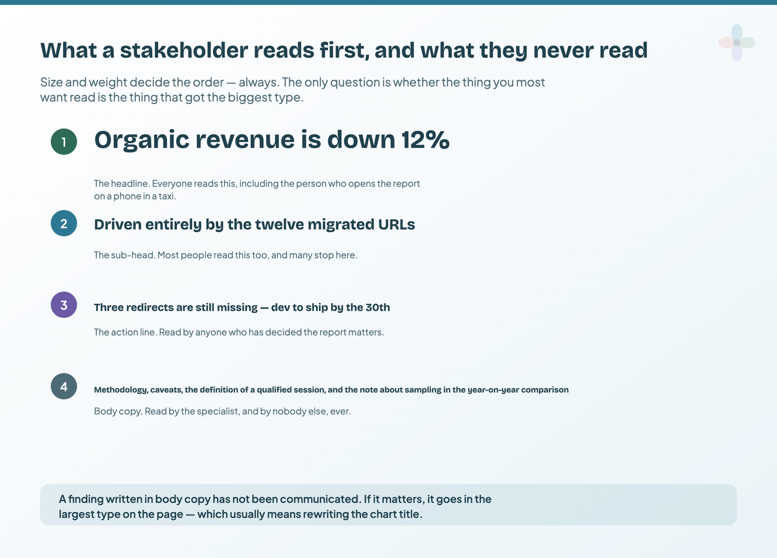
In practice a report page has four tiers. The headline — read by everyone, including the person opening it on a phone. The sub-head — read by most people, and many stop there. The action line — read by anyone who has decided the report matters. And body copy, which is read by the specialist and essentially nobody else.
Two consequences follow, and they’re the practical payload of this whole section. A finding written in body copy hasn’t been communicated; if it matters to every reader it belongs in the largest type on the page, which usually means rewriting a chart title rather than adding a paragraph. And caveats belong in body copy deliberately — not hidden, but placed where the reader who needs them will look and the reader who doesn’t won’t be slowed down.
Design for the direction people read
Readers of left-to-right languages start at the top left and sweep right and down. That’s where the most important thing goes, and it’s a surprisingly common thing to get wrong — a summary scorecard row placed under the charts it summarises, or the most important chart in the bottom right because that’s where there was space.
If you report to markets that read right to left, mirror the layout rather than assuming the convention travels. It’s a five-minute change and it is the sort of detail that gets noticed.
Grouping: let the gaps between tiles do the work
A page of twelve evenly spaced tiles gives the reader no information about which tiles relate to each other, so they have to read all twelve to find out. Grouping related tiles together and putting real space between the groups answers that question before anyone reads a word.
Three grouping rules cover most reports.
Group by question, not by data source. The commonest failure is a page organised by where the numbers came from — a GA4 section, a Search Console section, an Ads section. That’s the shape of your data pipeline, not the shape of anybody’s question. Which source a number comes from is your problem, not the reader’s.
Put things people compare next to each other. If two charts are meant to be read against one another — spend against conversions, pages published against sessions gained — they go side by side at the same scale. Two charts on opposite sides of a page won’t be compared, however logically related they’re.
Use padding consistently. Equal gutters between tiles, equal margins at the page edge, tiles aligned to a grid. Inconsistent spacing reads as carelessness even to people who could not say why, and it’s the single cheapest thing to fix in an existing report.
Fewer, larger tiles beat more, smaller ones
A four-by-six grid of small tiles and a three-by-four grid of larger ones can hold the same information, and the second is dramatically more usable. Limit the number of widgets per page, use fewer columns in tables, and give the numbers that matter physically larger type.
The test is whether somebody can take a useful impression of the page in about five seconds. If they have to lean in, the page is doing an exploratory job and it belongs behind the summary rather than on it — which is the structural argument in the guide to narrative frameworks and the martini-glass report structure.
Stay consistent across pages, so differences mean something
If a metric is shown as a bar chart on one page and a gauge on the next, the reader spends attention working out whether the change is significant. It never is, and that attention is gone.
Fix the conventions once per report and hold them: the same metric always uses the same chart type; the same entity always uses the same colour across every chart; comparison periods are the same everywhere unless there’s a stated reason; number formatting matches across tiles showing the same kind of quantity. Consistency isn’t an aesthetic preference — it’s what makes an inconsistency readable as a signal.
This is also the argument for a house template. When every client report starts from the same structure, the conventions come for free and nobody has to police them, which is covered in who owns the dashboards and how agencies standardise reporting.
Every number needs a subject, a period and a comparison
A bare number on a dashboard is a fact rather than information. The reader silently supplies a baseline, and it’s usually the wrong one. Three additions turn a scorecard into something somebody can act on: a label saying what the number is, the period it covers, and a comparison against something.
In Data Studio all three are settings rather than design work. The label is the scorecard’s own title. The comparison is the Comparison date range on the Setup tab, which is off by default — which is precisely why so many reports ship without it. The period is either in the label or in a visible date control at the top of the page.
The same logic applies to charts: a chart title that names the metric is doing half a job, and one that states the finding is doing the whole one. The “so what?” test for a dashboard is the fastest way to work out which of your titles are which.
How to use colour on a dashboard
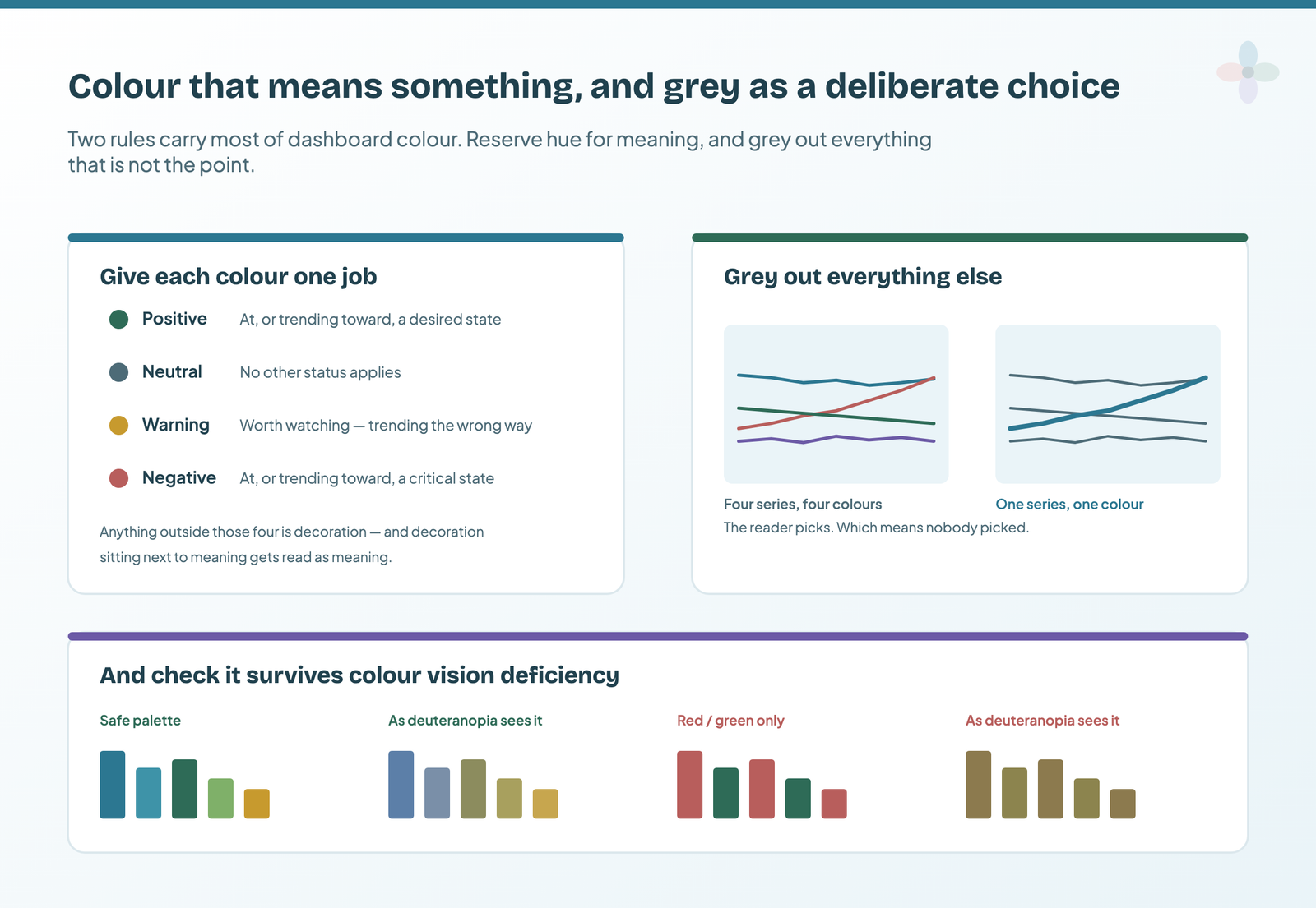
Colour is the element most often used decoratively and the one that most rewards being used semantically. Two rules carry almost all of it.
Give each colour exactly one job
Four semantic roles are enough for a marketing report. Positive — at, or trending toward, a desired state. Neutral — no other status applies. Warning — worth watching, trending the wrong way. Negative — at, or trending toward, a critically undesired state.
Anything outside those four is decoration, and decoration sitting next to meaning gets read as meaning. A brand-coloured accent on one tile and a semantic red on the next teaches the reader that colour on this page is unreliable, after which they stop reading it — which loses you the fastest signal on the page.
Grey is a decision, not an absence
A chart with four series in four colours asks the reader to decide which one matters. They won’t, and if they do they may decide wrong. A chart with three greyed series and one in colour has already answered the question.
This is the highest-leverage single change available on most dashboards, and in Data Studio it is done in the Style tab by setting series colours individually rather than accepting the default palette. Do it on every chart where you know which series the reader should be looking at — which, on a summary page, should be all of them.
Check the palette survives colour vision deficiency
The US National Eye Institute puts it at about one in twelve men, most commonly a red-green deficiency. Among women it’s far rarer — roughly 0.4%.
Both figures are population-specific rather than global, which is worth knowing if you report to an international team. Birch’s review of worldwide prevalence puts red-green deficiency at about 8% of men of European Caucasian descent, but 4–6.5% of men of Chinese and Japanese ethnicity. Either way, a palette that carries meaning through red versus green alone is unreadable to a meaningful share of any client’s leadership team, and they’re unlikely to mention it.
The colour palette guide goes further — including the WCAG criterion that governs chart series specifically, which almost nothing on this subject cites.
Three practical rules. Do not encode a positive-versus-negative distinction in red and green alone — pair it with position, a sign, an arrow or a label. Prefer palettes that vary in lightness as well as hue, since lightness survives every form of colour vision deficiency. And check a finished report through a simulator before it goes out; several free browser extensions do this in a few seconds.
Colour meanings aren’t universal
Worth one line, because it catches people reporting internationally: the associations that make red mean danger and green mean good are cultural rather than innate, and they differ by market. In several East Asian financial contexts red signals a rise rather than a loss. If your report goes to a market whose conventions you don’t know, lean on labels and position rather than relying on the colour to carry it.
Where text belongs on a dashboard page
Text on a dashboard tends to be either absent or dumped in a paragraph at the bottom that nobody reads. Both are avoidable.
Titles and descriptions go directly above the thing they describe, as short sentences rather than labels. Definitions — what counts as a qualified lead, which conversion is being reported — go somewhere stable and linked, not repeated on every page. Commentary goes next to the chart it explains, and needs to survive the data refreshing underneath it, which is the whole subject of annotations and expert commentary in Data Studio.
The placement rule that matters: if a piece of text applies to every reader, it belongs in the largest type on the page. Everything else is for the reader who is already looking at that part of the report.
Make the report’s page order do some of the work
A multi-page report has a reading order whether or not you designed one. Left in the order the pages were built, that order is usually the order you built them in, which correlates with nothing.
Put the summary first and everything else behind it, in the order somebody would ask questions. Place connected pages adjacent to each other, so drilling from one to the next is a step rather than a search. And add real navigation — Data Studio’s page navigation, or buttons — rather than expecting people to find the page menu. Readers don’t explore a report; they follow whatever path you left visible.
Where each principle becomes a Data Studio setting
Principles are portable; the controls aren’t. This is the map from each argument above to the panel that implements it, and to the guide that walks through it.
| The principle | The Data Studio control | Covered in |
|---|---|---|
| Remove what carries no information | Chart Style → gridlines, borders, legends; theme border weight and shadow | Building a branded theme |
| Size decides reading order | Per-component font size — there is no theme-level size | Fonts and type sizes |
| Group with real space between groups | Theme and layout → Grid Settings, and Arrange → Align | Layout and grid |
| Consistency across pages | Snap to Grid rather than Smart guides; report-level components | Layout and grid |
| Every number gets a comparison | Scorecard comparison type — Previous period, Value, Metric | Designing scorecards |
| Each colour means one thing | Edit theme → Colour by, the twenty palette slots, positive/negative change | Choosing a colour palette |
| Grey out everything that isn’t the point | Palette slots set to neutrals, or a series-level style override | Choosing a colour palette |
| Page order should follow the questions | Report Pages panel → sections, headers and dividers | Adding a navigation menu |
| Readable at the size it will be read | Canvas size, and View → Preview → Phone | Mobile-friendly reports |
If you only do one of these on an existing report, do the third: set a grid, then select everything on the busiest page and align it. It takes four minutes and it is the change people notice without being able to name.
A dashboard design checklist for an existing report
Run this over an existing report page. It takes about ten minutes and it is more useful than a redesign.
- Is there anything on this page carrying no information — a border, a gridline, a background, a legend duplicating an axis?
- Does every number have a label, a period and a comparison?
- Does every chart title state a finding rather than name a metric?
- Is the most important thing on the page also the largest thing on the page?
- Are related tiles grouped, with real space between the groups?
- Does each colour on this page mean exactly one thing?
- On any chart with more than two series, is one of them emphasised?
- Would the page still work for a reader who can’t distinguish red from green?
- Is the page readable in five seconds, or does it need leaning in?
- Is this page in the right position in the report’s order?
Frequently asked questions
What are the most important dashboard design principles?
Remove anything that carries no information, give every number a label, a period and a comparison, put the most important thing in the largest type, group related tiles with real space between groups, and use colour semantically rather than decoratively. Those five cover most of what separates a readable dashboard from an accumulated one.
How many charts should be on a dashboard page?
Fewer than you think, and larger. The test is whether somebody can take a useful impression of the page in about five seconds. If a page needs leaning in, it is doing an exploratory job and belongs behind the summary rather than on it.
What colours should I use on a dashboard?
Give each colour exactly one job — positive, neutral, warning, negative — and grey out everything that is not the point of a given chart. Avoid encoding meaning in red versus green alone, since red-green colour vision deficiency is common enough that a meaningful share of any leadership team cannot read it.
Where to go next on dashboard design and reporting
- Data Studio chart types, and how to choose one
- Data storytelling for marketers: the full guide
- How to build an executive summary page in Data Studio
- The “so what?” test for a dashboard
- Annotations and expert commentary in Data Studio
- Narrative frameworks, and which one your report needs
- Data Studio layout and grid: building aligned reports
- How to choose a dashboard colour palette in Data Studio
- Data Studio fonts and type sizes
- How to build a branded report theme in Data Studio
- Report templates versus report themes
- How to add a navigation menu to a Data Studio report
- Designing a report cover page in Data Studio
- Designing scorecards that communicate at a glance
- Using images, logos and icons in Data Studio
- Mobile-friendly Data Studio reports: the three options
- Dark themes in Data Studio, and what they cost