
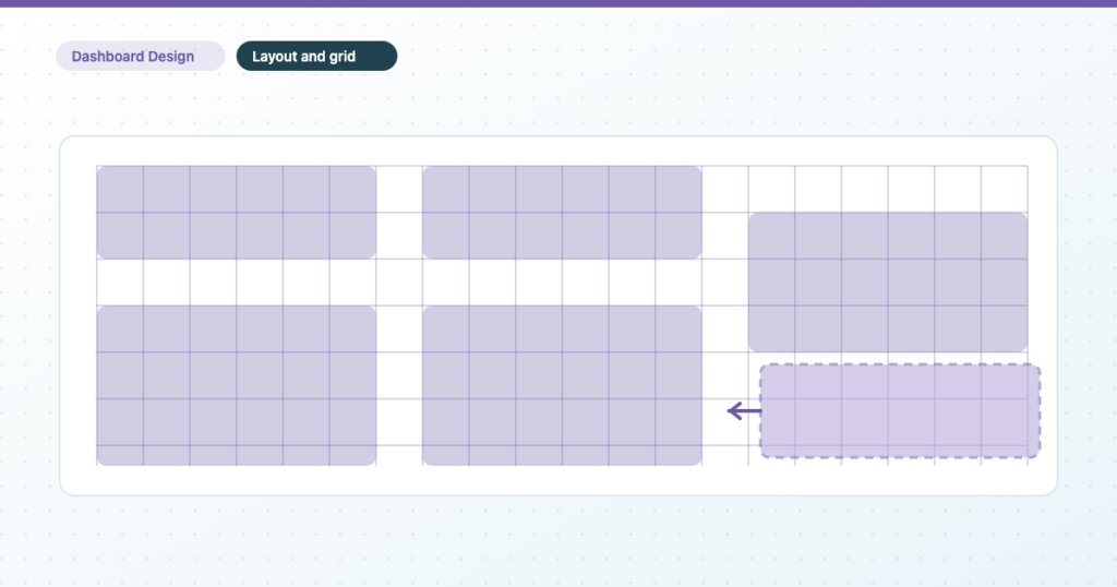
A report that looks “nearly right” is almost never a taste problem. It’s four numbers that were never set, and a menu two levels down that does in one click what people spend twenty minutes doing by eye.
The design principles guide makes the case for why alignment and whitespace matter. This is the mechanical half: where the controls are, what each one actually does, and the two rules that stop them working the way you expect.
Where Data Studio keeps its layout settings
Layout settings live in two places, and knowing which is which saves a lot of confusion.
Theme and layout → LAYOUT holds the report-wide settings: canvas size, display mode, grid settings, snap behaviour, header visibility, navigation type and report-level component position.
Page → Current page settings → STYLE holds the per-page overrides, including a canvas size for that page alone.
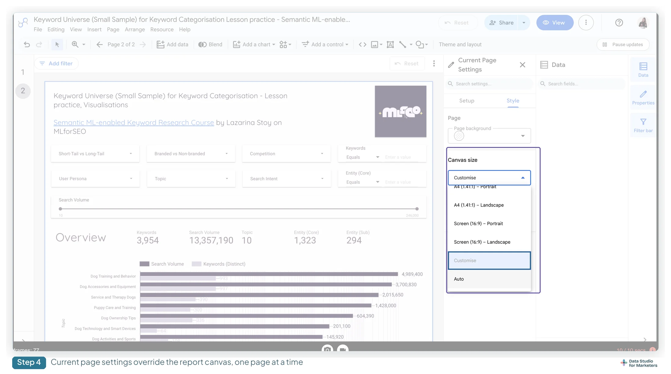
The trap is that a page-level canvas size silently overrides the report one. If a single page in a report is the wrong shape and nothing in Theme and layout explains it, check the page’s own settings before you look anywhere else.
Used deliberately it’s a real tool rather than a hazard. The case it earns its place in: a monthly report whose appendix is a single very long table. Give that one page a tall custom canvas, or Auto, and leave the other eleven on 16:9 — rather than stretching every page to fit the worst one.
Canvas size in Data Studio: six presets, and the dimensions nobody publishes
The canvas is the fixed rectangle your report is drawn on. It also becomes the page size when somebody downloads a PDF, which is the reason to care about it beyond aesthetics.
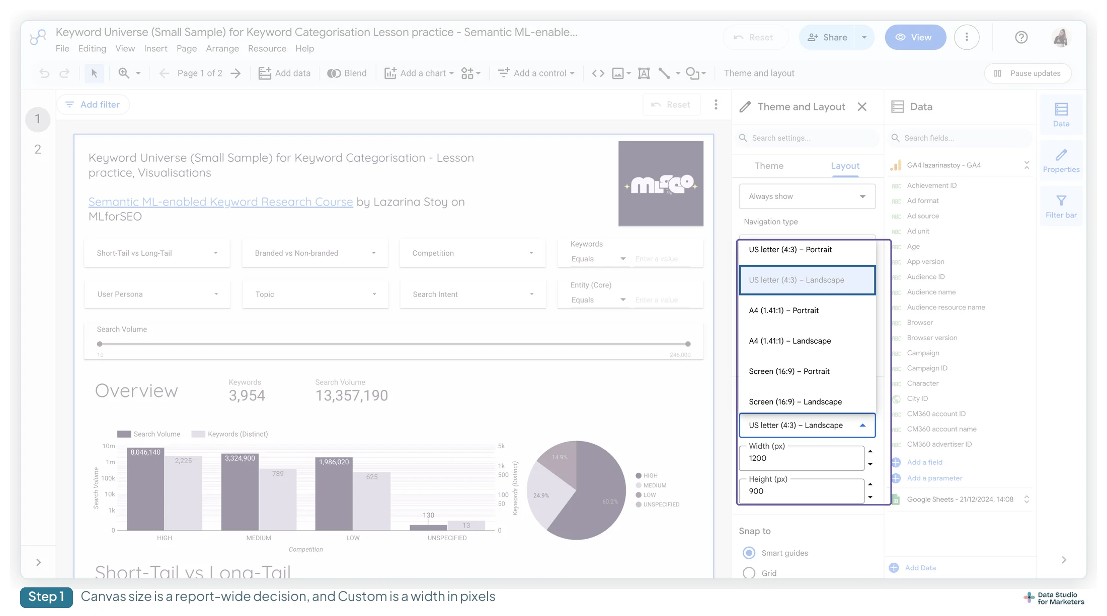
The six presets are US letter (4:3) portrait and landscape, A4 (1.41:1) portrait and landscape, and Screen (16:9) portrait and landscape, plus Custom.
Here is something worth stating plainly: Google documents none of the pixel dimensions behind those presets. They exist only in the width and height fields, which populate when you pick one. I’ve confirmed one in-product — US letter (4:3) Landscape is 1200 × 900 — and the others are derivable from the stated ratios but I haven’t verified them individually, so I’m not going to publish a table that looks more authoritative than it is.
The practical guidance doesn’t depend on the exact numbers anyway. Pick Screen (16:9) Landscape if the report will be read on a laptop, which is most of them. Pick A4 or US letter if the report’s real destination is a PDF that someone will print or drop into a deck — matching the canvas to the paper is what stops the export coming out with a band of white down one side.
Custom accepts anything from 10px up to 2000 × 10,000. The tall end is genuinely useful for a long scrolling single-page report; the narrow end mostly isn’t.
Display mode: what the reader’s browser does with your canvas
Three settings, and they decide what happens when the viewer’s window isn’t the same shape as your canvas.
Fit to width scales the report to fill the browser width. Actual size renders it at the pixel dimensions you set. Has margin controls whether there’s a gap around the canvas edge — and unchecking it is the single change that makes a dark-themed report look like an application rather than a slide sitting on a page.
One caveat I’d rather flag than paper over: the documentation describes Fit to width for the case where the window is wider than the canvas. What it does when the window is narrower — a laptop at a smaller resolution, a half-screen window — isn’t stated, and it’s worth checking with your own report rather than assuming.
Grid settings: the four numbers that are actually your spacing system
This is the section that changes reports. Theme and layout → LAYOUT → Grid Settings holds four values, and almost nobody sets them deliberately.
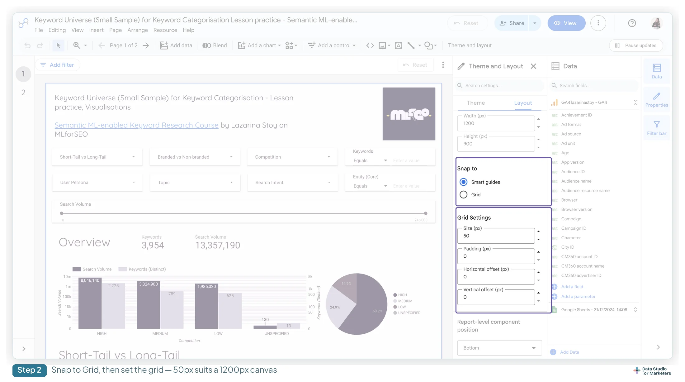
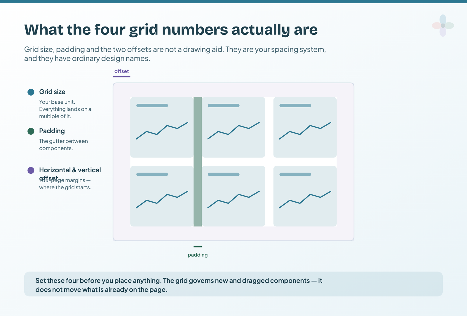
Read them as design decisions rather than as drawing aids and they become obvious:
- Grid size is your base unit. Everything on the page will be a multiple of it.
- Padding is the gutter between components.
- Horizontal and vertical offset are your page margins — where the grid starts relative to the canvas edge.
Set those four once, at the start of a report, and alignment stops being something you fight. Set a grid of 10 and a padding that gives you a visible gutter, and every component you draw afterwards lands where it should.
Two rules make the difference between this working and not:
Changing the grid doesn’t move what’s already there. The grid governs new and dragged components; existing ones stay exactly where you left them. So this is a start-of-report decision, and retrofitting it to a finished report means re-dragging everything.
A grid too fine stops being a grid. Below roughly fifteen pixels the squares are small enough that almost any position snaps to something, which is the same as having no grid at all. If yours is set to 5 because it felt safer, that’s why it isn’t helping.
“Grid” means three different things in Data Studio
Worth disambiguating, because the SERP for this topic is a mess of people answering the wrong question.
The canvas grid is what this section is about — the invisible spacing system. Gridlines are the horizontal rules behind a chart’s data, and they live in that chart’s Style tab. Grid layout is a small-multiples setting on some charts, laying repeated charts out By Pivot or By Row. Three unrelated things, one word.
Snap to Smart guides or Snap to Grid: when each one wins

Under Grid Settings sits a Snap to choice: Smart guides or Grid. They solve different problems and the distinction matters more than it looks.
Smart guides align a component to the other components near it. Drag a chart and you get a red line when its edge aligns with something else, and blue lines with a live pixel readout when its size or spacing matches a neighbour. Excellent for ad-hoc tidying.
Grid aligns to absolute canvas coordinates. Less immediately satisfying, and the only one of the two that makes page two line up with page one — because it’s anchored to the canvas rather than to whatever happens to be nearby.
For a one-page report, smart guides. For a multi-page client report where the header and the first chart should sit in the same place on every page, grid. That’s the whole decision.
The Arrange menu: align, then distribute
The Arrange menu does in two clicks what most people do by eye over several minutes.
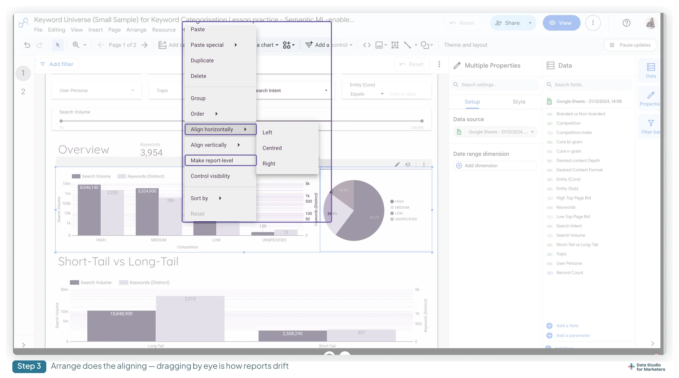
Align needs two or more components selected and lines them up on an edge or a centre. Distribute needs three or more and puts equal space between them. The order matters: align first so they share an axis, then distribute so the gaps match.
A row of six scorecards placed by hand and then aligned-and-distributed is the single most visible improvement available in a Data Studio report, and it takes about four seconds. The scorecard guide covers what goes in them.
Two shortcuts worth having in your hands rather than in a menu: hold Shift while dragging a component to constrain it to one axis, and hold Alt (Option on a Mac) while dragging to duplicate it in place. Between those and Align, a row of matched cards takes longer to describe than to build.
Arrange also holds ordering — bring forward, send backward — and grouping. Grouping is worth knowing for a reason beyond tidiness: a filter control inside a group only filters that group, which is the cleanest way to scope a control to part of a page.
Report-level components in Data Studio, and the trap that hides them
Select a component and use Arrange → Make report-level and it appears on every page. One logo, one date-range control, one navigation bar — maintained once instead of copied eight times and drifting out of sync.
Then the trap. Report-level components sit behind page-level ones by default, so if your page has a background shape, your report-level nav bar is now invisible and unclickable. The fix isn’t obvious and it isn’t where you’d look: Theme and layout → Report-level component position, switched to Top.

That one setting is the answer to a surprising share of “my navigation bar doesn’t work” questions. Adding a navigation menu to a report goes into the rest of it.
None of this applies to a responsive Data Studio report
Worth knowing before you spend an afternoon on grid settings. If your report uses the responsive layout rather than the default freeform one, canvas size, grid settings and snap-to are all unsupported — the canvas sizes itself to its contents and the grid is fixed at a 12-column layout you don’t control. Report-level components and grouping are unavailable too.
That’s not a reason to avoid responsive reports, but it is a reason to choose deliberately rather than discover it halfway through — the two layout modes and the trade-off between them are covered in the guide to the Data Studio interface.
Making a layout stick across a whole report
Three small things that save the most time on a long report.
Paste style only. Copy a styled component, then paste its styling onto another without touching its data. The fastest way to make eight charts match.
Multi-select and edit together. Select several components and the properties panel shows the settings they have in common; change one and it applies to all of them.
Search settings. The properties panel has a search box. When you know the setting exists but not which tab it’s on — which is most of the time — it’s faster than hunting.
A fifteen-minute layout setup for a new Data Studio report
- Pick the canvas size from where the report will be read, not from habit
- Set grid size, padding and both offsets before adding anything
- Choose Snap to Grid if the report will have more than one page
- Decide header visibility and navigation type now, while the canvas is empty
- Place the logo and date control, then make them report-level
- Set Report-level component position to Top, before you discover you needed to
- Build the first page, then align and distribute everything on it
- Copy that page as the basis for the rest
Frequently asked questions
What canvas size should a Data Studio report use?
Screen (16:9) landscape for anything read on a laptop, which is most reports. A4 or US letter if the report’s real destination is a PDF someone will print or paste into a deck — the canvas becomes the PDF page size, so matching it is what stops the export coming out with a white band down one side.
Why doesn’t changing the grid move my existing charts?
Because it isn’t meant to. Grid settings govern components you add or drag afterwards, not ones already placed. That makes it a start-of-report decision: retrofitting a grid to a finished report means re-dragging everything on it.
Why is my report-level navigation bar invisible or unclickable?
Report-level components sit behind page-level ones by default, so a page background shape covers them. Fix it in Theme and layout by setting Report-level component position to Top. It is not a layering problem you can solve with bring-to-front on the component itself.