

Data storytelling for marketers
Most writing on data storytelling is for data teams presenting quarterly. Marketers ship a report every month to someone who half-reads it. This is written for that.

Most writing on data storytelling is for data teams presenting quarterly. Marketers ship a report every month to someone who half-reads it. This is written for that.

Most metrics survive one “so what”. A few survive two. The ones that reach three are the reason anybody opens the report. A test you can run on an existing dashboard in twenty minutes.
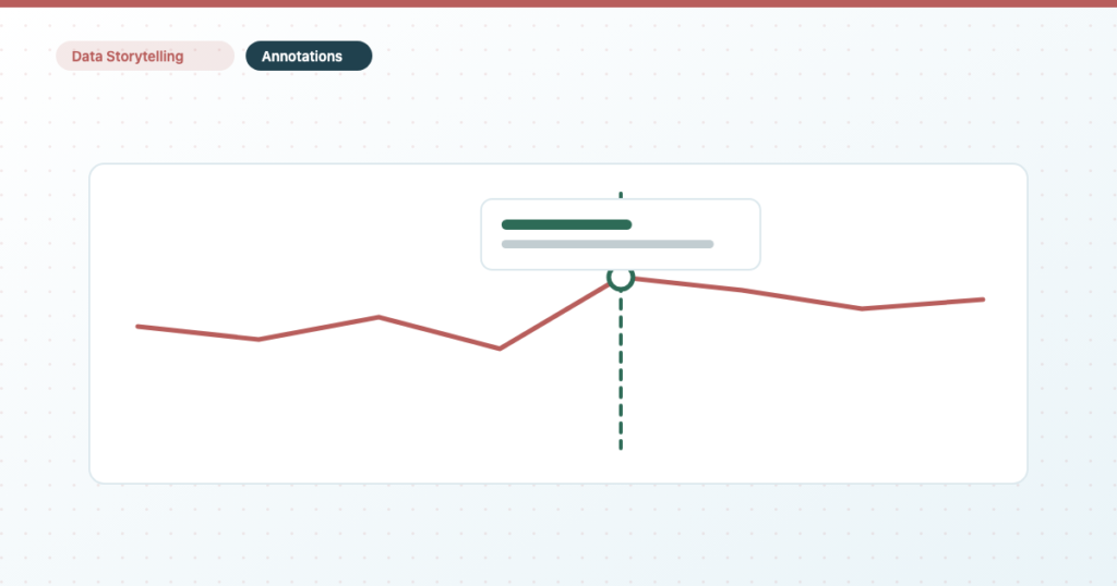
A spike with no explanation generates a question; a spike with a label generates a decision. Four ways to annotate, compared — and the discipline that stops an annotation becoming a claim you can’t support.
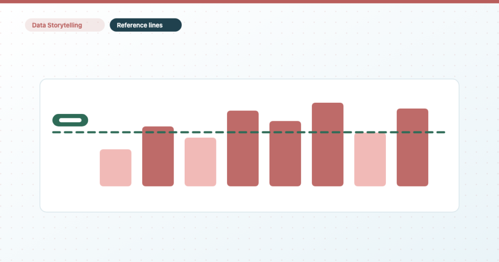
Twenty seconds to add and most client reports don’t use them. What you can put a line on, the four kinds of target including the parameter nobody covers, and why you can’t mark a date.

Most client reports are made entirely of lagging KPIs, which is why every meeting becomes an explanation of the past. What to stop reporting, what to report instead, and how to make the swap visible in the report itself.

You already have the dashboard, it has the right numbers, and nobody reads it. That is a structure problem. The frameworks that actually apply to marketing reports, which to use when, and how to retrofit the report you have.
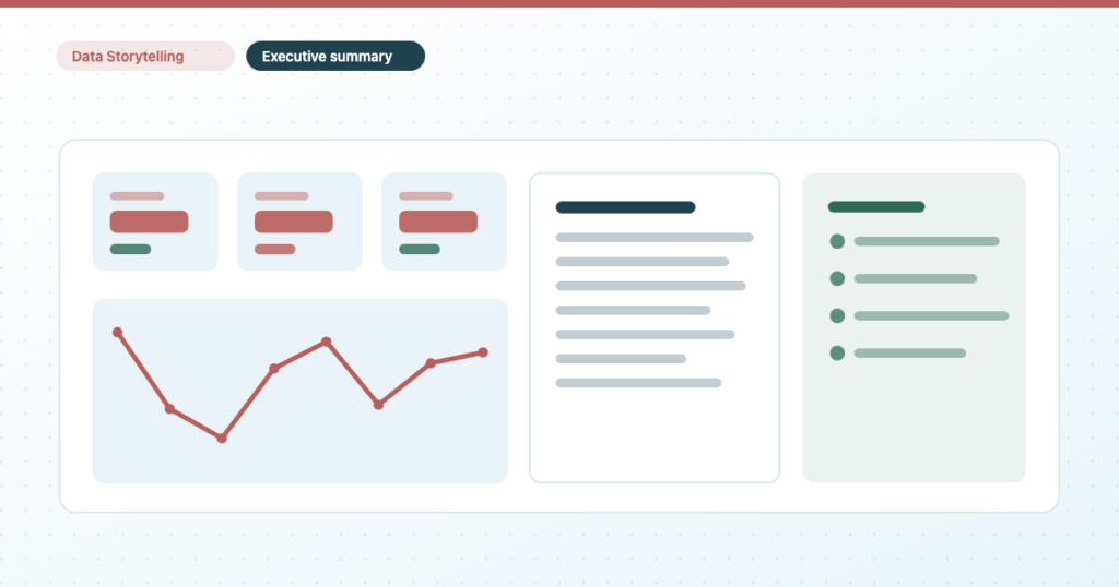
Every other page in your report answers what happened. This one answers what to do about it — and only works if a reader gets that in five seconds. What earns a slot, how to build it, and how to write the summary.

A filter is a decision you make for the viewer; a control hands it to them. All the control types — there are more than six — scoping, cross-source filtering, and why your drop-down is empty.

Adding the control takes ten seconds. The confusing part is that three different places can set a date range, and the most specific one always wins — which explains almost every chart that ignores it.

Not an academic distinction: editing the wrong kind of data source silently changes reports you have never opened. The chain from dataset to report, and the two one-way doors in it.

Six ways to get a report in front of someone, and picking the wrong one is why your client can’t open it. Includes what changed in scheduled delivery, and why schedules stop working weeks later.
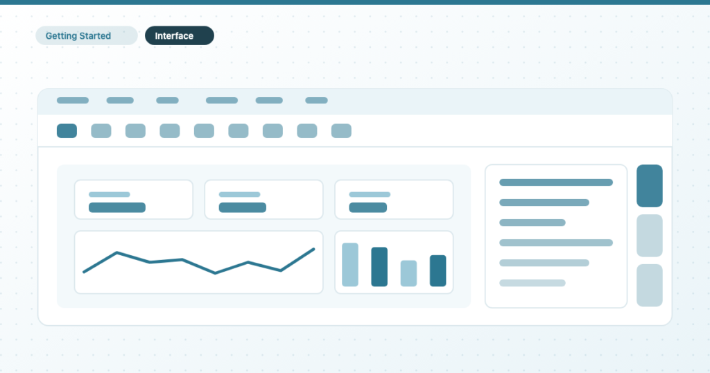
Four regions, and once you know which one owns which decision the tool stops feeling large. Plus the Setup vs Style rule that saves the most time, and four features most people never find.