
The Data Studio dashboard examples worth copying are the ones you can open, copy and take apart. Below are 14 real dashboards from the library, each analysed for its layout, how it frames its KPIs and why its charts are the right ones, with the one move you can take into your own report.
Galleries of screenshots are pleasant to scroll, but you can’t see how a chart was built or why a number sits top-left. Every example here opens as a working Data Studio (formerly Looker Studio) report. I’ve grouped them by the kind of question they answer (performance against a period, rankings, channel comparison, funnels, audits), and credited every builder. Then: a side-by-side of how three builders tackle the same Google Business Profile report, four moves that turn any template into your report, and how to study one in the editor.
What to look at in any dashboard example
Before the examples, four things to check. They’re rarely what people notice first, and they’re where the good decisions live.
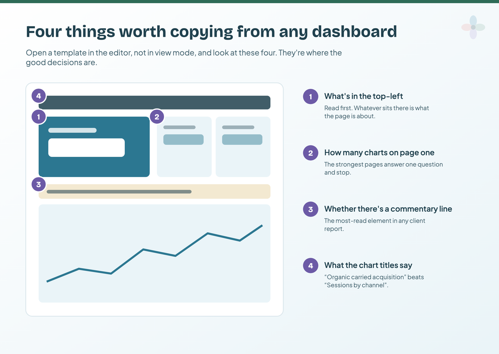
- What’s in the top-left. It’s read first. Whatever sits there is what the page is about, intended or not.
- How many charts are on page one. The strongest pages answer one question and stop.
- Whether there’s a commentary line. The most-read element in any client report.
- What the chart titles say. “Organic carried acquisition this month” says more than “Sessions by channel”.
Those four come from the dashboard design principles guide, and they make a better checklist than any gallery.
Six layouts the strongest examples are built on
Across the examples below, the same six layouts keep coming back. Each one answers a different kind of question, which is the useful way to choose between them: start from the question your reader asks, then pick the layout.
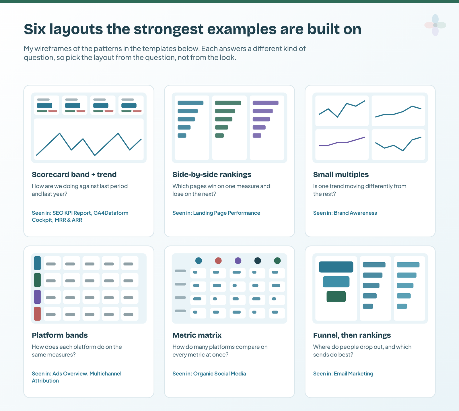
| Layout | The question it answers | Example below |
|---|---|---|
| Scorecard band + trend | How are we doing against last period and last year? | SEO KPI Report, GA4Dataform Cockpit, MRR & ARR |
| Side-by-side rankings | Which items win on one measure and lose on the next? | Landing Page Performance |
| Small multiples | Is one trend moving differently from the rest? | Brand Awareness |
| Platform bands | How does each platform do on the same measures? | Ads Overview, Multichannel Attribution |
| Metric matrix | How do many platforms compare on every metric at once? | Organic Social Media |
| Funnel, then rankings | Where do people drop out, and which sends do best? | Email Marketing |
How these examples were chosen
I looked at the dashboard image of every candidate in a library of 255 templates on 13 October 2026, and kept the ones where a design decision is visible and worth copying. I also read the 17 pages that rank for “dashboard examples” and “report examples” searches, and ten forum threads where people ask for examples. None of the 17 pages analyses the design of a real dashboard; most list what each one contains. The most common requests in those threads were examples people can open and copy (4 of the 10 threads), help with navigation across pages (4), and what goes at the top (3).
| I kept an example if | Why |
|---|---|
| Its first screen answers a question you can name | That’s the decision you’re copying |
| It opens as a real report you can copy | You can check how each chart was built |
| It covers a channel the others don’t | SEO, GA4, paid, social, email, CRM, local, revenue |
| The builder is credited and linked | Every example links to its creator’s profile |
14 Data Studio dashboard examples, analysed
All fourteen at a glance: what each covers, what it runs on and who it suits. Google’s own connectors are free; everything else needs the builder’s connector, each of which has a free tier or a free trial.
| Example | Channel | Runs on | Suits |
|---|---|---|---|
| SEO KPI Report | SEO | Google’s GA4 and Search Console connectors | SEOs sending a monthly report |
| GA4Dataform Cockpit | GA4 / ecommerce | BigQuery (Google’s connector) | Analysts with GA4 in BigQuery |
| Landing Page Performance | SEO + GA4 | Coupler.io | Content and SEO teams |
| Keyword Rank Tracker | SEO | Windsor.ai | SEO specialists |
| MRR & ARR | Revenue | Coupler.io (Stripe) | SaaS and subscription teams |
| Multichannel Attribution | Paid media | Windsor.ai | Cross-channel teams |
| HubSpot | CRM | Windsor.ai | B2B sales and marketing |
| Brand Awareness | Brand | Coupler.io | Brand and comms teams |
| Ads Overview | Paid media | Catchr | Agencies with multi-platform clients |
| Organic Social Media | Social | Supermetrics | Social media managers |
| Google Ads vs Facebook Ads | Paid media | Supermetrics | Anyone splitting search and social budget |
| Email Marketing | Coupler.io | Email marketers | |
| GA4 Audit | GA4 | Google’s GA4 connector | Anyone inheriting a GA4 property |
| Business Profile, three ways | Local | Catchr, Supermetrics, Windsor.ai | Local SEO and multi-location brands |
SEO KPI Report: two comparisons on every number
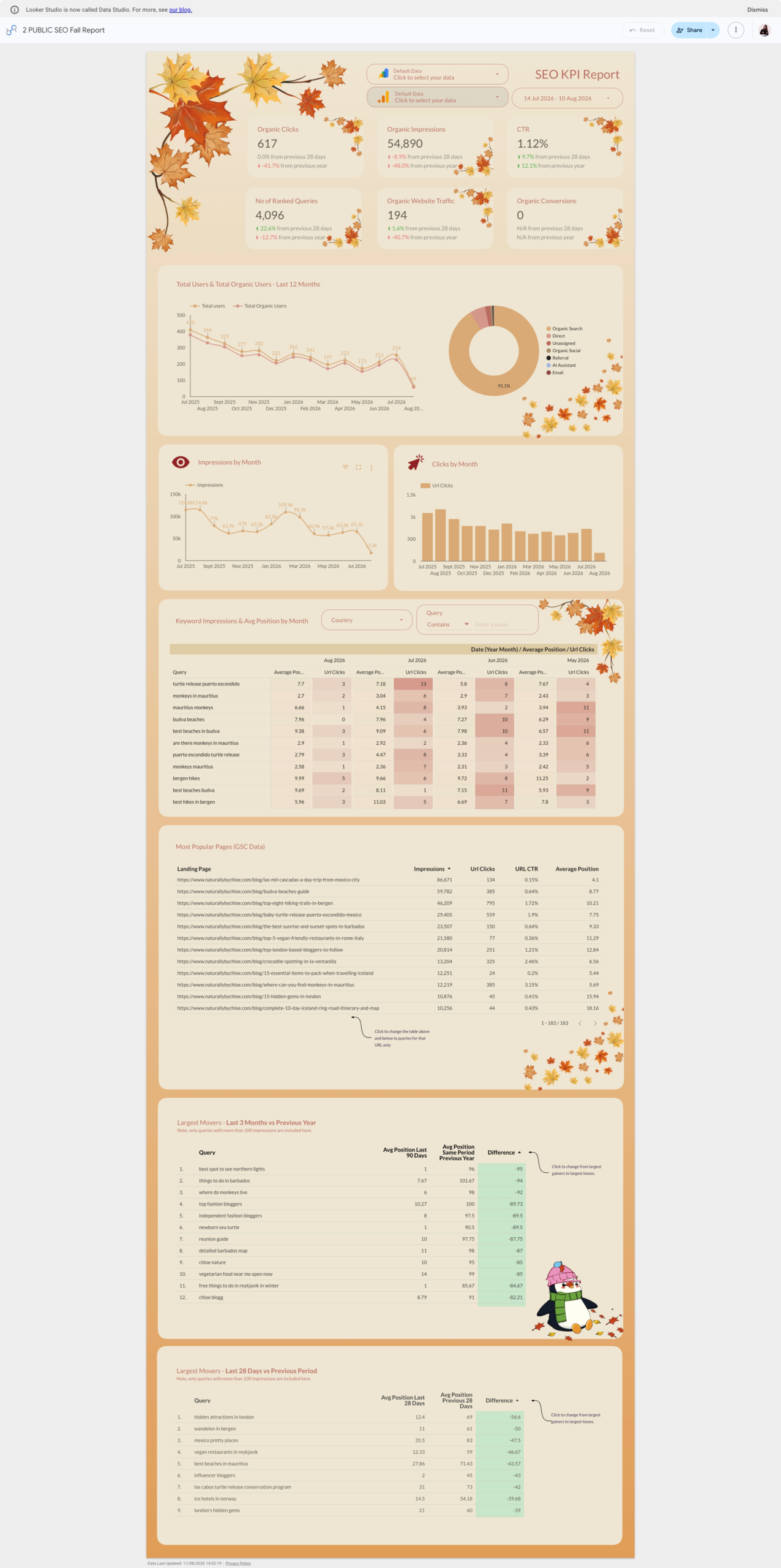
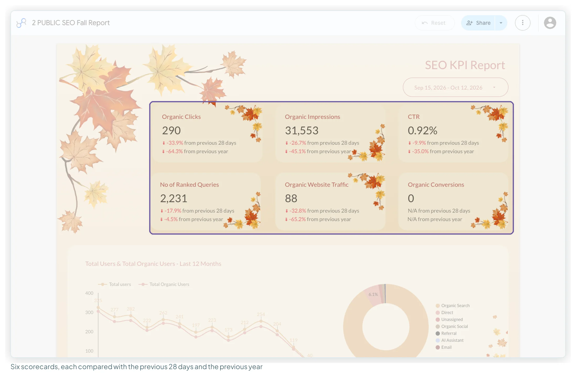
Layout: a classic top-down read. Six scorecards in two rows (clicks, impressions, CTR, ranked queries, organic traffic, conversions), then a 12-month trend with a channel donut, then monthly impressions and clicks side by side, then the keyword and page tables, and finally two “largest movers” tables. KPI framing: each scorecard shows its change from the previous 28 days and from the previous year, so a seasonal dip doesn’t read as a crisis. Chart choices: the keyword table is a monthly pivot with a heatmap, which makes position changes visible without a chart per keyword.
Two details are worth stealing outright. A pair of data controls at the top lets anyone viewing the report point it at their own GA4 property and Search Console site. And the movers tables carry hand-drawn notes (“click to change from largest gainers to largest losses”) telling the reader how to use them.
Take from it: give every headline number two comparisons, one short-term and one year-on-year. The scorecard guide covers the comparison settings. Built by Chloe Christine, on Google’s own GA4 and Search Console connectors.
GA4Dataform Cockpit: one column per KPI
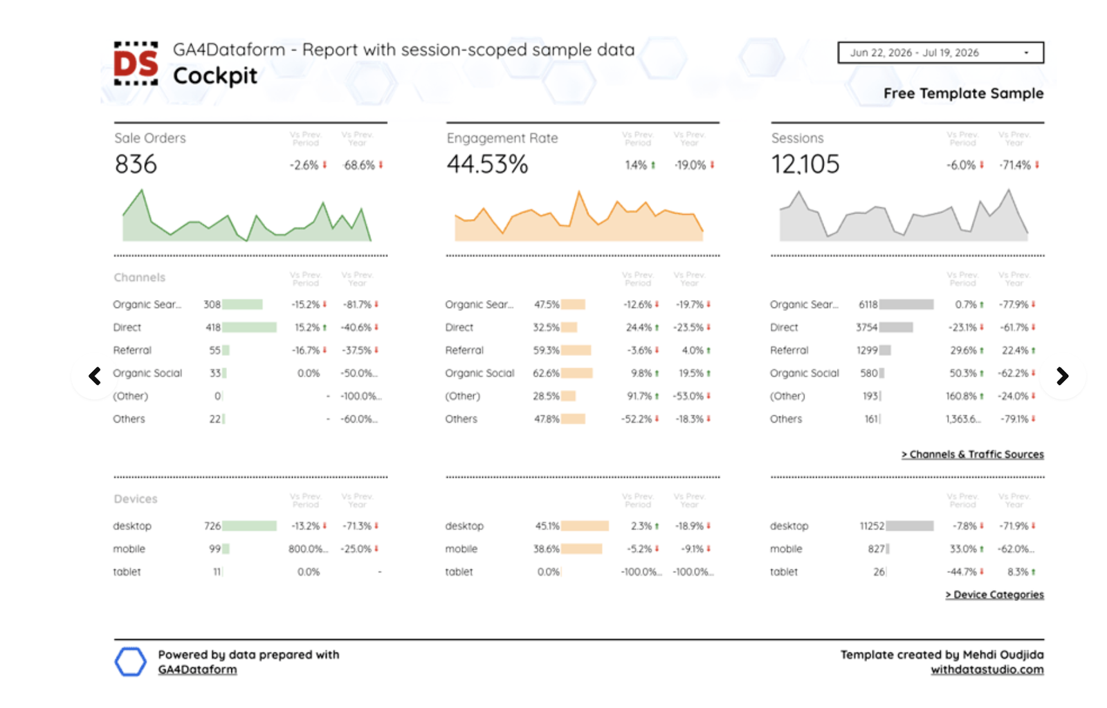
Layout: three columns, one per KPI, and each column is a complete mini-report: the number, its change against the previous period and the previous year, a sparkline, then the same channel and device tables underneath. Reading across compares the KPIs; reading down explains one. KPI framing: both comparisons sit in small labelled columns beside every row, not just the headline. Chart choices: sparklines instead of full line charts keep the trend present without stealing the page, and “Channels & Traffic Sources” and “Device Categories” links send the reader to detail pages.
Take from it: repeat one structure per KPI, so the reader learns the pattern once and reads the rest at speed. Built by Mehdi Oudjida, on BigQuery (GA4 data modelled with GA4Dataform).
Landing Page Performance: three rankings side by side
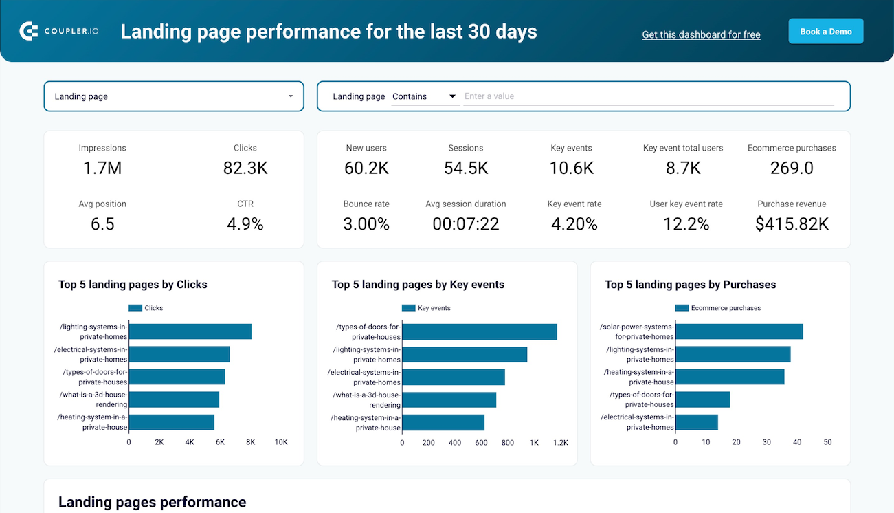
Layout: a landing-page filter across the top, then two groups of scorecards, Search Console’s on the left and GA4’s on the right, then three bar charts in a row. KPI framing: grouping the scorecards by source tells the reader which numbers come from search and which from the site, without a label. Chart choices: the three charts rank the same pages by clicks, by key events and by purchases. A page that ranks first for clicks and nowhere for purchases is the finding, and the layout shows it without a sentence of explanation.
Take from it: rank the same items by different measures, side by side. Built by Coupler.io, on its connector for Search Console and GA4.
Keyword Rank Tracker: one question per page
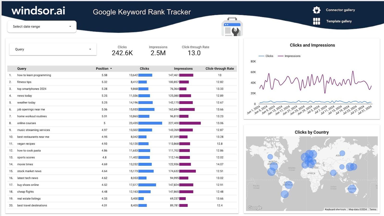
Layout: everything on the page answers “how are our queries doing?”. Nothing about sessions or conversions; those belong on another page. KPI framing: three scorecards only (clicks, impressions, CTR), beside the query selector. Chart choices: the table carries inline bars for clicks and impressions, so it reads as a chart and a table at once, and the map answers “where” without another table.
Take from it: one question per page, and bars inside the table when the list itself is the answer. Built by Windsor.ai, on its Search Console connector.
MRR & ARR: the numbers finance already has
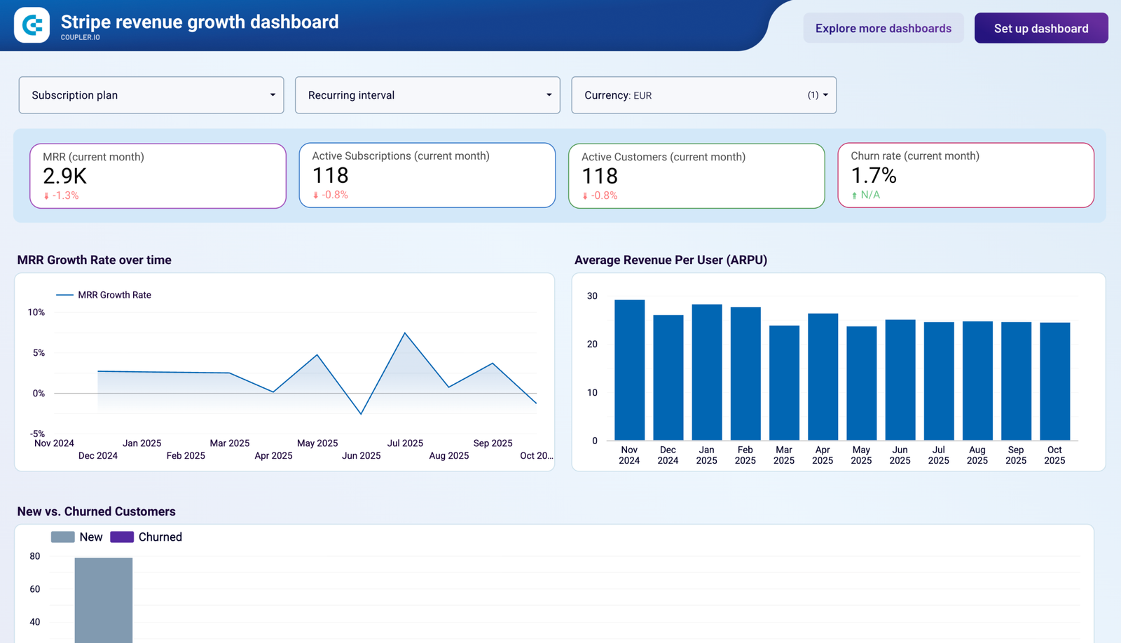
Layout: filters for subscription plan, billing interval and currency, then four scorecards, then three charts. KPI framing: every scorecard says “(current month)” in its title, so nobody has to guess the period. Chart choices: MRR growth as a line (rate over time), ARPU as bars (a value per month), new versus churned as paired bars (two flows to compare).
Take from it: report the number the finance team already has, from the payment processor, so it reconciles. A marketing report whose revenue matches finance’s earns a great deal of trust. Built by Coupler.io, on its Stripe connector.
Multichannel Attribution: four platforms on one scale
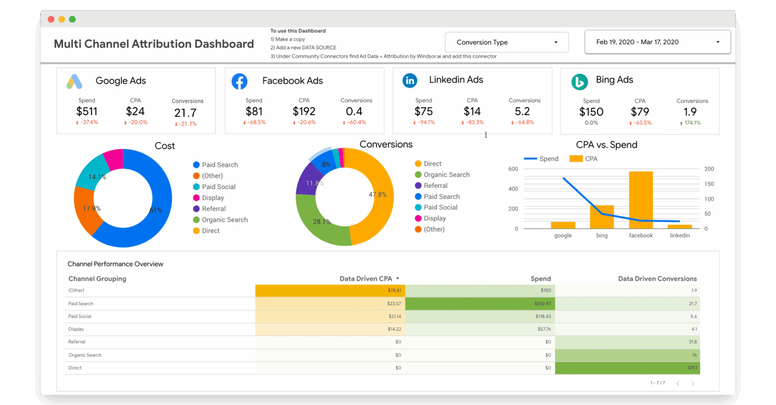
Layout: four platform cards in a row, each with the same three measures, then two donuts, a CPA-versus-spend combo chart, and a channel table. KPI framing: every platform reports spend, CPA and conversions, in that order, so the row is comparable at a glance. Chart choices: the combo chart puts CPA (bars) and spend (line) on one axis pair, which is how you spot a platform where more money buys more expensive conversions. The table heatmaps data-driven CPA. The builder also wrote the setup steps on the canvas itself.
Take from it: decide which measures are comparable across platforms before you build, then show only those in the comparison row. Built by Windsor.ai, on its connectors for four ad platforms.
HubSpot: who the customers are, before how they perform
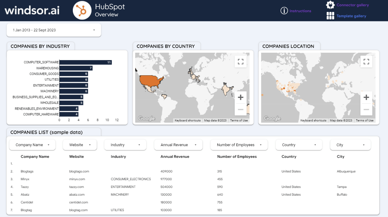
Layout: the page opens with segmentation (industry bars, a country map and a location map), and the company list sits below with a filter above each column. KPI framing: deliberately none at the top. For a B2B client, “who are our customers” is often the question behind the question. Chart choices: a filled map for countries and a bubble map for cities: two maps, two different jobs.
Take from it: put segmentation before metrics when the client’s real question is about their customers. Built by Windsor.ai, on its HubSpot connector.
Brand Awareness: small multiples
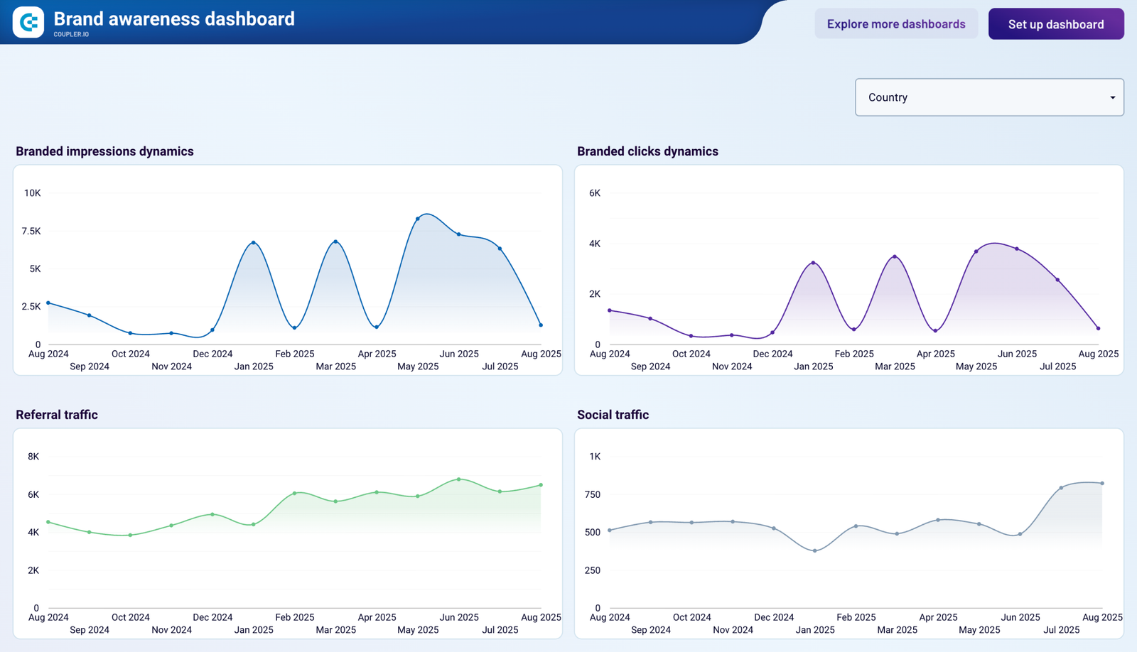
Layout: four charts at the same size, on the same monthly axis, with one country filter for all four. Chart choices: the eye compares shapes, not numbers, so a channel that rises while the others fall stands out at once. One thing to keep in mind when reading it: each chart has its own vertical scale, so compare the shapes and the timing, not the heights.
Take from it: a grid of matching trends beats one crowded line chart when the question is “which one is moving differently?”. Built by Coupler.io, on its connectors for ads and Search Console.
Ads Overview: one band per platform
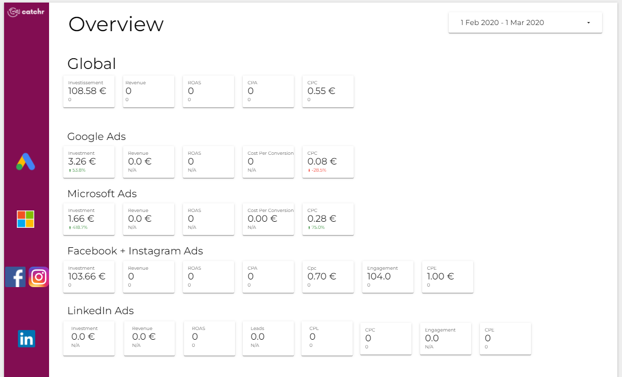
Layout: a global band first, then one band per platform. A coloured rail down the left carries each platform’s logo level with its band, so the logo is the row label. KPI framing: investment, revenue, ROAS, CPA and CPC in the same order every time; LinkedIn adds leads and cost per lead, because that’s what LinkedIn is bought for. Chart choices: scorecards only, which suits a page whose job is comparison, not trend.
Take from it: consistent bands, so reading down the page compares like with like. Built by Catchr, on its connectors for four ad platforms.
Organic Social Media: a metric matrix that admits its gaps

Layout: platforms across, metrics down, with platform icons at the top and repeated at the bottom so the columns stay identifiable on a long page. KPI framing: under each engagement figure, the template says what “engagement” means on that platform (reactions, shares and comments on one; saves and pin clicks on another). Chart choices: none, on purpose. Where a platform doesn’t report a metric, the cell says “Not available” instead of showing zero.
Take from it: define the metric where platforms disagree, and show a gap as a gap. Built by Supermetrics, on its connectors for six social platforms.
Google Ads vs Facebook Ads: one colour per platform, everywhere
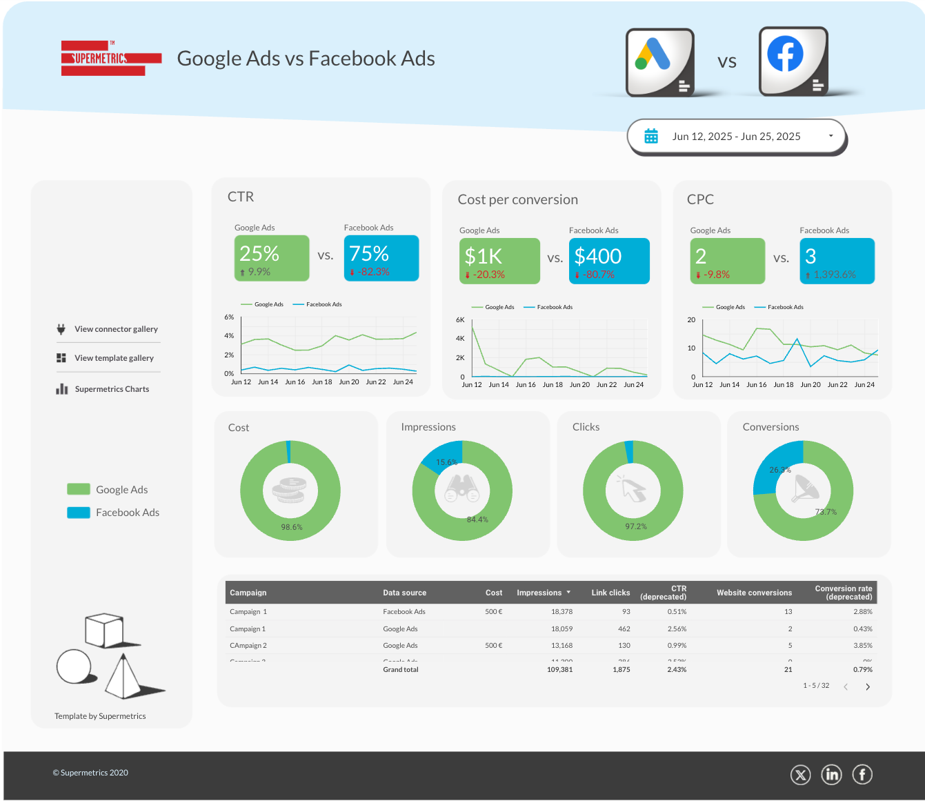
Layout: a header with the two logos and “vs”, then three pairs of scorecards with a trend under each pair, then four donuts and a campaign table. KPI framing: each measure appears as a pair, so the comparison is the unit, not the single number. Chart choices: Google Ads is green and Facebook Ads is blue in every scorecard, line and donut, with a legend on the left rail. Once the reader learns the colours, they never need the legend again.
Take from it: give each entity one colour and hold it across the whole report. The colour palette guide shows how to fix colours to dimension values. Built by Supermetrics.
Email Marketing: the funnel first
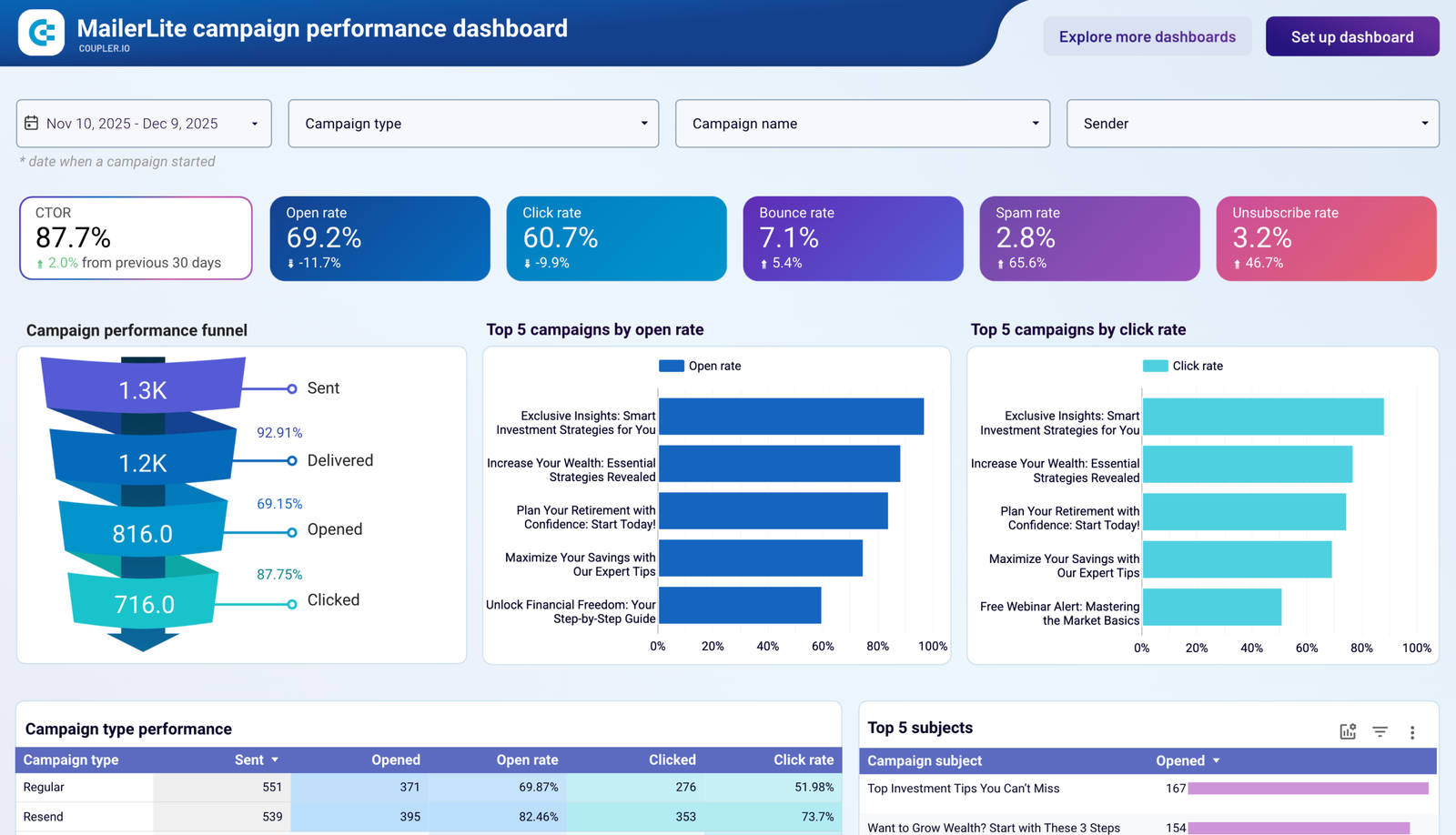
Layout: four filters (date, campaign type, campaign name, sender), six rate scorecards, then the funnel on the left with the two ranking charts beside it. KPI framing: the funnel labels the conversion between each step, so the reader sees where people drop out, not just how many are left. Chart choices: rates as scorecards (comparable across sends of any size) and counts in the funnel (where size is the point).
Take from it: label the step-to-step rate between funnel stages. Built by Coupler.io, on its email connectors (Klaviyo, Mailchimp, MailerLite).
GA4 Audit: a status board, not a report
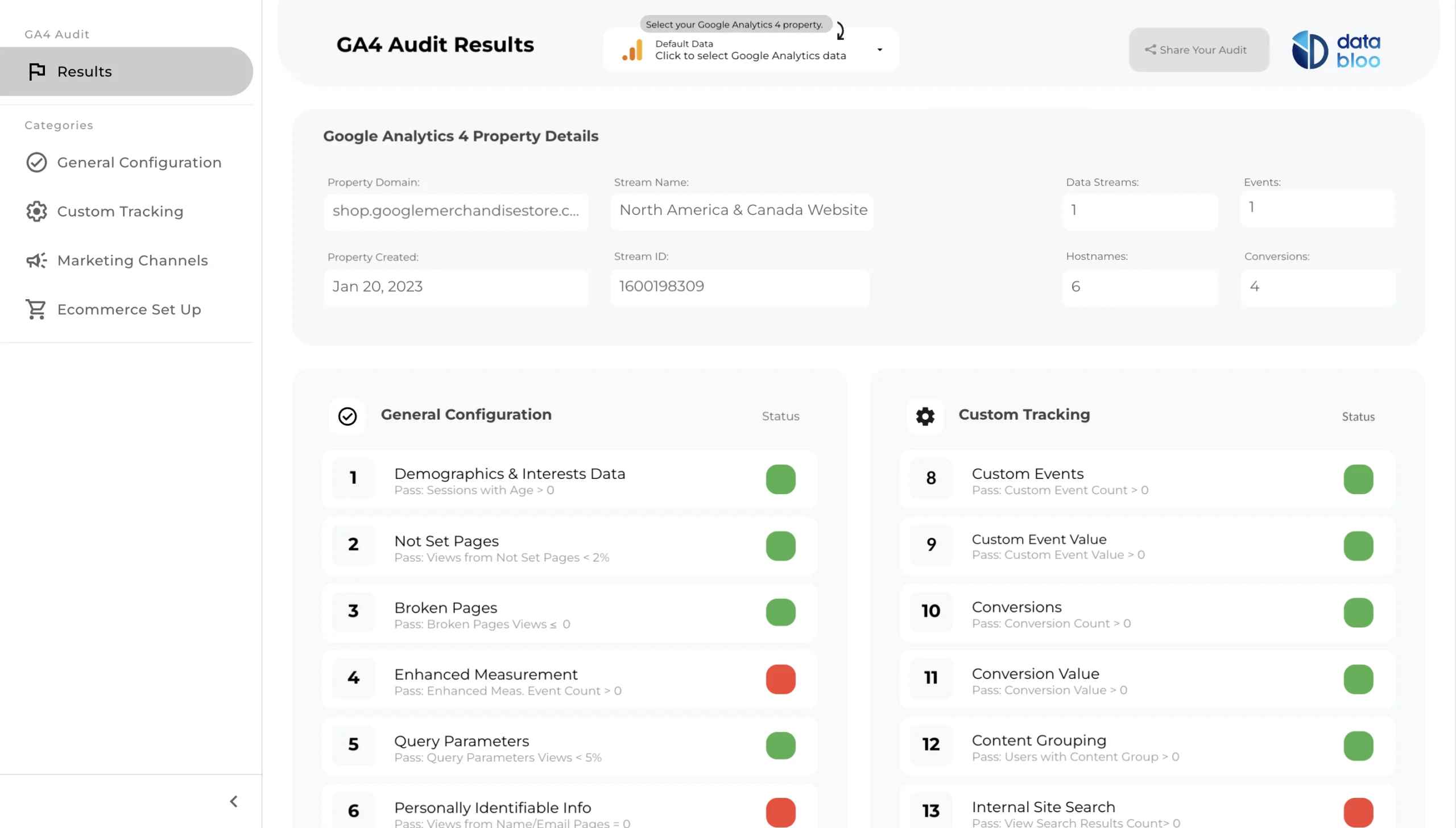
Layout: a left-hand list of check categories, the property’s details at the top, then numbered checks in two columns. KPI framing: there are no KPIs; each row is pass or fail. Chart choices: a coloured dot per check, with the pass rule written in small type beneath it (“Pass: …”), so the reader can see why a check failed. A data control at the top lets you pick your own property.
Take from it: write the rule next to the status, so red means something the reader can act on. Built by Data Bloo, free, on Google’s GA4 connector.
Same data, three builders: Google Business Profile
The library has five templates with Business Profile (or its old name, Google My Business) in the title, one from each of five builders. Three of them show how much layout decides what a report is for.
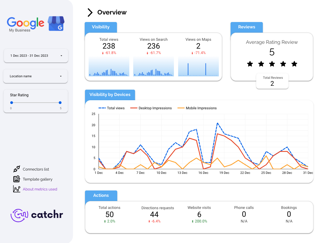
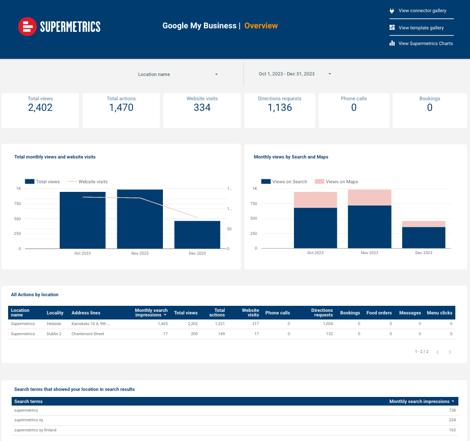
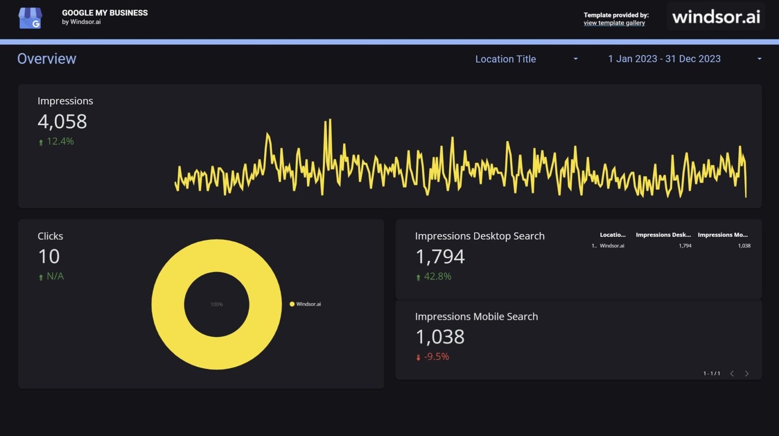
| Builder | Leads with | Best for |
|---|---|---|
| Catchr | Visibility, then reviews, then actions | A one-location monthly story |
| Supermetrics | A location selector and an actions-by-location table | Comparing branches |
| Windsor.ai | One large impressions trend | A quick health check |
Take from it: the same data makes three different reports. Choose by your reader’s question. All three need a connector, because Google builds none for Business Profile.
If you’d rather start from a premium template
The library also carries 40 premium templates, sold by their creators. Data Bloo’s Digital Performance Master is one, and it shows a navigation pattern worth knowing.
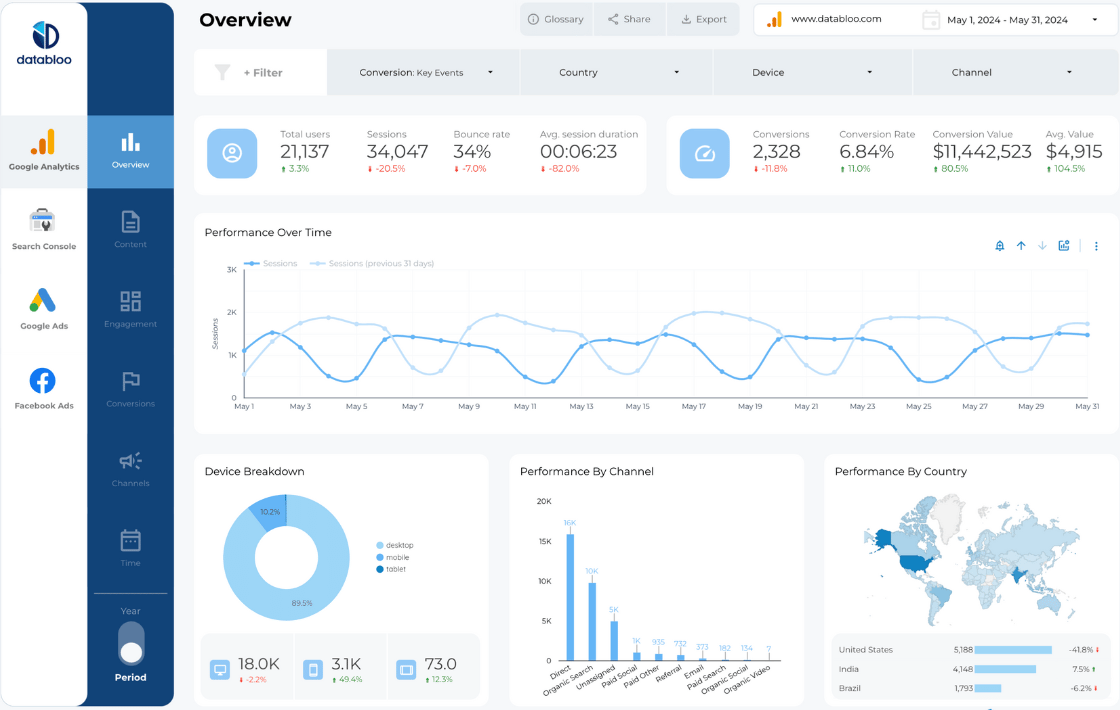
Layout: a two-level rail on the left: data sources first (Google Analytics, Search Console, Google Ads, Facebook Ads), then the pages for each (overview, content, engagement, conversions, channels, time). Filters for conversion, country, device and channel run across the top. KPI framing: two scorecard groups with icons, each with a change figure. Take from it: navigation by source, then topic, which the navigation guide calls a hierarchy rather than a list of pages.
Google’s own Report Gallery, as a source of examples
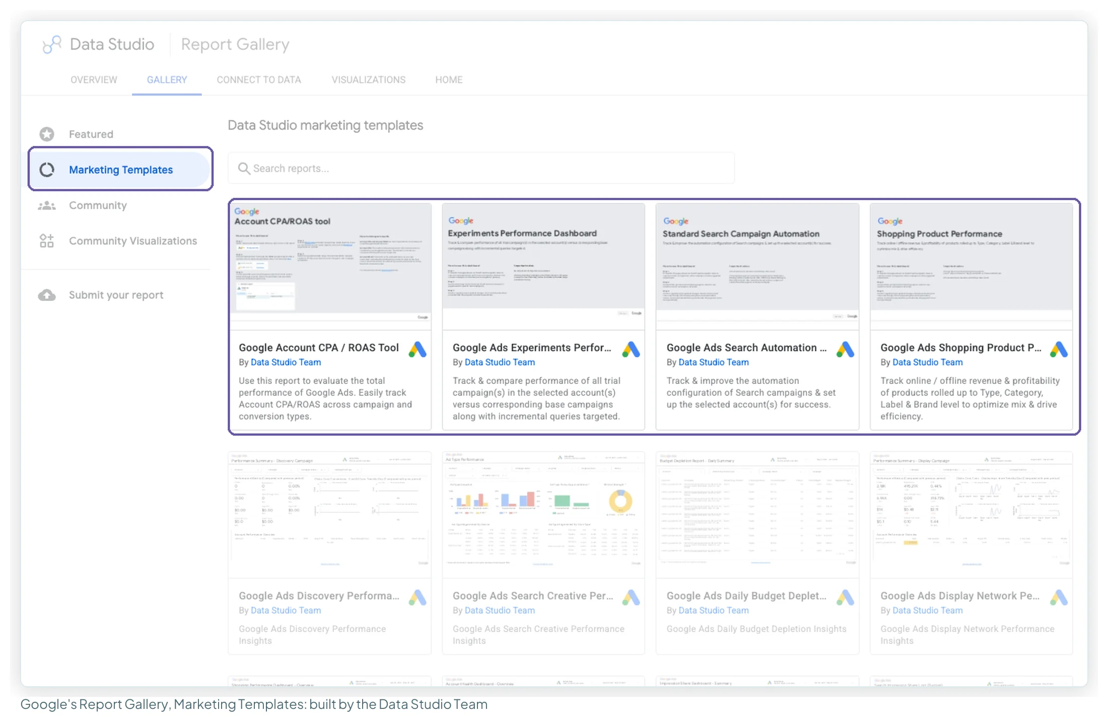
Google keeps its own gallery of featured, marketing and community reports. The marketing templates are built by the Data Studio Team and lean heavily towards Google Ads, so they’re a good source for Ads-specific layouts (budget, search automation, shopping). The Featured and Community sections are where you’ll find work from independent builders, Data Bloo among them.
Four moves that turn a template into your report
A good template arrives complete: a broad set of metrics, laid out and styled. That’s exactly what you want on day one, and it’s why starting from one saves a day. These four take about twenty minutes and turn a complete report into your report.
| Move | Why | Where in Data Studio |
|---|---|---|
| Put your client’s key number top-left | A template leads with the most universal metric; you know which one this client opens the report to find | Drag it there and make it the largest thing on the page |
| Rewrite chart titles as findings | “Paid is cannibalising brand search” is the line a client repeats in their own meeting | Chart → Style → Chart title |
| Emphasise one series per chart | Templates show the full palette so you see what’s available; pick what matters this month | Grey the rest, one click per chart |
| Add a commentary box | The one thing no template can ship, because only you can write it | Insert → Text, at the top of each page |
For the top-left number and the commentary line together, an executive summary page is the natural home, and the “so what?” test is a quick way to decide which charts earn their place. The seven report makeovers in my ebook, Data Storytelling in Data Studio, make these moves on full reports, from an SEO monthly to an executive QBR, one decision at a time.
How to study a dashboard properly
View mode tells you almost nothing about how a report was built. Copy the template into your own account and open the editor.

- Make a copy from the ⋮ menu and map every data source (the copy guide covers the details).
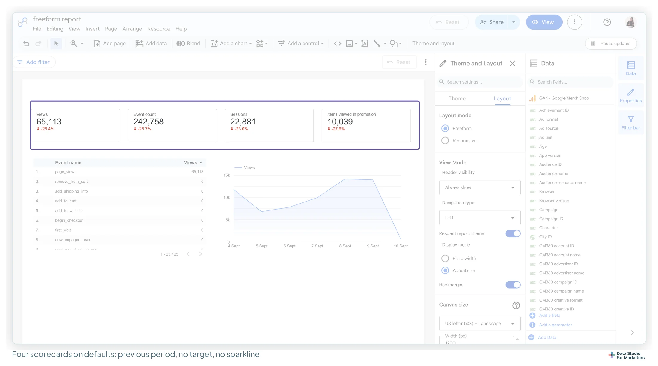
- Check canvas size and grid first: Theme and layout → Layout. A report built on a set grid looks aligned for a reason, and that reason is copyable.
- Look at the theme before the charts. The palette, the font and the positive and negative change colours are where the visual consistency comes from.
- Open one chart’s Setup tab and see which dimension it breaks on. It’s often not the obvious one.
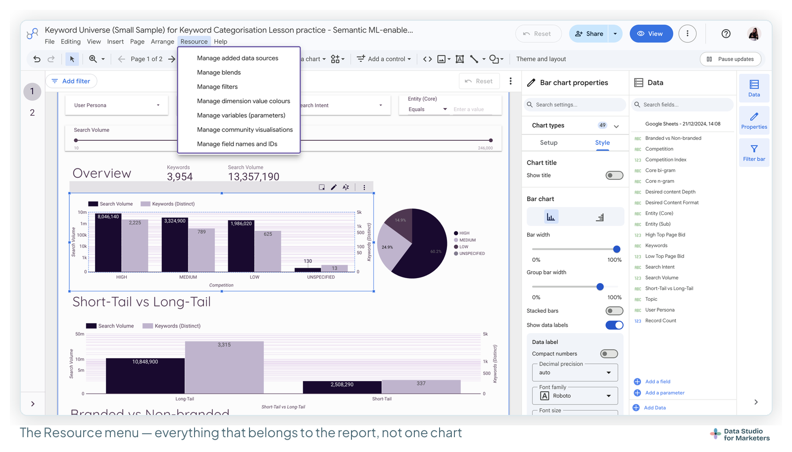
- Find the calculated fields in the Data panel’s field list (Add a field is where new ones go), and in each data source via Resource → Manage added data sources. This is the intellectual content of most good templates, and it’s invisible from the front.
- Note what’s a control and what’s fixed. A date control or a data control at the top, versus a hard-coded range, tells you who the builder expected to use it.

Twenty minutes doing that on one good template teaches more than an afternoon of scrolling screenshots. The best free templates, sorted by job is a good place to pick one, and every example above opens from its own template page.
Frequently asked questions
Where can I find Looker Studio dashboard examples I can actually open?
Every example on this page opens as a real Data Studio report you can copy, from its template page in the library (255 templates, 215 of them free). Google’s own Report Gallery has featured, marketing and community reports too. Copy one into your own account and study it in the editor rather than in view mode.
What should go at the top of a dashboard?
The number the reader opens the report to find, with its comparison. Most of the examples here follow scorecards first, trends second, detail tables last. The SEO KPI Report and the GA4Dataform Cockpit add a year-on-year comparison to every headline number.
Do I need a paid connector to use these examples?
Only for data Google doesn’t connect. The SEO KPI Report, GA4 Audit and GA4Dataform Cockpit run on Google’s own free connectors. The ads, social, email, CRM and Business Profile examples run on a connector from Coupler.io, Windsor.ai, Catchr or Supermetrics, each with a free tier or a free trial.
Can one template serve several client accounts?
Yes, for Google data. A data control lets the person viewing the report switch it to another account or property they have access to; it works with Google sources such as GA4, Google Ads, Search Console and YouTube. The SEO KPI Report and the GA4 Audit both use one at the top.
Can I use a template as a client report as it is?
Yes. A good template is a working report the moment your data is connected. It’s worth twenty minutes making it yours first: move the client’s key number top-left, rewrite chart titles as findings, emphasise one series per chart and add a commentary box.
What makes a Data Studio dashboard good?
One question per page, the answer in the top-left, related charts grouped with space between groups, and every colour meaning one thing. The examples here each show one of those: the rank tracker’s single question, the landing-page report’s side-by-side rankings, Google Ads vs Facebook Ads holding one colour per platform.
Where to go next
- The best free Data Studio templates, sorted by job
- Dashboard design principles for readable reports
- Designing Data Studio scorecards
- Data Studio layout and grid
- Data Studio navigation menus
- How to copy and reuse a Data Studio template
Some links in this post are affiliate links: if you sign up through one, I may earn a commission at no extra cost to you. How I work with partners.