
Data Studio has no native chart annotation feature. Everything below is a workaround, and knowing which one to reach for is most of the job.
That’s worth saying first because most guides teach one method as though it were the method. There are four, they suit different situations, and one of them costs nothing and is frequently the right answer.
Why an annotation matters more than the chart it sits on
A spike with no explanation generates a question. A spike with a label generates a decision.
That’s the whole argument. Every unexplained movement in a client report is a meeting agenda item you didn’t choose — and worse, it’s an invitation for someone else to supply the explanation. A dip in March means “the migration went live on the 4th” if you say so, and “something went wrong with SEO” if you don’t.
Annotation is also where the interpretive work you were hired for actually becomes visible. Without it, a dashboard is a data feed with your logo on it.
What Data Studio natively gives you for annotating a chart
Text boxes
Free, static, and underrated. Insert a text box, put it beside the chart, write the sentence. Zero maintenance cost beyond editing it, and no dependencies.
Chart titles and subtitles as annotation
The most under-used annotation space in the tool. A chart title should state the finding, not name the metric. “Organic traffic fell 12% after the March update” does more work than “Sessions by month”, and it costs nothing.
If you change one thing after reading this, change your chart titles.
Tooltips
Built-in charts show values on hover. Useful for detail, useless for anything read as a PDF or a screenshot — and a lot of client reporting ends up as a screenshot.
Reference lines and bands
Good for thresholds, and no help at all for events: they’re numeric-axis only, so they can’t mark a date. That limitation is why this post exists, and it’s covered in full in reference lines and targets.
Four ways to get real, data-driven annotations into a Data Studio report
| Method | Effort | Maintenance | Client-safe? | Best for |
|---|---|---|---|---|
| Text box by hand | Minutes | Manual, but trivial | Yes | One-off commentary; small reports |
| Google Sheets blend | An hour to set up | Editing a spreadsheet row | Yes | Recurring reports; teams; scale |
| Community component | Minutes | Low, until it breaks | With caution | Internal dashboards |
| Third-party connector | Setup + subscription | Vendor’s problem | Yes | Agencies already paying for one |
Method 1: blend an annotations sheet into the report
The method worth learning, credited to Chris Green, who worked it out and wrote it up.
Keep a sheet with a Date column and an Event column. Blend it into your report on Date with a left join, so every date in your data can carry an event. Render it as a series on a combo chart against a hidden right-hand axis, and the events appear against the timeline.
It’s fiddly — there’s a certain amount of hiding an axis and positioning a rectangle over it — and it is still the best available answer for anything recurring. Two reasons:
- Updating the story means editing a spreadsheet, not editing a report. Anyone on the team can do it, including people you’d never give edit access to a client dashboard.
- It accumulates. After a year you’ve a dated log of expert commentary against specific events, which is its own asset at renewal time.
Method 2: the community Tooltip visualisation
A community visualisation that adds hover annotations. Quick and it works.
The caveat is the same as for any community visualisation: it’s third-party code running against your data, and if it breaks or is abandoned there’s no support. Fine on an internal dashboard. On a client report you’ll still be maintaining in two years, it’s a dependency you don’t control.
Method 3: a third-party annotation connector
Several paid connectors offer annotation as a feature. If you’re already paying one for data, check whether it’s included before building anything.
Method 4: text boxes positioned by hand
The unglamorous one, and frequently correct. If a report has three charts and you write commentary once a month, a text box beside each chart is faster to build, faster to update, and impossible to break.
Reach for the blend when the manual work stops being trivial — usually at a few reports, or when more than one person maintains them.
The real objection: the dashboard refreshes and your commentary doesn’t
This is the question anyone who has actually tried this asks, and most guides don’t address it.
The dashboard refreshes automatically. Your commentary doesn’t. So on the first of the month, the report shows this month’s data next to last month’s notes — which is worse than no commentary, because it’s actively misleading.
Two things fix it, and neither is “update it more often”.
Move the commentary out of the report. The Sheets blend above means the annotation lives in a spreadsheet with a date attached, so it’s tied to the period it describes rather than floating on the page.
Publish your update cadence in the dashboard itself. A small text component saying “insights updated by our analysts on the first and third Monday of each month” converts a stale-looking report into a documented one. It’s expectation management, and it costs one text box.
That second one is the more valuable habit, because it generalises: a reader who knows when something was last reviewed can judge it. A reader who doesn’t assumes the worst.
An annotation records an event, it doesn’t prove a cause
The discipline that keeps this honest, and the part most likely to get you into trouble.
An annotation placed next to a movement reads as a causal claim, whether you meant it that way or not. Put “core update” next to a dip and you’ve told the reader the update caused the dip. If it didn’t — if the real cause was a tracking change, or a stock-out, or seasonality — you’ve now anchored the whole conversation on the wrong thing, and it’s very hard to walk back.
So before an annotation stays on the chart, check it against the inputs. Did anything else change in that window? Did the tag break? Did a redirect go in? An annotation should survive the question “how do you know”.
When you’re inferring rather than measuring, say so in the annotation. “Core update landed 12 March — likely contributor” is honest and still useful. “Core update” beside a cliff is a claim you may not be able to support.
What to annotate on a marketing report, and what to leave alone
Worth annotating: algorithm updates · campaign launches and end dates · site migrations and redesigns · tracking or tag changes · pages deleted or redirected · known seasonality · data gaps.
Not worth annotating: everything else that happened. The temptation with a working annotation system is to log every event, and a chart with eleven labels communicates less than a chart with two.
The test: does this event explain the shape of the line? If not, it belongs in a project log, not on the chart.
Annotating a tracking break or data gap honestly
The most valuable annotation on any client report, and it appears on almost no competitor page.
When the tag broke, the connector failed, or the GA4 property switched over — say so, on the chart, at the dates affected. “Tracking gap 3–9 April, data incomplete” prevents three separate wrong conclusions and takes ten seconds.
It feels like admitting a fault. It reads as competence. A consultant who flags their own data problems is one whose numbers you can trust the rest of the time — and the alternative is someone eventually noticing the dip themselves and asking what happened.
Where to put an annotation, and what each placement does
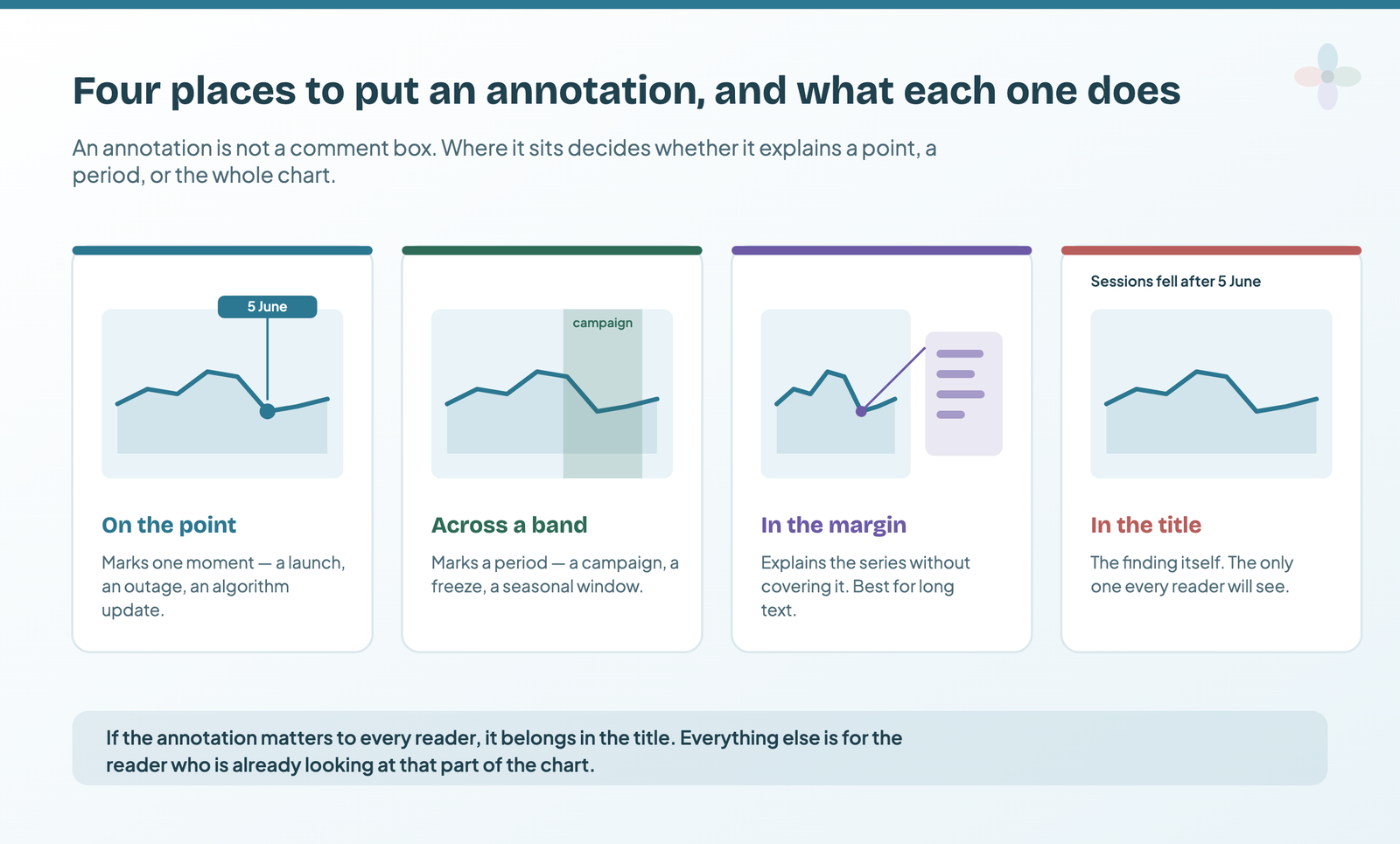
An annotation isn’t a comment box, and the position is part of the meaning. Four placements cover almost everything on a marketing report.
On the point marks a single moment — a launch, an outage, an algorithm update. It’s the highest-precision placement and the one that needs the least text, because the position is doing half the work.
Across a band marks a period rather than a moment: a campaign window, a content freeze, a seasonal peak. A shaded band behind the series reads as duration in a way that a single marker never does.
In the margin keeps longer text off the data. Anything over about fifteen words belongs here, with a leader line back to the point it refers to, because text laid over a series obscures the thing it is explaining.
In the title is the placement that matters most, and the one people reach for last. It’s the only annotation every reader will definitely see. If a piece of context matters to everyone opening the report, it isn’t an annotation at all — it’s the chart title, and it should be written as a sentence.
How to write an annotation that earns its space
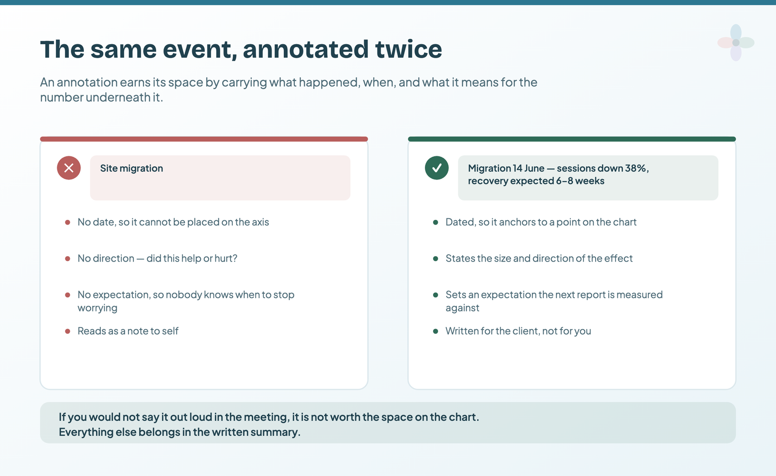
Short, and in this shape: what happened, when, and which way it pushed.
- “Site migration, 14 March — traffic recovery expected over 6–8 weeks”
- “Brand campaign ran 8–22 March — inflates non-brand comparison”
- “Deleted and redirected 40 thin blog posts in December — explains the Dec–Jan drop”
Each one turns a scary shape into a known event. That third example is the one worth studying: without it, a January review starts with someone asking why traffic collapsed.
Frequently asked questions
Can you add annotations in Data Studio?
Not as a native chart feature the way you can in Google Analytics. Data Studio gives you text boxes, chart titles and subtitles, tooltips and reference lines. For annotations that move with the data you blend a dated events sheet into the report, use a community Tooltip visualisation, or use a third-party annotation connector.
How do I mark an event like a site migration on a Data Studio time series?
There is no vertical reference line for a date, so the working options are a positioned text box, a shaded band driven by a second series, or a blended annotations sheet keyed on the same date field as the chart.
How do I stop report commentary going stale when the data refreshes?
Store the commentary as dated rows in a sheet rather than typing it into a text box, and blend that sheet into the report on the date field. The note then stays attached to the period it describes instead of to the page.