An AI assistant can draft your monthly client commentary well, as long as it only writes about numbers you’ve given it and causes you’ve told it. Give it the exported figures and a dated list of what happened, make it follow a fixed structure, forbid it from supplying causes or benchmarks of its own, and check every number and every “why” against the report before it goes out.
A common ask: an agency sends automated monthly reports and wants to know which AI can “analyse them for insights”. The answer isn’t a tool. It’s a method, and it works the same in ChatGPT, Claude or Gemini. (Data Studio was called Looker Studio until April 2026.) Below:
- what an assistant can and can’t know about your client’s month
- five steps: numbers only, a fixed structure, banned moves, a verification pass, and where the text lives in the report
- nine ways AI commentary goes wrong, and the check that catches each
- what to tell clients, and which data goes where
- the prompts and checklist, as a Google Sheet to copy
On the evidence: this is the method I use and teach. I’ve spent years teaching marketers where machine learning helps and where it confidently makes things up, and commentary is where it does the most damage. The prompts are mine, not benchmarked across models. Google’s features are described from its documentation as it read on 14 October 2026; I haven’t used Gemini’s Slides summaries, because they need Data Studio Pro.
What an assistant can know about your client’s month, and what it can’t
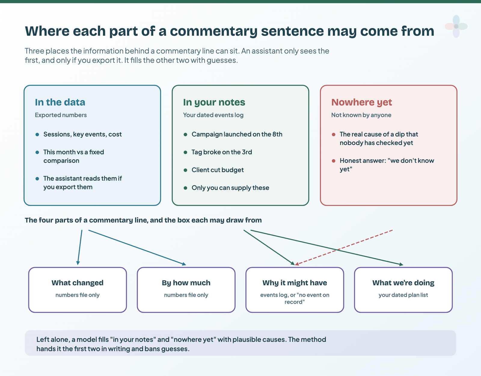
Every commentary sentence draws on three kinds of information. Some of it is in the data: sessions, key events, cost, the change on last month. An assistant can read those, if you hand them over. Some of it is in your head and your calendar: the campaign that launched on the 8th, the tag that broke on the 3rd, the budget the client cut. Only you can supply that. And some of it is nowhere yet: nobody has worked out the real cause, and the honest line is “we don’t know yet”.
An assistant fills the second and third boxes with plausible guesses, because producing plausible text is what a language model does. That’s the whole problem, and it’s why an AI Overview promising AI that highlights “root causes for dips” sets the wrong expectation. Google’s own Gemini documentation warns of output “that seems plausible but is factually incorrect”, and an annotation records an event; it doesn’t prove a cause. The “why” usually lives further up the chain of input metrics, in things the assistant never saw.
Four routes to a first draft, by what the assistant can see:
| Route | What it sees | What it can’t see | Plan and cost | Control over the wording |
|---|---|---|---|---|
| Gemini’s Slides summaries in Data Studio | The charts you select, one summary per chart | Your events log, other reports, anything outside the chart | Pro, Preview | On or off per slide; no prompt |
| GA4 Insights and Ask Advisor | The GA4 property only; flags unusual changes | Your campaign calendar, other data sources | Free (Ask Advisor in Beta) | None |
| An assistant connected to GA4 over MCP | Whatever it queries from the GA4 source | The report itself, its filters and your notes | Google’s official server: local, read-only | Full, but it queries the source, not the report |
| Export to ChatGPT, Claude or Gemini | Exactly what you export, plus your notes | Everything else | Any plan | Full |
From Google’s Slides with Gemini, Analytics Insights and Ask Advisor pages, read 14 October 2026.
The MCP route is set up in my guide to connecting GA4 to Claude or ChatGPT. Conversational Analytics needs a BigQuery data agent, so for most readers it isn’t a commentary route. The rest of this post uses the export route: you control both the inputs and the words. Every AI feature inside Data Studio is in my AI in Data Studio guide.
Step 1: give it the numbers, and only the numbers
An assistant can’t open your report. There’s no MCP server for Data Studio, and in September 2026 Google’s staff wrote on its forum that “there is currently no defined timeline for the development of an MCP server for Data Studio”. So you export.
- Set a fixed date range. 1–30 September, compared with 1–31 August (or last September). Never “last 28 days”: the export and the report you check it against must cover the same days. My date range post covers where the comparison lives.
- Export each chart you’ll comment on. In view mode, open the chart’s three-dot menu and choose Export. You get CSV, CSV for Excel or Google Sheets, with the chart’s filters and date range applied, up to 750,000 rows. (More on exporting here.)
- Note each export’s filters in a line above its rows. An organic-only chart exported without that note becomes “sessions” in the draft.
Don’t send a screenshot for the numbers: digits read off an image can’t be traced to a row. If the owner has turned exporting off, that’s a governance answer, not an obstacle.
Then write the second input yourself: the events log (date, what happened, how you know, confirmed or not). It’s the only place a “why” may come from. Glance at your data health page first, so a tracking gap doesn’t get narrated as a trend.
NUMBERS (example data; chart filter: none; 1–30 Sep 2026 vs 1–31 Aug 2026)
Channel,Sessions Sep,Sessions Aug,Key events Sep,Key events Aug
Organic Search,14200,15100,310,335
Paid Search,8900,9400,260,240
Direct,5100,5600,120,118
Email,1800,4250,40,96
Referral,1900,1900,30,31

EVENTS LOG (example)
2026-09-03 | Key event tag missing on checkout until 2026-09-06 | Tag Assistant | confirmed
2026-09-08 | Autumn campaign launched on Google Ads | campaign settings | confirmed
2026-09-15 | Client paused the newsletter until 7 October | client email | confirmed
2026-09-20 | Competitor sale seen in their ads | our observation | not confirmed
Aggregates only: no client names, no user-level rows. A good sentence needs neither.
Step 2: give it a fixed structure to write into
I use the same four-part pattern as my executive summary post: what changed → by how much → why → what we’re doing about it. For an assistant, each part gets bound to a source, and “why” becomes “why it might have”.
| Part | Allowed source | Example wording | Banned |
|---|---|---|---|
| What changed | The numbers file | “Email sessions fell against August…” | A metric not in the export |
| By how much | The numbers file, rounded by your rule | “…from 4,250 to 1,800.” | Estimated or recalculated figures without arithmetic |
| Why it might have | The events log, with the event and date named | “Likely the newsletter pause from 15 September.” | Any cause not in the log; use “No event on record explains this” |
| What we’re doing | Your plan list: owned, dated actions | “The newsletter restarts on 7 October.” | Recommendations you haven’t agreed |
Set a length (four sentences per chart), a rounding rule, and the comparison named in every sentence. Ask for a claim table first (claim, number as written, source row), prose second: Step 4 checks that table. The short version:
You're drafting the monthly commentary for a client report. The reader is {{audience}}.
Write only from the three blocks below. They are the only facts you have.
NUMBERS ({{period}} compared with {{comparison}}): {{numbers}}
EVENTS LOG (dated, written by us): {{events}}
PLAN (owned, dated actions): {{plan}}
For each chart, in this order, in no more than 4 sentences:
1. What changed: metric, direction, comparison period named in the sentence.
2. By how much: the figure from NUMBERS, rounded to {{rounding}}. Rate changes are percentage points.
3. Why it might have: only an event from the EVENTS LOG, with its date, worded "likely" or "possibly".
4. What we're doing: only an action from the PLAN, with owner and date, or "No action agreed yet."
Output a claim table first (claim | number as written | source row), then the commentary.
[paste the banned-moves block]
The full version, with variants for the executive summary and chart titles, is in the Sheet. When a client’s next question is “so what should we do?”, the plan list is what lets you answer it in the room.
Step 3: ban the moves that invent things
Most fabrications come from a handful of moves. Ban them in writing, at the end of every prompt:
Rules. Breaking any of them makes the draft unusable.
1. No cause that isn't in the EVENTS LOG. If nothing explains a change, write "No event on record explains this."
2. No benchmark, industry average or "typical" figure unless it's in a document I've supplied.
3. No number that isn't in NUMBERS. Don't estimate or fill in missing values.
4. If you calculate a percentage or a difference, show the arithmetic in the claim table.
5. Don't call a change "significant", "strong" or "worrying" unless it passes this threshold: {{threshold}}.
6. No forecasts or predictions.
7. No recommendation that isn't in the PLAN. Ideas go in a separate list headed "Ideas, not agreed".
8. If the blocks don't hold enough information for a part, write "Not enough information". That is a good answer.
Why each one is there:
- Causes (1). It can’t see your calendar, so without a list it supplies a plausible cause you then defend.
- Benchmarks (2). Some advice says to have ChatGPT cross-reference “external industry benchmarks”. I’d do the opposite: a web average doesn’t match your client’s market or tracking. If a benchmark matters, supply the source.
- Numbers (3, 4). An estimate reads exactly like a fact. Shown arithmetic is checkable.
- Adjectives and forecasts (5, 6). Your threshold decides what’s notable, not the model’s sense of drama. A forecast becomes a promise.
- Plans (7). I’m not saying never let it suggest an idea. I’m saying ideas go in a separate list, labelled as ideas, and never in the client’s paragraph.
- “Not enough information” (8). Letting the model say it doesn’t know is the first technique in Anthropic’s guide to reducing hallucinations, alongside restricting it to the documents you provide. And when nothing much happened, saying so is the commentary.
Nine ways AI commentary goes wrong, and the check that catches each
Most bad AI commentary isn’t nonsense. It’s plausible, which is worse. The nine I look for (example sentences are illustrations, not quotes):
| Failure | What it looks like | The check |
|---|---|---|
| Invented cause | “Traffic fell because of Google’s latest core update.” | Every “why” names a dated events-log row |
| Invented benchmark | “Well above the industry average.” | No figure that isn’t in your files |
| Percent vs percentage points | Conversion rate 2.0% → 2.5% written as “up 0.5%” | +0.5 percentage points, which is +25% |
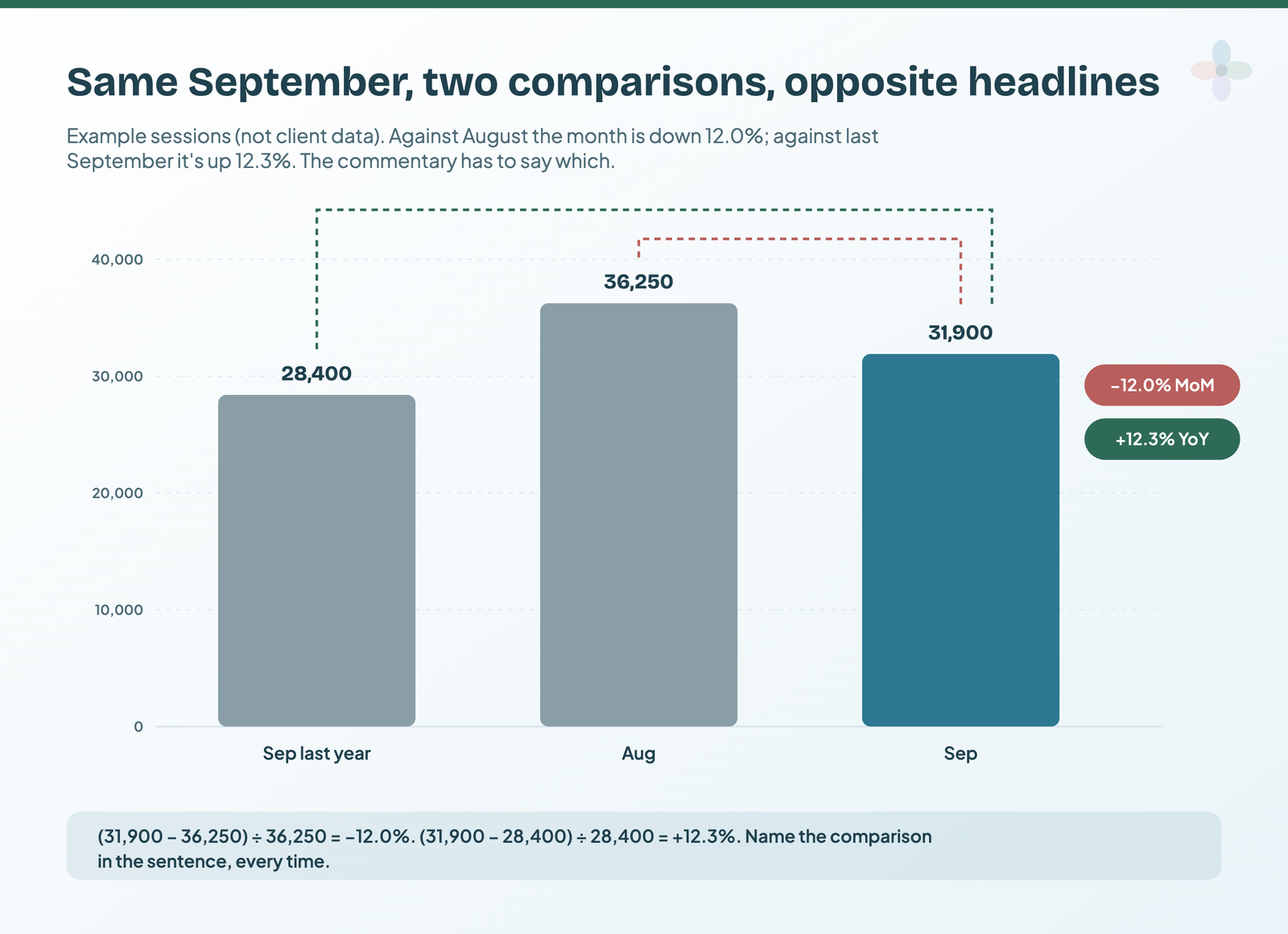
| Wrong comparison period | “Sessions down 12.0%” when the report compares year on year | Same fixed range; comparison named in the sentence |
| Averaging rates | Campaigns at 10% and 0.5% “averaging 5.25%” | Recompute from totals: 120 ÷ 5,000 = 2.4% |
| Renamed or invented metric | “Conversions rose” when GA4 reports Key events | Metric names copied from the export headers |
| A trend from noise | “A worrying downward trend” from a small move | Your threshold; no adjective below it |
| A filtered view as the total | Organic-only sessions described as “sessions” | Filters noted above each export |
| A tracking gap as performance | “Key events collapsed in the first week” when the tag broke | Tracking problems go in the events log |
The averaging example in full: campaign A has 100 key events from 1,000 clicks (10%), campaign B has 20 from 4,000 (0.5%). The average of the two rates is 5.25%. The real combined rate is 120 from 5,000, or 2.4%. My filter controls guide covers how a chart’s filter ends up in an export.
The wrong comparison does the most damage, because it can flip the sign:
Google’s warning about plausible but incorrect output applies to its own summaries too. The formula equivalents of these failures, for calculated fields, are in my guide to building a report with AI.
Step 4: the verification pass, line by line against the report
The step that makes the rest safe:
- Open the report on the same fixed range and comparison as the export.
- Check every number in the draft against the claim table and its source row, and recompute every percentage. The Sheet’s Number check tab (linked at the end) flags mismatches.
- Check every direction word. “Rose”, “fell” and “flat” must match the sign of the change.
- Check every “why”. It names an events-log row, or it comes out.
- Run a second pass in a fresh chat (below). It asks the assistant to quote the supporting row for every sentence and replace any sentence without one with []. That’s the “verify with citations” technique from Anthropic’s guide.
- Read it as the client. Would you defend each sentence in the meeting?
- A named person signs it off.
Below are the NUMBERS, the EVENTS LOG, the PLAN and a draft commentary written from them.
Check the draft sentence by sentence.
1. For each sentence, quote the exact row from NUMBERS, EVENTS LOG or PLAN that supports it.
2. If no row supports a sentence, replace it with [] and say in one line what was unsupported.
3. List every number in the draft and whether it matches its source after rounding. Show the
   arithmetic for any percentage.
4. Flag any change described with the wrong comparison period or the wrong direction word.
Don't rewrite, improve or add anything else.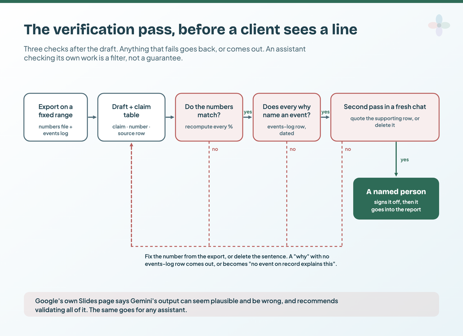
The second pass is a filter, not a guarantee: Anthropic’s guide says these techniques reduce hallucinations rather than eliminate them. Checks 2 to 4 are yours. If a client challenges a number, the claim table puts the answer one row away.
Step 5: where the commentary lives in a Data Studio report
Data Studio has no native annotation feature, so checked text goes in one of four places:
| Placement | Best for | Goes stale when | How to |
|---|---|---|---|
| The chart title, as the finding | One headline per chart | The date range moves and the title doesn’t | Scorecard titles |
| A text box beside the chart | Two to four sentences of commentary | Nobody updates it next month | Executive page build |
| A dated commentary Sheet, blended in | Commentary that belongs to its period | Rarely: each row carries its own dates | Annotation methods |
| The executive summary page | The one paragraph the client reads first | The pattern isn’t followed monthly | Writing the summary |
Add a “Commentary updated on…” line to whichever you use, so the reader knows which month the words belong to.
Gemini’s Slides summaries, on Pro
Data Studio’s one built-in way to generate commentary isn’t on the dashboard. On Pro, the Gemini panel generates a Google Slides deck from a report: charts go in as images, and Gemini “generates a textual summary of each chart”. An AI Overview describes comments “directly from your dashboard charts”; Google’s documentation puts them in the generated deck.
| Gemini Slides | What Google’s documentation says |
|---|---|
| Needs | Data Studio Pro with Gemini enabled, the Gemini for Google Cloud API on in the Pro project, and viewer or editor access to the report |
| Generates | A new deck: title slide, one slide per chart (title and summary), closing slide. It can’t be edited in Data Studio afterwards |
| No summary for | Filters, controls and text boxes; charts with fewer than three data rows, such as single-value charts (its error table says four); charts based on blends |
| Other limits | May time out over 75 visualisations; slide previews are deleted after 24 hours or when the panel closes; English only |
| Control | A Summary on icon per slide, and thumbs up or down. No documented way to prompt or constrain the wording |
| Cost and status | Pro is $9 per user per project per month. Gemini is Preview, at no extra cost during Preview, and may carry a fee afterwards |
| Google’s warning | Gemini “can generate output that seems plausible but is factually incorrect”; validate all of it |
From Google’s Slides with Gemini and Gemini in Data Studio overview and troubleshooting pages; price from Google’s Pro page. All read 14 October 2026.
Two unanswered threads on Google’s forum (October 2025, April 2026) report decks with chart images and no summaries, which Google’s docs don’t explain. An early review by Gaille Reports (June 2025) found discrepancies in active-user counts and percentages in the slide commentary. A summary describes a chart; it doesn’t know your events log. Put it through Step 4. Is Pro worth it? See my free vs Pro comparison.
Telling clients an assistant helped
My position, and it’s an opinion: disclose the process once in the statement of work; the sign-off stays human. Clients pay for judgement, and the judgement is still yours: the events log, the plan, the decision that a sentence is true. I don’t label every sentence, and I never send AI text I haven’t read. Accountability doesn’t transfer to the model.
| Where | Wording |
|---|---|
| Statement of work, once | “We use AI assistants to help draft the written commentary in your reports. They work only from the report’s aggregated figures and our own notes. A named member of our team checks every figure and statement against the report and signs it off before it’s sent.” |
| Report footer, optional | “Commentary drafted with an AI assistant from this report’s figures and our notes; checked and signed off by [name], [date].” |
| “Did AI write this?” | “An assistant drafted it from our numbers and notes, and I checked every line.” |
The SOW line is also where you name the tool and plan (next section). Professional practice, not legal advice: check your contract. With several writers, put the sign-off into your reporting operations, and hold the follow-up email to the same standard.
Before you paste: which client data goes where
Where the data goes depends on the route and plan, not the brand:
| Route and plan | Used for training? | Source |
|---|---|---|
| ChatGPT Free, Plus, Pro | May be, unless you turn off Improve the model for everyone (Settings › Data controls); thumbs feedback can still send that conversation to training | OpenAI |
| ChatGPT Business, Enterprise, Edu, API | Not by default | OpenAI, same page |
| Claude Free, Pro, Max | If you allow it in privacy settings; thumbs feedback and chats flagged for safety review can still be used | Anthropic |
| Claude for Work, Team, Enterprise, API | Not by default | Anthropic |
| Gemini app, personal account | With Keep Activity on, yes, and some chats are read by human reviewers. Google: don’t enter confidential information | |
| Gemini in Workspace apps | No | |
| Gemini in Data Studio (Gemini for Google Cloud) | No | Google Cloud |
Each provider’s page, read 14 October 2026. Check your own plan’s data controls before the first paste; these pages change.
Before the first paste, five ticks:
- a business plan, or training turned off on a personal one
- aggregates only, no client names or user-level rows
- the client contract allows AI processing
- the report owner allows exporting
- output checked before it’s sent
On Pro, a sharing option stops viewers generating Slides with Gemini. Who sees which rows is a row-level security question. Contracts and a plan register are in my guide to client data and AI assistants.
The commentary prompt and checklist, to copy
Everything above is in one Google Sheet. Fill in the audience, dates, rounding rule and threshold, paste your export, and three prompts (monthly commentary, executive summary paragraph, chart titles) assemble themselves from your events log, plan list and the banned moves. The Number check tab recomputes every change and checks the direction word.
For the build itself, see the Data Studio prompt library. The monthly routine:
- Set the report to a fixed date range and comparison.
- Export each chart you’ll comment on, and note its filters.
- Write the events log: dated, sourced, confirmed or not.
- Paste the structure and the banned moves, with your numbers, events and plan.
- Get the claim table first, then the prose.
- Check every number, direction word and “why”.
- Run the second-pass prompt in a fresh chat; fix or delete every [].
- Sign it off, and place it in the report with the date.
Report templates to write your first commentary on
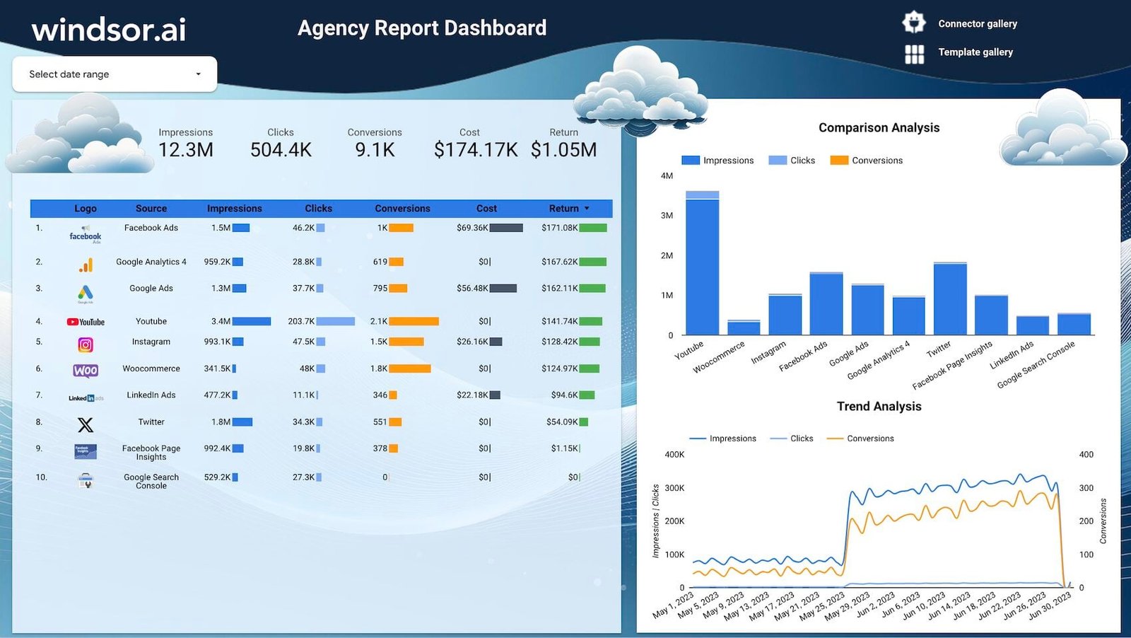
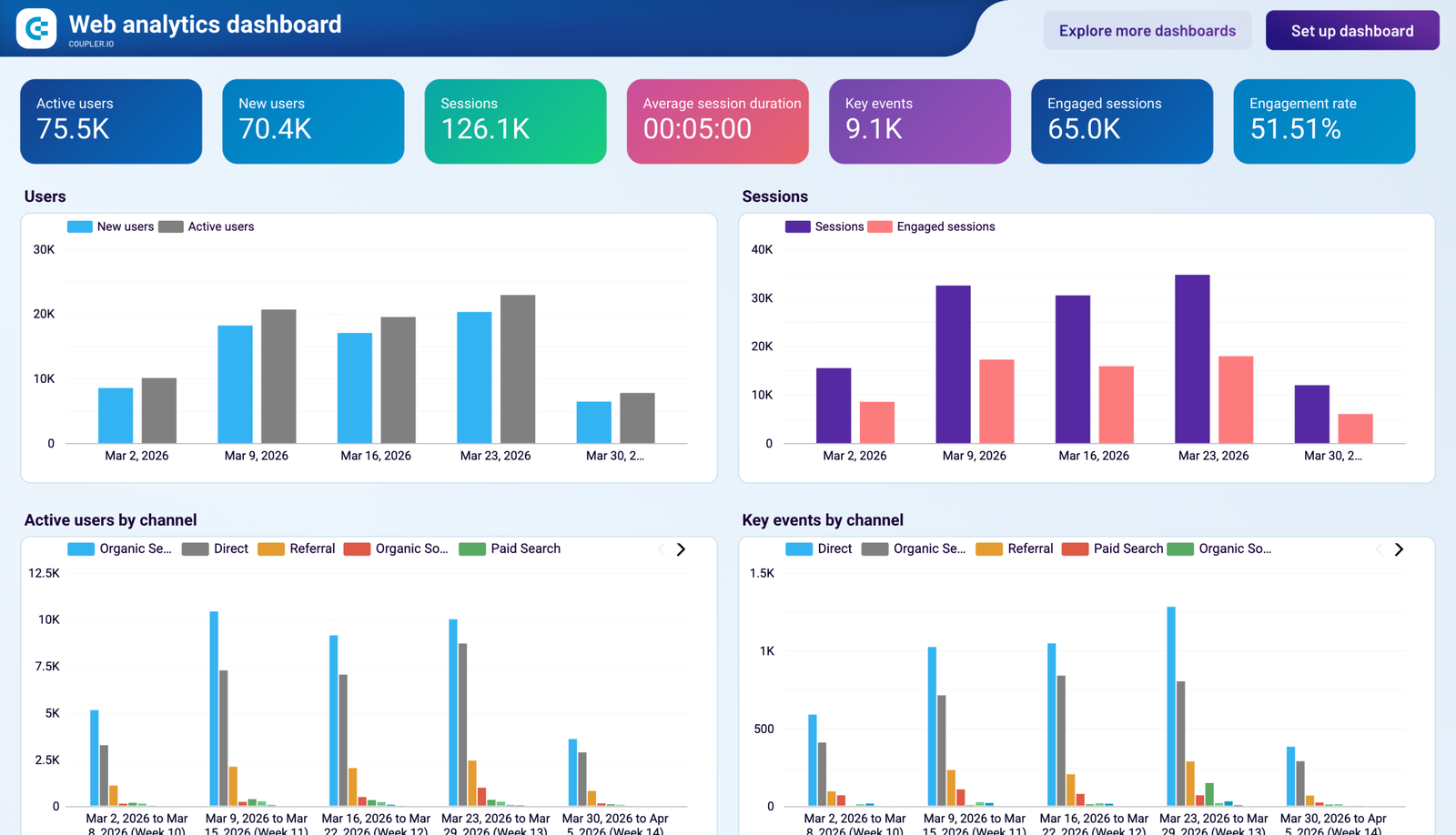
Two free multi-channel reports with trends worth explaining:
Where to go next
- The executive summary page: what the paragraph should say
- Annotations in Data Studio: the dated commentary Sheet
- The so-what test: when the answer is “we don’t know yet”
- Presenting a report to a client, bad months included
- Data storytelling for marketers: the bigger picture
- AI in Data Studio: every AI feature and what it needs
Frequently asked questions
Can ChatGPT or Claude read my Data Studio report and write the commentary?
Not the report: there’s no MCP server or API that reads report data. Export the chart data, or connect the assistant to the source, such as GA4 over MCP.
Does Gemini in Data Studio write summaries?
Only inside a Google Slides deck it generates from the report, on Pro, in Preview, one summary per chart, with none for blends or charts with fewer than three rows.
Should I tell clients I use AI for reporting?
I would: disclose the process once in the statement of work; the sign-off stays human. Professional practice, not legal advice; check your contract.
Is it safe to paste client data into an assistant?
Aggregates, on a plan that doesn’t train on your inputs, if your contract allows it. Check your plan’s data controls first.
Which assistant writes the best commentary?
I haven’t benchmarked them. The structure, the banned moves and the check matter more than the model.
Can AI explain why traffic dropped?
GA4’s Insights and Ask Advisor can flag unusual changes in the property’s own data. They can’t see your campaign calendar, so the “why” comes from your events log.
Some links in this post are affiliate links: if you sign up through one, I may earn a commission at no extra cost to you. How I work with partners.