
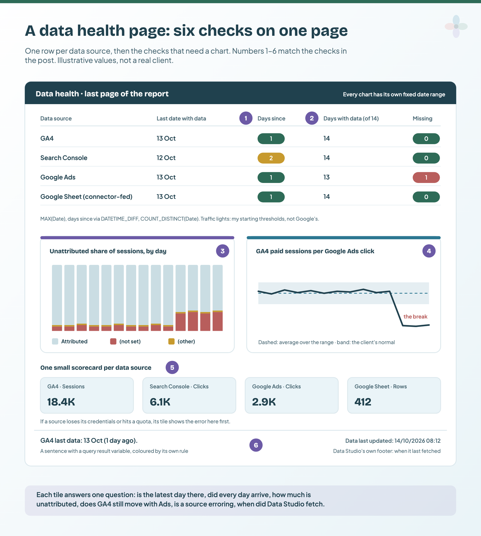
A data health page is one extra page in each client report that answers “can I trust these numbers today?” before anyone reads them: the last date each source has data, whether every day in the last two weeks arrived, how much traffic sits in (not set) or (other), whether GA4 sessions still move with Google Ads clicks, whether any source is erroring, and when Data Studio last fetched. All six checks run on the free version of Data Studio (formerly Looker Studio).
Automated reports rarely break loudly. This covers:
- why “automated” reports go wrong without an error
- the six checks, and how to build each one (formulas included)
- the settings that stop a client’s date range hiding a problem
- a Monday routine, and what to do when a tile goes red
I built this page from Google’s documentation and from failure reports in Google’s own Data Studio forum. Where Google documents each function but not the exact combination I use, I say so next to the formula. The kit at the end has every formula, a source register and the checklist.
Why “automated” client reports go wrong without telling you
A source that stops, or arrives half-full, rarely produces an error message. It produces a smaller number, a zero or a flat line, and the scheduled email goes out on time regardless. In the last 18 months Google’s forum has had all four of these:
| What happened | What the client sees | The check that catches it |
|---|---|---|
| Search Console data stopped after 3 June 2025 in every connected report, while Search Console itself was current | Organic clicks falling to nothing | 1: last date |
| The GA4 connector returned no row for 27 August 2026 (and 18 September) that GA4 itself had; cause unresolved in the thread | A one-day zero in the trend | 2: missing days |
| Business Profile data missing from the scheduled PDF only (a third-party connector) | An empty section in the email | 5: canary chart (partly) |
| GA4 quota errors across every report at once (October 2026) | Charts that won’t load | 5: canary chart |
| Sampled GA4 data | Nothing: Data Studio doesn’t indicate GA4 sampling | None. No tile on this page can see it |
Threads from Google’s Data Studio forum, read 13 October 2026. Sampling: Google’s GA4 sampling page.
Recent days also move on their own (Google says GA4 “data processing can take 24-48 hours”), so the page has to tell “late” from “broken”. An email that never arrives is a scheduling problem; numbers a few hours old are freshness and caching. The health page is the first item in an agency review step.
What goes on a data health page: six checks
Six checks, each for one way a report fails:
| # | Question | Built with | Free? |
|---|---|---|---|
| 1 | What’s the latest day each source has? | MAX(Date), DATETIME_DIFF, conditional formatting | Yes |
| 2 | Did every day in the last 14 arrive? | COUNT_DISTINCT(Date), Line Breaks | Yes |
| 3 | How much traffic is (not set) or (other)? | A CASE or Group field, Percent of total | Yes |
| 4 | Do GA4 paid sessions still move with Ads clicks? | A blend joined on Date, a reference line | Yes |
| 5 | Is any source erroring? | One small scorecard per data source | Yes |
| 6 | When did Data Studio last fetch? | The report footer, a query result variable | Yes |
If you’ve met the phrase “data quality dashboard”, this is the marketer’s version: checks 1 and 6 are timeliness, 2 is completeness, 3 and 4 are consistency. Build the tiles as plain scorecards and small charts, so the eye goes to colour.
Set the page up so a client’s date range can’t hide a problem
A date range control governs every chart on its page, unless a chart has its own date range set. That’s the property this page depends on: a client who picks “last month” mustn’t be able to hide yesterday. (The full hierarchy is in how date range controls work.)
- Decide where it lives. The full page goes in your team’s copy of the report, on the same data sources; the client’s report gets the simplified version described at the end.
- Add a page and put it last, so it doesn’t interrupt the story. (Page order and menus: the navigation menu.)
- Give every health chart its own range. Select the chart, then Setup → Default date range → Custom, and use the advanced options, which count from Today with Minus N days.
- Use two ranges. Today minus 14 → Today for “last date” (so today counts if it’s arrived); Today minus 14 → Today minus 1 for “missing days” (14 complete days).
- Note the time zone. TODAY() uses UTC unless you give it one, so the formulas below pass the GA4 property’s time zone.
Left on Auto, GA4 and Google Ads charts show the last 28 days and Sheets and BigQuery the whole dataset. Neither is the window you want.
Check 1: the last date each source has data
Two calculated fields per data source. MAX returns the latest date in the chart’s range; DATETIME_DIFF turns it into days you can colour:
// Written from Google's function docs, not tested here.
Last date with data   = MAX(Date)
Days since last data  = DATETIME_DIFF(TODAY("Europe/London"), MAX(Date), DAY)
Swap Europe/London for the property’s time zone (Google’s docs use names like America/Los_Angeles; offsets like “-08” work too). DATETIME_DIFF counts day boundaries, so the result is 1 when yesterday is the latest day and 0 once today’s data is in.
Three details from Google’s docs that trip people up:
- Use DATETIME_DIFF, not DATE_DIFF. DATE_DIFF only works on compatibility-mode dates. If DATETIME_DIFF rejects your Date field, it’s in compatibility mode; Google recommends upgrading it.
- Don’t build “first date with data” with MIN. Google documents MIN for numeric fields only.
- If a scorecard won’t take MAX(Date), use a one-row table per source instead. Google documents MAX on dates, not in a scorecard specifically. If it saves as a Number, set its type to Date.
Then the traffic light. Select the Days since scorecard, open Style → Conditional formatting, and add rules: green at 1 or less, amber at 2, red at 3 or more. A scorecard’s rule uses its own metric. (The mechanics: making a colour carry a rule.)
Those thresholds are my starting points, not Google’s. Each source has its own normal lag:
| Source | What Google (or the vendor) says about lag | Starting threshold (mine) |
|---|---|---|
| GA4 | Daily data typically about 12 hours for standard properties; processing can take 24–48 hours | Amber at 2 days, red at 3 |
| Search Console | The newest data can be preliminary and change over the next few hours; no fixed lag figure | Watch two weeks, then set it |
| Google Sheet fed by a connector | Whatever the connector’s sync schedule is: Coupler.io Starter refreshes daily, its free tier manually | Sync interval plus 1 day |
| BigQuery | Your own load schedule | Load interval plus 1 day |
GA4: Google’s data freshness page. Search Console: Google’s help. Read 13 October 2026.
The calculated field editor itself has its own guide in the Calculated Fields series.
Check 2: days that never arrived
Over a fixed 14-day range, counting distinct dates should give 14. Anything less is a missing day:
// Written from Google's function docs, not tested here.
Days with data   = COUNT_DISTINCT(Date)
Missing days     = 14 - COUNT_DISTINCT(Date)
Rows (Sheets)    = COUNT(Date)
COUNT_DISTINCT works on a dimension like Date; it errors on an Auto-aggregated metric such as Sessions. For row counts, every BigQuery data source has a Record Count metric built in. For a Google Sheet I count a column instead (COUNT includes duplicates, which is what you want for rows).
Then fix the trend chart, because the forum’s missing day showed up as a zero. On a time series, Style → Missing data defaults to Line To Zero. Set it to Line Breaks and a missing day becomes a gap instead of a fake collapse.
| Days with data | What it usually means | What to do |
|---|---|---|
| 14 | Every day arrived | Nothing |
| 13, gap mid-range | The connector didn’t return a day the source may have | Check that date in the source; annotate it |
| 13, yesterday missing | Processing lag | Wait a day, then look again |
| 0 | The source is broken or disconnected | Check 5’s canary tile, then credentials |
Once you’ve found a gap, annotate it on the client’s charts. If the source is an extract, a stale extract looks exactly like this: extracted data sources explains the schedule.
Check 3: how much traffic is (not set) or (other)
Three placeholder values, three different meanings, per Google’s GA4 help:
- (not set): GA4 received no value for that dimension. For Google Ads traffic the causes Google lists are accounts not linked, auto-tagging off, an unlinked Ads account, and incomplete or incorrect UTM tagging. Usually fixable.
- (other): a table went over its row limit and the rest was grouped. Dimensions with more than 500 values count as high-cardinality.
- (data not available): traffic-source values still processing. Expected on recent days, more in intraday data; you generally can’t reduce it.
The tempting build, SUM(CASE … Sessions …), fails on GA4: most GA4 metrics are already aggregated, and Data Studio’s error is “Re-aggregating metrics is not supported”. So bucket the dimension, and let the chart do the sums:
// Written from Google's function docs, not tested here.
Attribution bucket =
CASE
  WHEN REGEXP_MATCH(Session source / medium, r".*\(not set\).*") THEN "(not set)"
  WHEN REGEXP_MATCH(Session source / medium, r".*\(other\).*") THEN "(other)"
  ELSE "Attributed"
END
Two notes on the regex. REGEXP_MATCH only returns true if the whole value matches, hence the .* at both ends. And the r"…" raw string means the brackets need one backslash, not two. Check the exact name of the session source / medium field in your own data source, and use it as shown there.
No code? ADD A FIELD → Add group on session source / medium, with two groups, “(not set)” and “(other)”, and tick Group remaining values as a new group, named “Attributed”. A Group field takes up to 195 groups; you need two.
Chart it as a 100% stacked column by Date, Attribution bucket as the breakdown, Sessions as the metric. In a table, set Sessions’ comparison calculation to Percent of total. A jump from your usual share is the signal; the level itself varies by client.
Search Console’s anonymised queries aren’t this check (see connecting Search Console). GA4 field names: connecting GA4.
Check 4: GA4 sessions against Google Ads clicks
GA4 paid-search sessions and Google Ads clicks never match, and they shouldn’t. Google’s explanation (on a page still labelled for Universal Analytics, so I take only the mechanisms from it): one person can click several times in one session, a later return on the same referral can count, a page can be left before the tag fires, and Google Ads filters invalid clicks that Analytics still records.
What matters is a break in the ratio. A drop towards zero usually points at auto-tagging, a redirect that strips the click ID, consent, or a broken GA4 tag. I won’t give you a “normal” percentage, because Google doesn’t publish one. The line on the chart is the client’s own baseline.
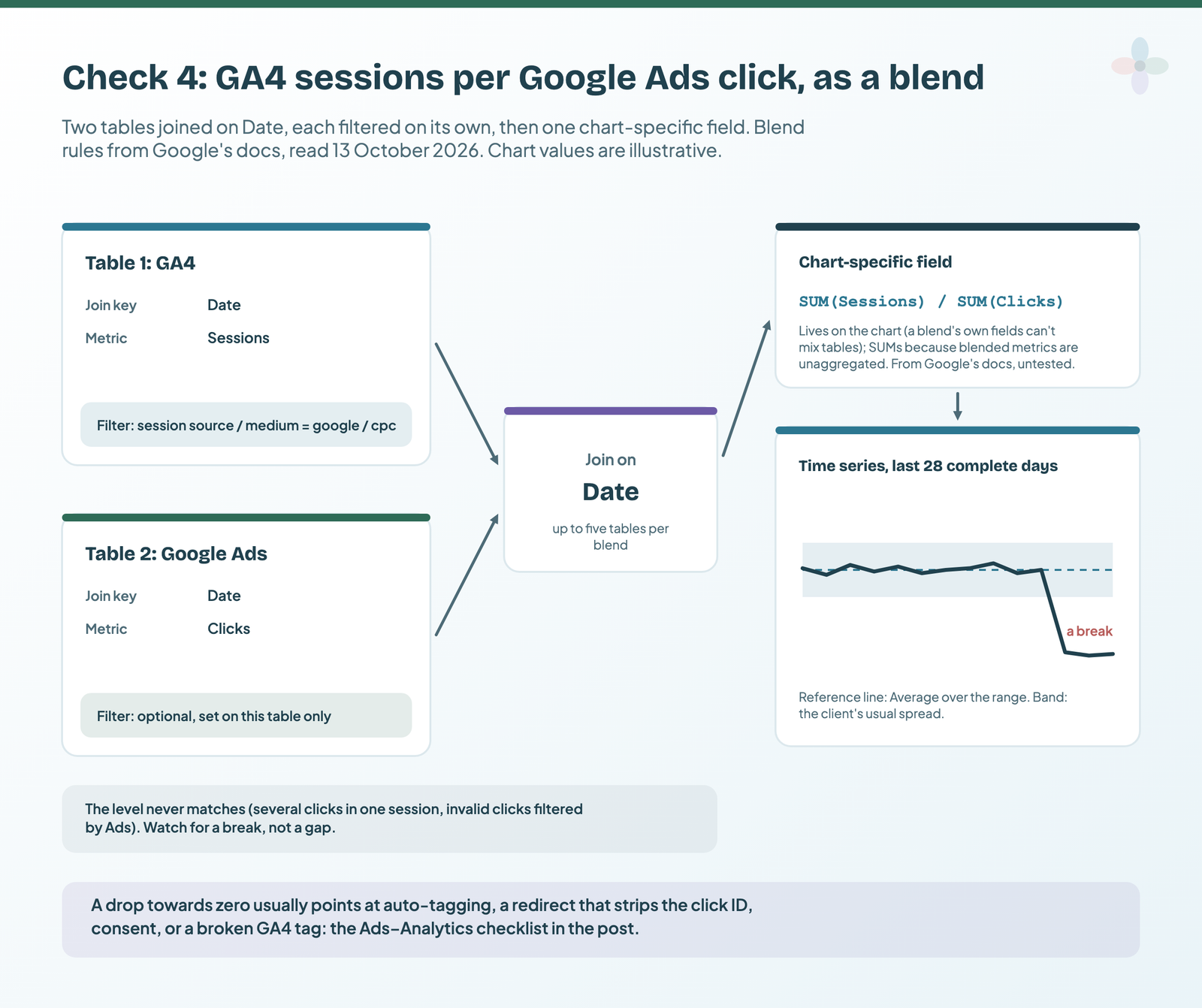
- Blend the GA4 data source and the Google Ads data source, joined on Date. (A blend takes up to five tables; you need two.)
- Filter each table on its own: GA4 to session source / medium = google / cpc.
- Add the ratio as a chart-specific field. A blend’s own calculated fields can only use one table’s fields, so a cross-source ratio has to live on the chart:
// Written from Google's function docs, not tested here.
// Chart-specific field on the blended time series:
Sessions per click = SUM(Sessions) / SUM(Clicks)
Why SUM, when SUM(Sessions) errors on GA4 itself? In a blend, metrics become unaggregated numbers; plain Sessions / Clicks would divide row by row, then add the ratios up. Google’s ratio-from-filtered-metrics tutorial builds the same shape. I couldn’t test it on a GA4 + Ads blend: I don’t have a Google Ads account with data for this post.
Last, give the line a baseline: add a reference line using the Average of Sessions per click, and a reference band for the client’s usual spread (reference lines and bands). I use the last 28 complete days, so a break stands out against four weeks of normal. If the line falls through the band, run Google’s Ads–Analytics configuration checklist: linked accounts, the tag on landing pages, auto-tagging, tagged final URLs. The Ads side: connecting Google Ads.
Check 5: a canary chart for every data source
One small scorecard per data source the report uses, including partner-connector and Sheets sources. If a source loses its credentials, is disconnected or hits a quota, its tile shows the error on this page before the client’s pages do.
Keep the page light. GA4 reports draw on GA4 Data API quotas, and one of Google’s own fixes for quota errors is fewer charts. After building it, right-click a GA4 chart and open Google Analytics token usage: it shows the tokens each chart used, with a green tick for charts loaded from memory.
| What the tile shows | Google’s wording, for example | Google’s steps, in its order |
|---|---|---|
| A data source error | Missing data source · No data set access · The underlying data has changed · Database connection error | Add the correct data source to the chart; refresh the fields; reconnect; remove the data source and add it back |
| A GA4 quota error | This property has issued too many requests in the last hour (or last day) | Owner’s credentials; one reusable GA4 data source instead of duplicates; fewer charts |
| Still broken after that | Any of the above | Create a new data source to see whether a clean connection works; revoke and restore Data Studio’s access to your Google Account |
From Google’s troubleshooting guide, read 13 October 2026.
Credentials decide a lot here. With owner’s credentials, every viewer shares one cache; with viewer’s credentials, each viewer gets their own. Replies in the forum’s missing-PDF thread suggested owner’s credentials. The setting itself is in the sharing guide, the schedule side in the scheduled report post, and reusable versus embedded sources in data source vs dataset.
Check 6: when Data Studio last fetched
Every report shows the time of its last data refresh in the bottom left corner. If that time is earlier than your last change to the view, the charts were served from memory. It isn’t the same question as check 1: the footer says when Data Studio asked; check 1 says what the source had.
To put check 1 into a sentence, use a query result variable: in a text box, type @, choose Add a variable and give it one metric, Days since last data. The value appears inside the text, with its own conditional formatting: “GA4 last data: 13 Oct (1 day ago)”, in red when it’s late. Variables arrived in March 2025; conditional formatting on them in August 2025.
Clients can re-fetch too, if you let them. Since 18 June 2026, Report settings has a Viewer data refresh toggle; editors can always use More options → Refresh data, and a button with the Refresh data action does the same from the page. There’s a one-minute cooldown, and a refresh resets freshness for every data source in the report.
How often each connector refreshes on its own (Google’s pages disagree about GA4) is in the freshness post.
Make it a Monday routine, and know what to do when a check goes red
Build the page once, then copy it into each client’s report (copying and reusing a report covers what moves with a copy). Reusable data sources keep field names the same across reports, so the formulas paste cleanly. Then look at every client’s health page before any report goes out:
| # | Monday check | Where |
|---|---|---|
| 1 | Every source’s last date is within its threshold | Check 1 |
| 2 | Days with data = 14 for every source | Check 2 |
| 3 | (not set) and (other) in line with last week | Check 3 |
| 4 | Sessions per click inside the client’s band | Check 4 |
| 5 | No canary tile shows an error | Check 5 |
| 6 | The fetch stamp is recent enough | Footer |
| 7 | Nobody changed a source or field unexpectedly | File → Version history |
| 8 | Any gap is annotated on the client’s charts | Client pages |
Version history shows each saved version, when and by whom (reusable data sources have their own).
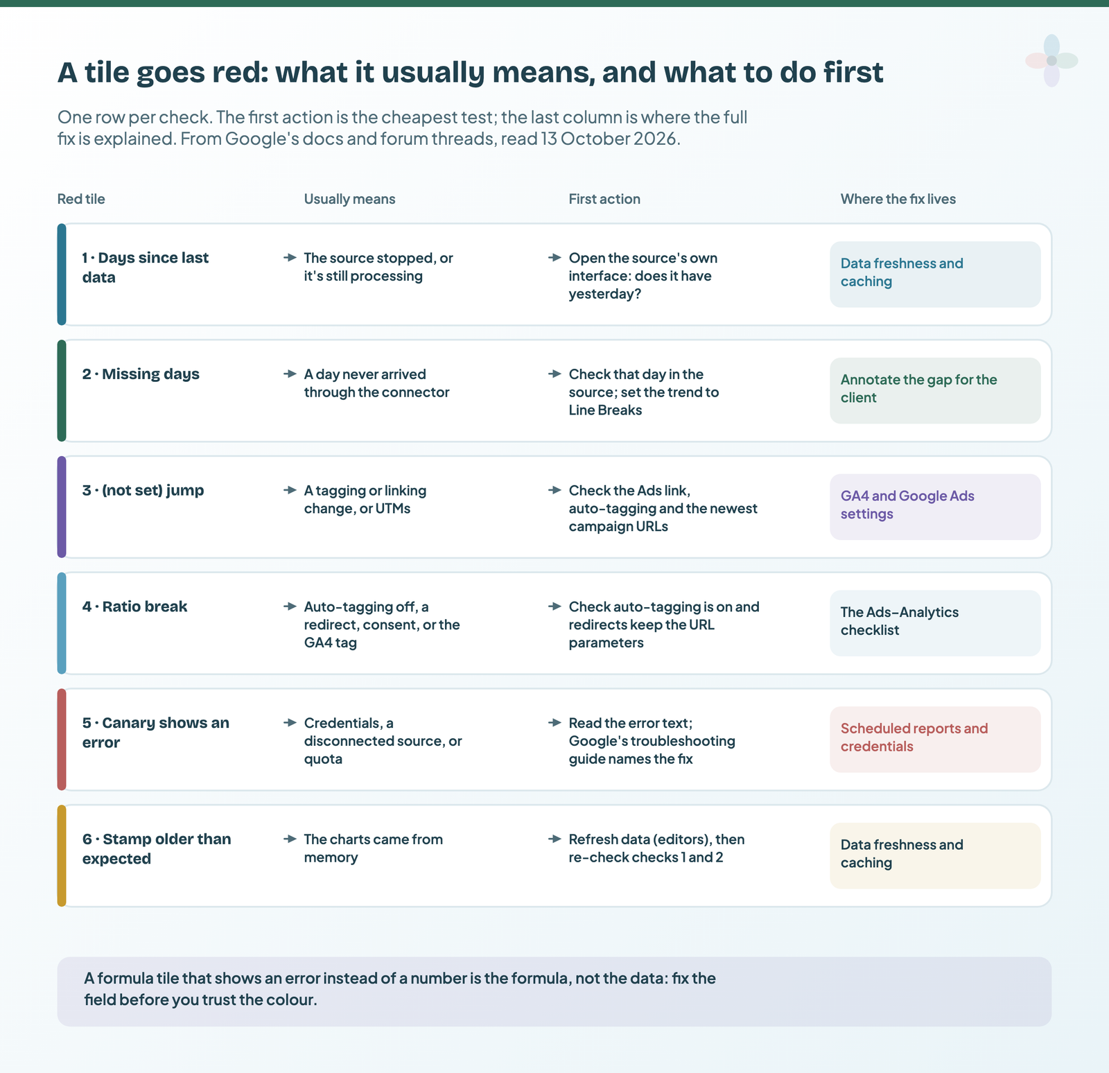
A tile that shows an error instead of a number is usually the formula, not the data; calculated field errors have their own post in the Calculated Fields series. If you’d rather be told than look, that’s Pro alerts or a free workaround.
Should the client see the health page?
My view: a simplified version, yes; the diagnostic tiles, no. The client’s report ends with the check 1 table (last date per source, traffic lights) and one sentence from check 6. The missing-day counts, the (not set) chart, the ratio and the canaries stay in your team’s copy, where a red tile starts work instead of a worried email. Chapter 24 of my ebook, Data Storytelling in Data Studio, shows how to put that one sentence on the client’s summary page as a “data to” stamp that updates itself.
When the page finds a gap, say so on the affected charts with an annotation, rather than quietly fixing numbers (annotating a data gap honestly). It’s an easier conversation than the one where the client finds it first: when a client challenges a number covers that one.
Where to go next
- Why your Data Studio report shows yesterday’s numbers
- Get told when a client metric drops: Pro alerts and free workarounds
- Why your scheduled report didn’t arrive
- Annotating a tracking break honestly
- Automated client reporting in Data Studio
Frequently asked questions
Can I hide the “Data last updated” text?
Google’s documentation describes it as shown in the bottom left of the report, and a community answer on Google’s forum says it can’t be hidden. Use it: it’s check 6.
Why does my trend chart show a zero for a day GA4 has?
The connector may have returned no row for that day, and the time series default, Line To Zero, draws a missing date as zero. Set Missing data to Line Breaks so it shows as a gap, then compare the date in GA4.
Why don’t Google Ads clicks and GA4 sessions match?
They count different things: several clicks can make one session, and Ads filters invalid clicks Analytics still records. Watch the ratio for breaks, not the level.
How do I see when a Google Sheet behind my report was last updated?
If the sheet has a date column, MAX of it gives the latest date in the data. Data Studio doesn’t read the Sheet’s edit history.
Can Data Studio email me when a check goes red?
Only on Pro, through chart alerts. The free workarounds are in the alerts post.
How do I refresh a data source?
Editors: More options → Refresh data. Viewers can too if Viewer data refresh is on in Report settings. There’s a one-minute cooldown.
Some links in this post are affiliate links: if you sign up through one, I may earn a commission at no extra cost to you. How I work with partners.